Color is a Simple Language. Here’s How to Speak It.
Have you ever watched a tutorial on color theory?
Maybe it made a lot of sense at the time, but when you went out into the real world and tried to apply it, it just didn’t work?
And then you turned to the cameras, the recipes, and the presets, but your photos still didn’t look the same as other photographers’?
Well, you’re not alone.
You see, as a street and travel photographer, you might be surprised to hear, but the standard “color theory” you’d learn in a textbook has never really worked for me.
And yet I’ve taken thousands of photos I’d think have pretty good color.
Because although there is a science to color, there’s a very big problem with the practicality, especially when it comes to candid photography.
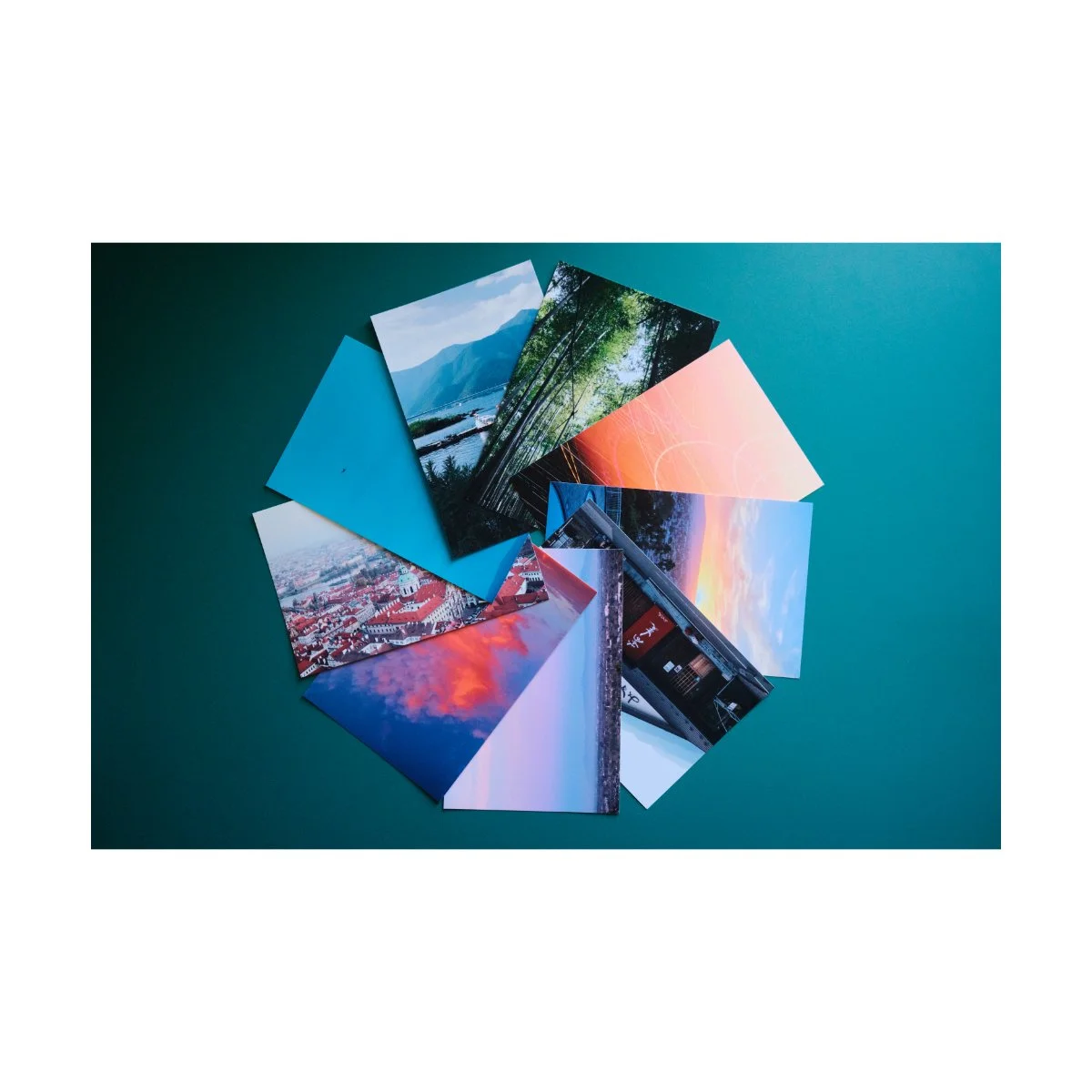
In fact, color is something photographers manipulate, not create.
Which might sound like a bad thing at first, but realizing this years ago has actually made my color photography better.
When you get down to it, color is actually a simple language, it’s just different than what the theories tells you.
Today, we’re going to learn how to speak it.
Disclaimer:
First, I’ll be speaking in the context of street and travel photography (candid genres), because that’s what I do.
Obviously, if you do things like portrait or product photography, you do have more influence on the environment, and therefore how you use color will be different.
Second, this whole video is a big hot take, because it contrasts the opinions of many people online.
But I don’t care because this is what’s worked and made sense to me.
I’m making this not because I think I’m “right”, or hate color theory, but because there’s someone out there similar to me, whom color theory has never really worked for.
And I’d like to provide a different perspective or route for them.
Let’s begin.
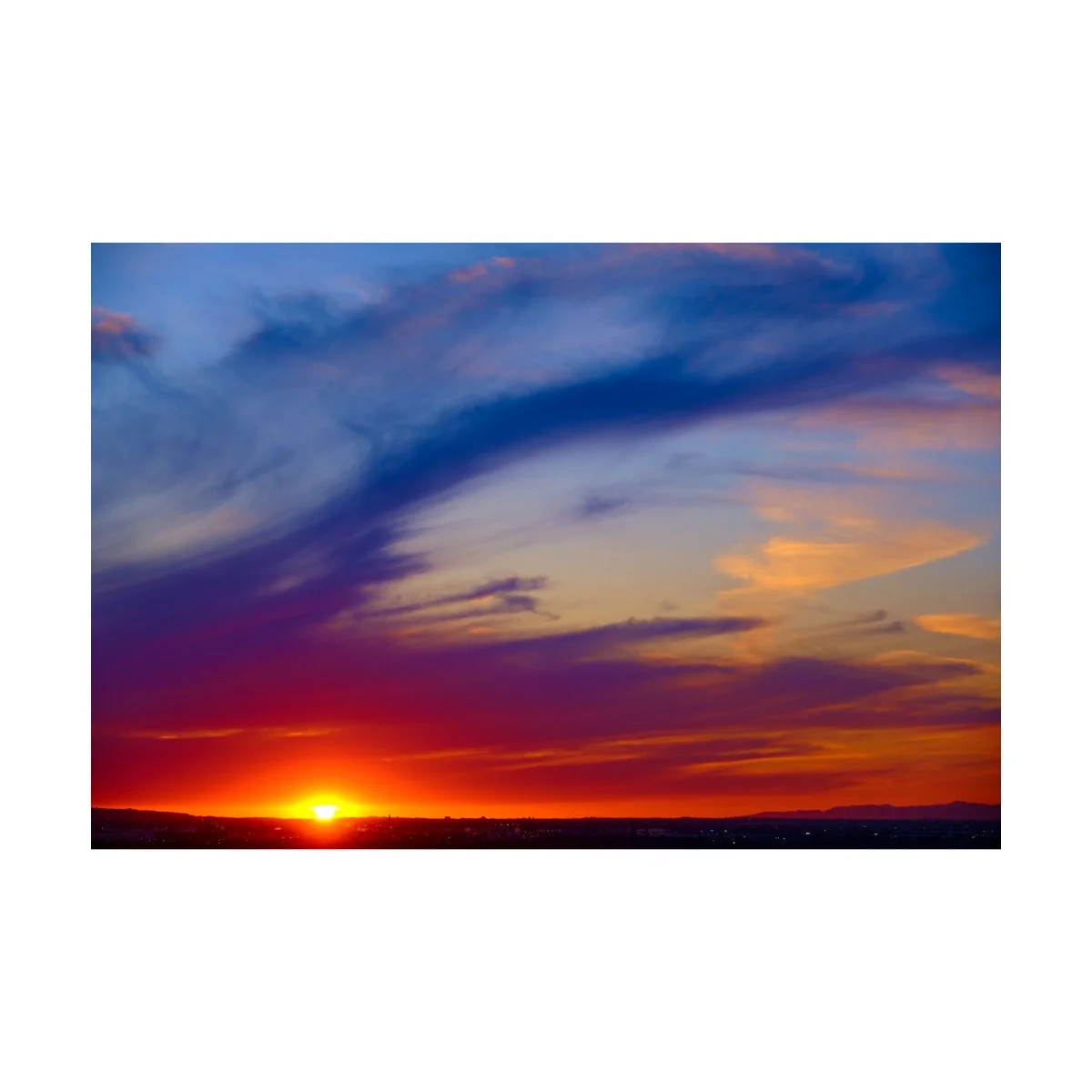
Common Misconceptions About Color
In my experience, these are the three most common misconceptions when it comes to color.
Again, your mileage may vary, and that’s okay.
First misconception: “You need to know color theory to get good color.”
On YouTube, some of the most viewed videos made by photographers are about color.
People will talk all about the “science” of color, how you have to have analogous colors, complementary colors, and understand the meaning and relationship of them.
But would it surprise you to know that you don’t actually need to know color theory to get good colors?
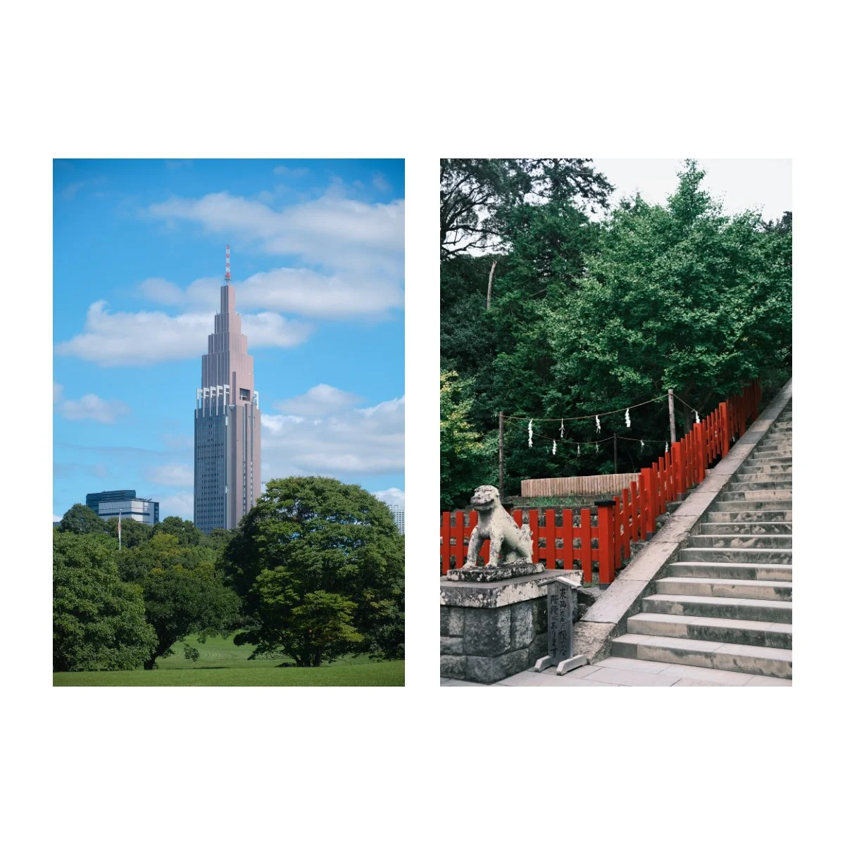
In fact, this might make more sense if we look at it from the perspective of music.
If you think of a “professional” musician, producer, whatever, you’d probably assume they can read sheet music.
But there are actually many famous musicians like Jimi Hendrix, Paul McCartney, and even Hans Zimmer, who can’t/couldn’t read sheet music.
And yet they are some of the most accomplished and talented musicians alive.
Meaning that although sheet music can be useful, it’s not necessary to make great music.
The same applies for photography.
Color theory is interesting and can be useful, but it’s not always necessary to know the ins and outs of.
In fact, many photographers have taken great photos with great color, without knowing a lick of color theory.
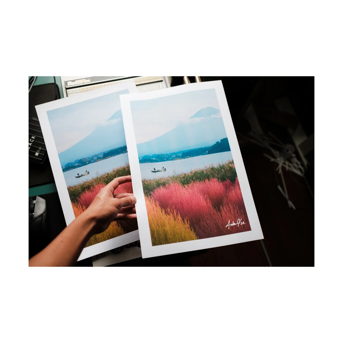
Ironically, the many YouTubers you’ve watched were probably not thinking about how analogous or complementary these colors were when they took that photo.
They probably just saw something nice and pressed the shutter.
And then they decided to make a video on color theory, found the photos that applied to the “rules”, and used them as examples.
So we must not mistake the map for the territory.
Color theory can be useful in the sense that it helps you be more intentional about what you’re doing.
And if knowing more works for you, fantastic.
But if you don’t know it to a T, don’t worry, you’ve haven’t been doing photography wrong.
This should hopefully come as a great sigh of relief to many of you.
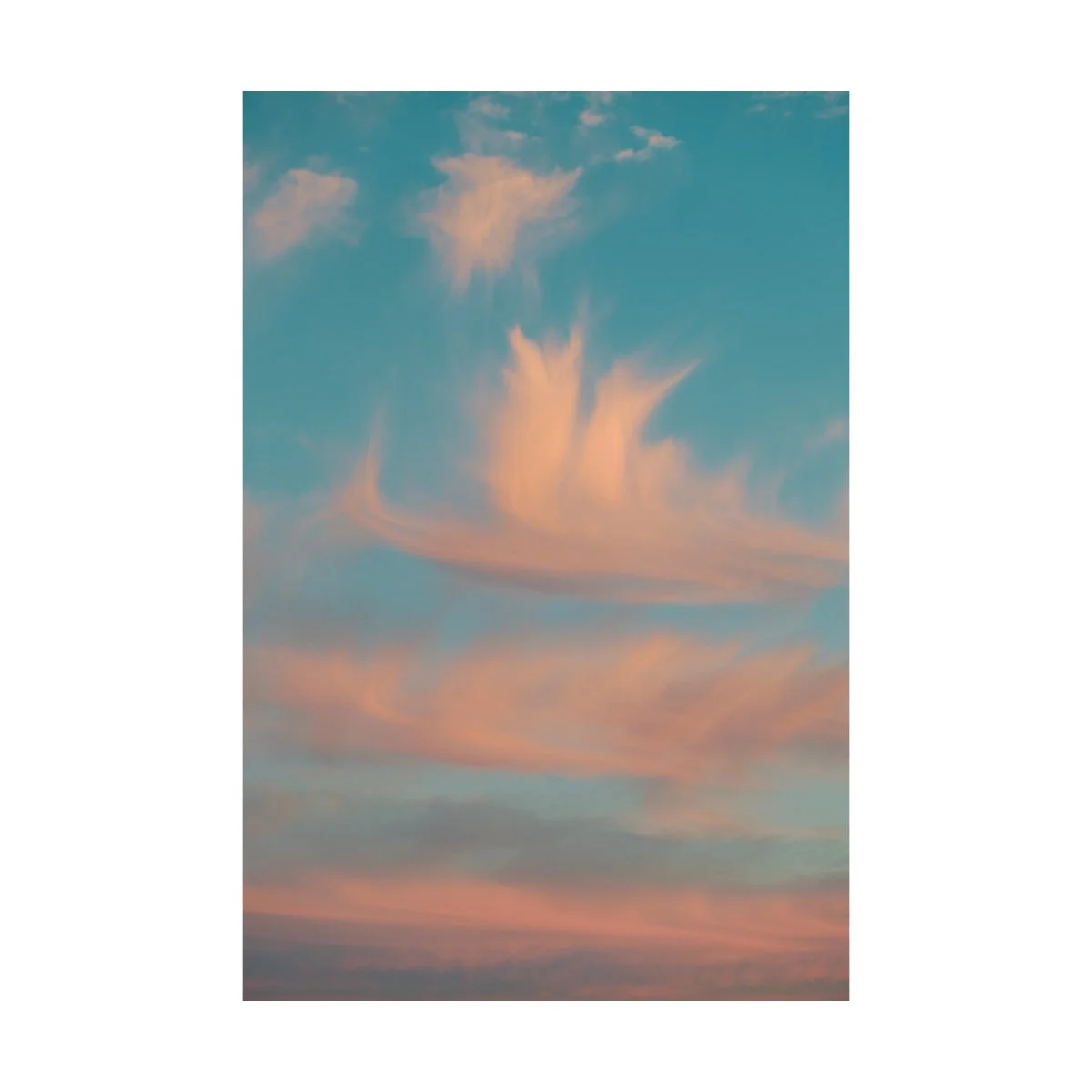
Second misconception: “This camera has ‘great colors’.”
A phrase that has never sat well with me, was the idea that a camera could have great color.
You’d hear people talk about it all the time, whether it’s Canon, Sony, or even Fuji, which I use.
People would say “Oh, but the colors that come from that camera are so good!”
As if it’s justification to use or stick with a certain brand.
Bullcrap.
Because…a camera can’t have color.
All a camera does is capture and record data from the real world.
The world is our source of color and the photos we take are proxies of that.
So if we’re taking a shot of the world that has “good color”, then that photo will have pretty good color no matter what we take it with.
Because the source of color is the most important thing.
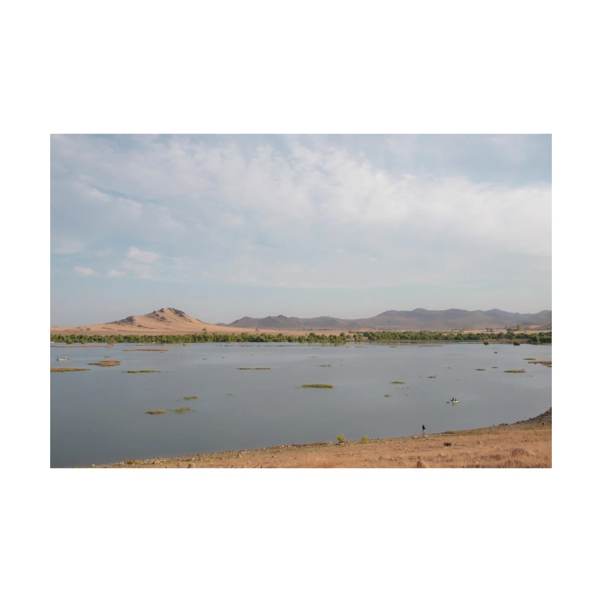
I remember one summer morning I was taking photos of a sunrise at a camping spot called Success Lake.
God-awful place - you do not want to go there, trust me.
I took photos both on a digital camera and a film camera, and these were the results.
Some editing was done of course, but in my opinion, both versions had pretty nice color.
Because the original source of the picture had good color.
So what it boils down to is which look you prefer.
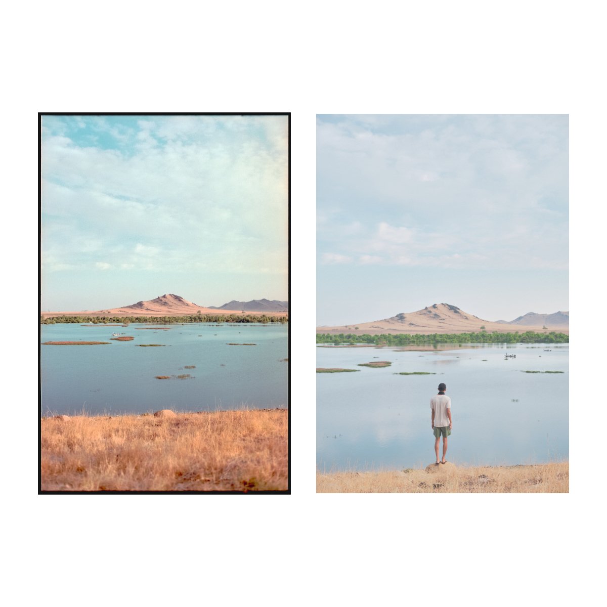
You might say that this camera “interprets color better”, but that’s just our subjective opinion.
You might say that that camera “captures more data”, but good color can come from an outdated camera.
And at the end of the day, you and I have both seen great photos with great colors from all brands of cameras.
Meaning all cameras have “great colors”.
So don’t worry about whether the camera you’re using has “better color” than that one, just use what you prefer and what looks good to you.
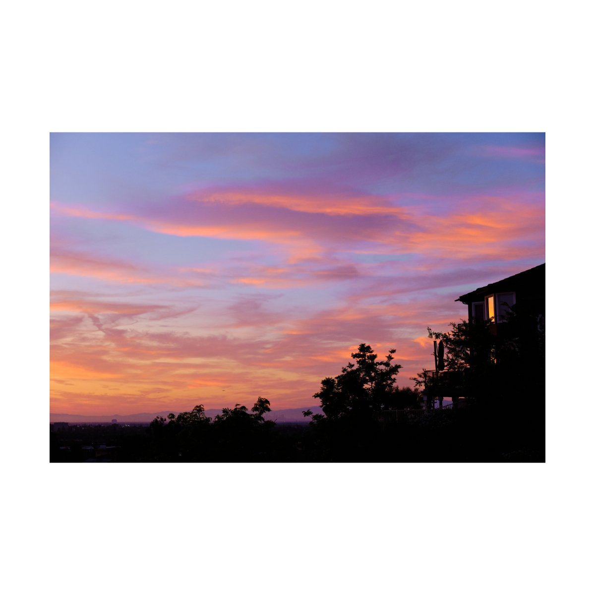
Third misconception: “Color is king.”
Many people overprioritize the importance of color.
Because, who doesn’t want photos with good color, right?
But at the end of the day, something we must understand is that color is actually not necessary to take a good photo.
Take all of the great 20th century black and white photos you may have seen before.
Many of them were shot without color and yet we’d still consider them great photos.
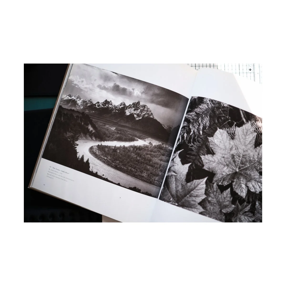
What does this mean?
This means that photography is more than color and color isn’t “king”.
And color is technically not necessary to take a great photo.
I know, I know, this may sound crazy to some.
In fact, color is actually lower on the priority list than many other things in photography.
We’ve simply come to think that color is more important than it is because of marketing and trends.
And if color isn’t necessary for a great photo, then it becomes more of a cherry on top, or the icing on the cake, rather than the cake itself.
Good color can make a good photo better, but a crappy photo will be crappy, even if it has good color.
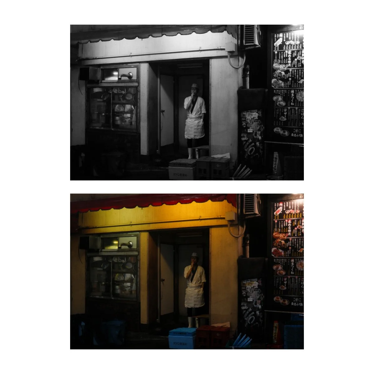
So as photographers who want to take photos with good color, how do we use this information?
Well, something practical and useful I like to tell myself is:
It’s not color first, it’s color second.
Instead of prioritizing good color, I’ll focus on the other aspects of photography that make for a great photo, and add color later.
The basics for example, like nailing exposure, composition, and framing, cannot be compensated for with good color.
And perhaps one of the most important parts of photography, is the moment.
If you capture a priceless moment, your photo will be good regardless of the color.
It’s then you can play around with, add, or remove color as you wish.
Ironically, you might see your photos, both color and black and white, improving because of this.
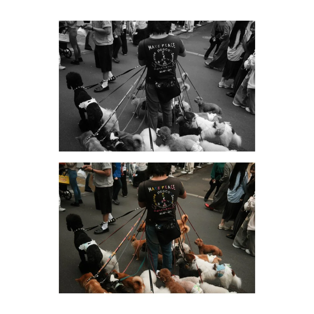
Some may argue that color is a subject, color can change the composition, and color will point you in different directions.
Which is fine, I don’t disagree.
I just think people get so caught up in color, they forget to focus on the more important basics.
Which is more of what their photography needs, and if they just did that, their photos would be way better with or without color.
So great Andre.
You’ve done all this talking about color, it’s misconceptions, telling us it’s less important than we think, etc.
But I still want pictures with good color.
So how do we do that?
Well, I’m glad you asked.
Because now that we’ve cleared up those things about color, we can finally get to finding color, using color, and speaking it’s language.
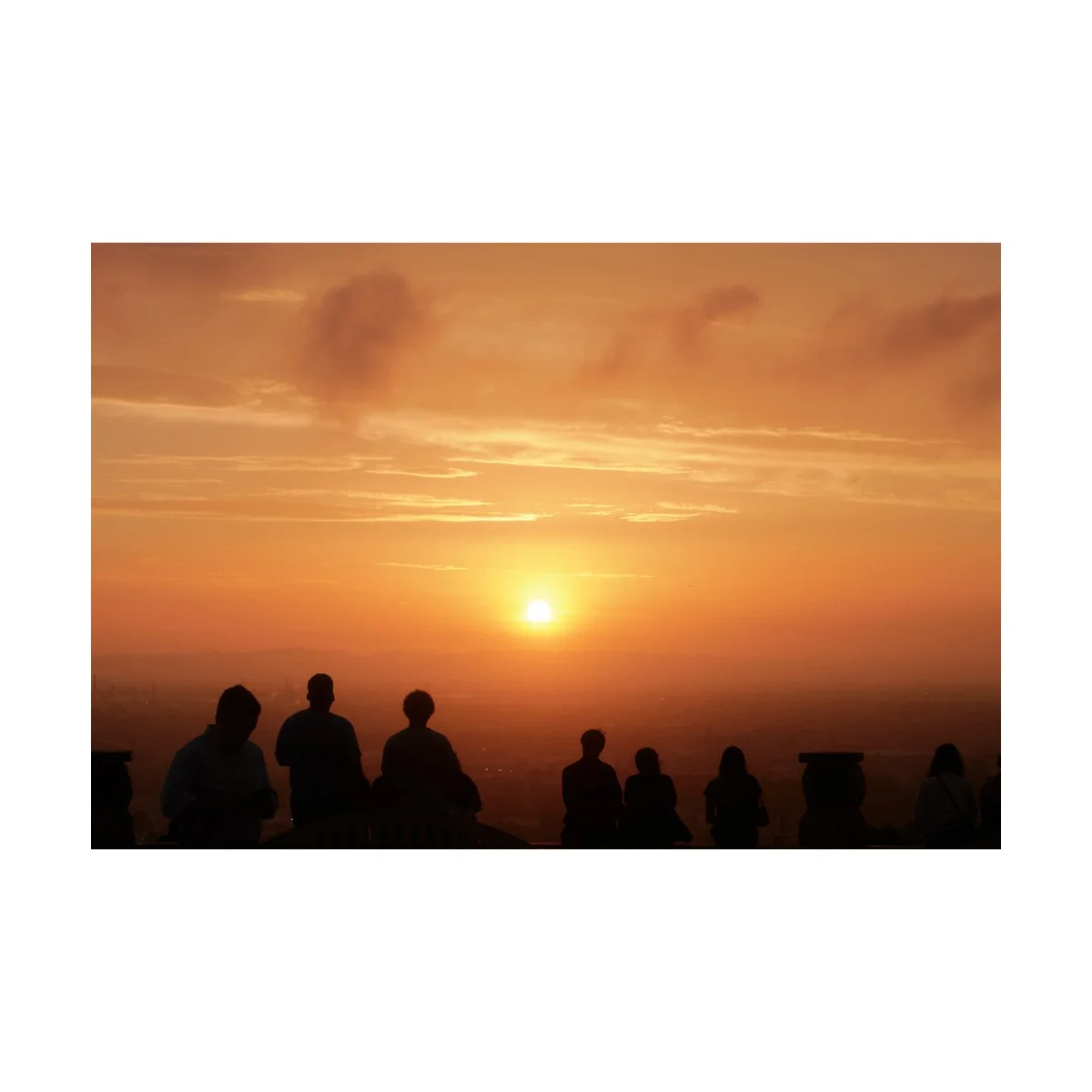
How to Speak the Language of Color
In a nutshell, basic color theory states:
Use color pairings or color emotions to signal or invoke that emotion in a viewer.
This can be done through things like complementary, analogous, or triadic colors.
Complementary colors are simply colors that are directly opposite to each other on the color wheel, like blue and orange.
Analogous colors are colors adjacent to each other on the color wheel, like yellow, orange, and red.
And triadic colors are three colors evenly spaced from one other on the color wheel, like green, orange, and purple.
Understanding what these are and how they can be used can be helpful when utilizing color.
However, there’s a big problem with standard color theory for candid photographers in particular.
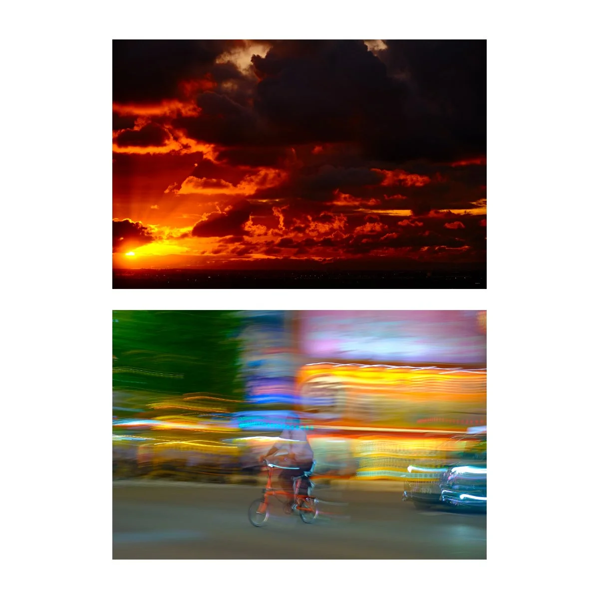
Hunting for Color
In candid photography, like street and travel, we must use what’s at our disposal.
There’s a lot going on in the world and many things are outside of our control.
Color is actually one of those things.
For example, we can’t pick and choose the color of a building or a car or a plant.
Those things are just what they are, and we can only really make use of them while they’re there.
Hence, lies the difficulty of color theory for candid photography.
Because even if we know that orange contrasts blue, how often will we actually see that combination out in the real world?
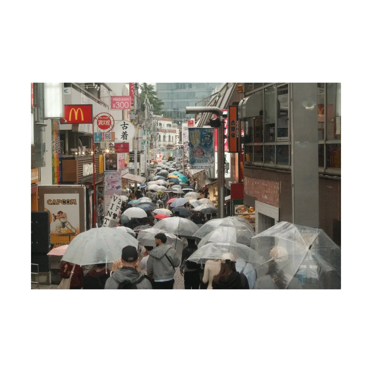
In fact, most of what we see in the real world are colors that don’t obey the standard rules of color theory.
Colors that aren’t complementary, analogous, or triadic make up 90% of the world.
Which means two things:
color theory is largely overrated for candid photographers
color becomes something we look for, but not overprioritize
Color then, becomes something we can hunt for and manipulate, but not create.
Color can be a subject, we can look for variations or interesting combinations and take photos of them.
And if you find something that obeys the rules of color theory, make use of it.
But if it doesn’t, because most of the real world doesn’t, we have to approach it differently.
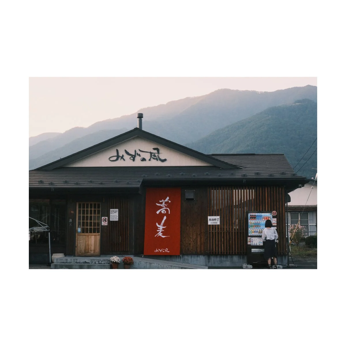
In these cases, I actually make it a point to ignore color and focus on moment and composition instead.
The assumption being:
This scene might not obey color theory or be what I’m looking for, but it’s still a good photo.
So I’m going to assume that whatever color is here right now is already exactly how it should be.
That within the infinite amount of color combinations, this here is one of them, and if something in nature exists, then it’s right, even if it doesn’t obey whatever “rule” out there.
Because color theory, at the end of the day, is a manmade conception.
Who’s to say that one color combination is better than the other?
Only we humans will.
But nature doesn’t care for that, it just is what it is.
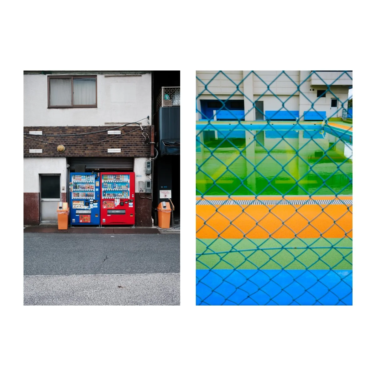
So if something exists out in the real world, I just assume that combination is already perfect as it is and take the photo.
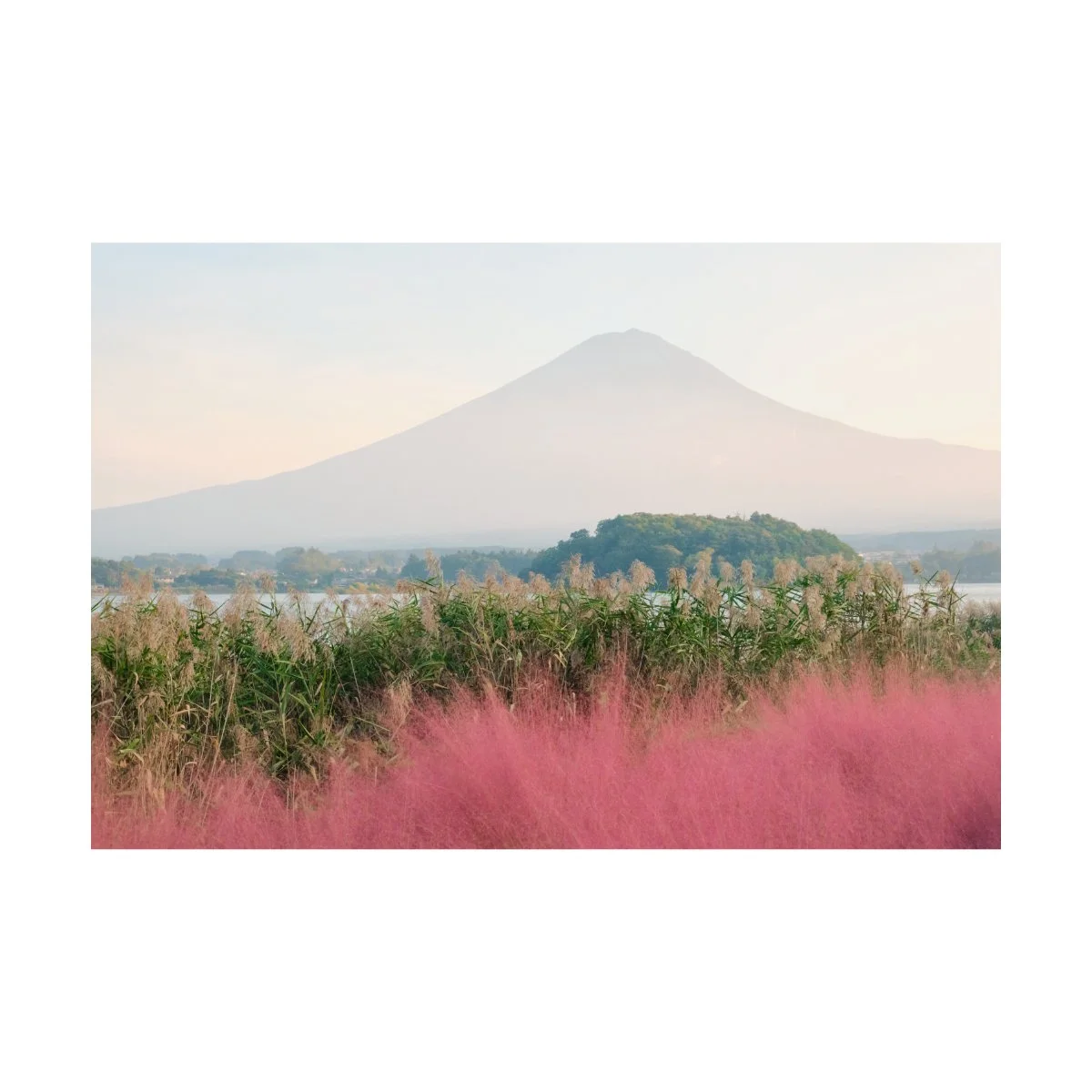
Green can go with pink, brown can go with blue, orange can go with grey, whatever.
All colors can go together.
It’s a simpler and easier way to make use of color, by letting the world speak for us.
It’s also a roundabout way to say:
F*ck it, just take pictures.
Now, if you do want to hunt for color more tactically, I’d recommend looking for color pairings in general, rather than one specific color pairing.
Don’t just look for blue and green, open the door for pink and green, red and green, etc.
Have your eyes open for many, because you never know what you might find.
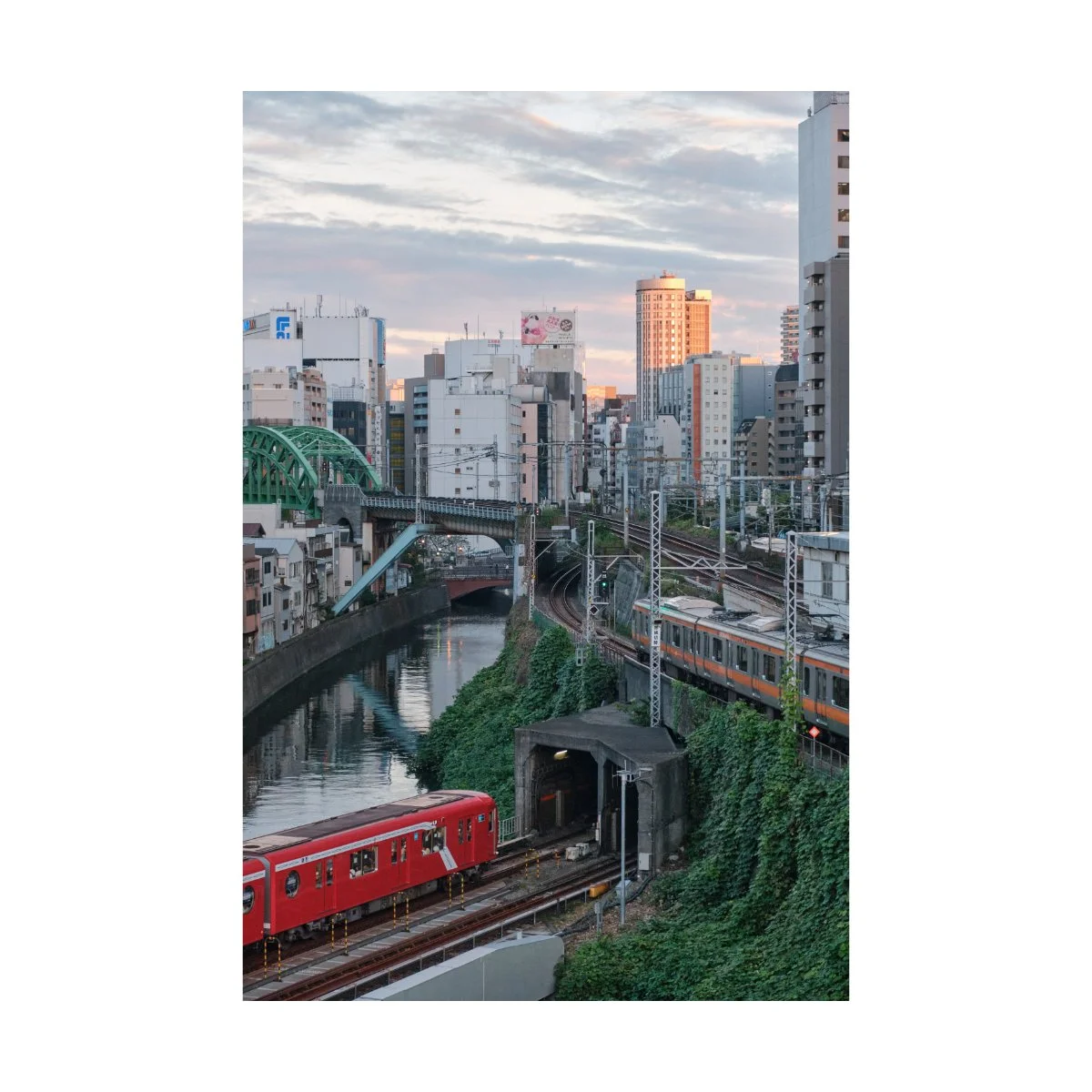
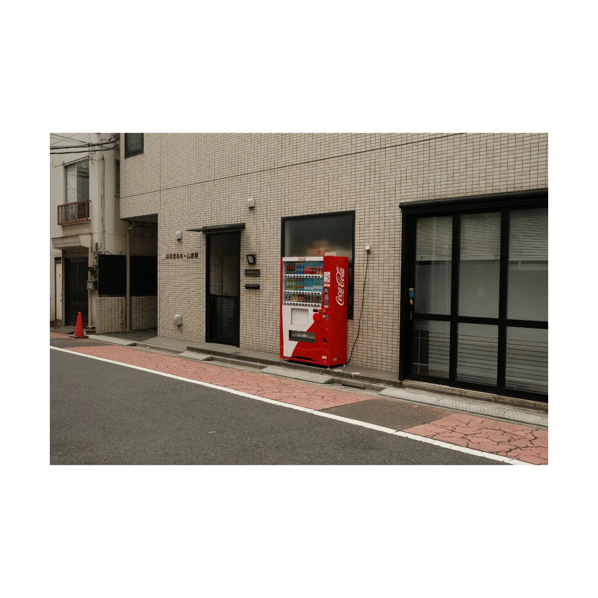
You can also try looking for colors that either stand out or contrast each other.
For example, a bright red, orange, or blue will be very noticeable.
So, if you pair a standout color with a flatter, basic, more neutral rest of the image, that’s an easy way to contrast one another.
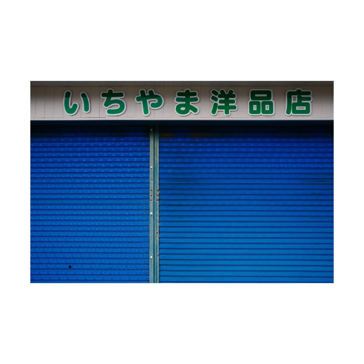
Similarly, you can try playing with the ratio of colors itself.
80% one color, 20% another.
60% one color, 40% another.
Or ratios of 3+ different colors.
All of these are examples of how you can hunt for and compose color without needing specific color pairings or color theory.
And it’s way easier and more practical.
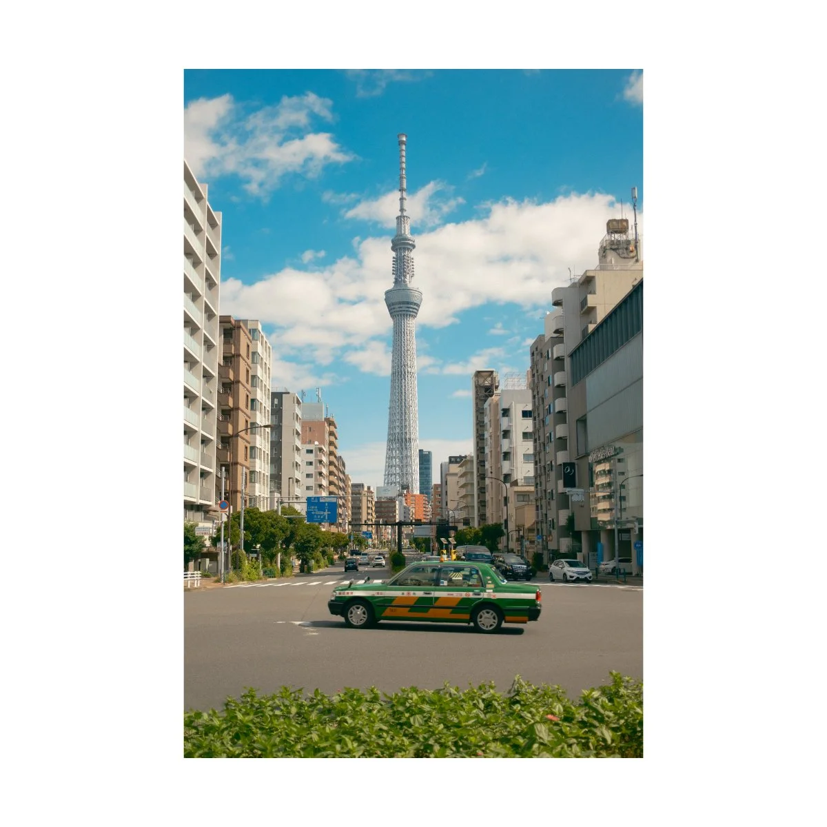
So hunt for color if you can - if you can’t, just take the picture anyways.
Again, sometimes you don’t need to know why, but if your brain says “this has nice color”, believe it.
Because if your brain recognizes it as a picture worth taking, then there’s something good there, even if you can’t explain it.
A lot of photography comes down to intuition, so like we mentioned earlier, we can use color without fully knowing why it works.
Take the shot, analyze it later - that’s the simple way.
Manipulating Color
So now, what about photo editing?
Not everyone edits, but editing is the primary way photographers can manipulate color to better speak it’s language.
The problem is when it gets out of hand.
Many photographers will attempt to use editing to bend the photo to their will and manipulate colors to obey the rules of color theory.
I personally have a different philosophy, and most of my editing is actually lies around exercising caution.
For example, yes you can technically hue shift your photo to oblivion and try and get some complementary colors working in there.
But you’ll quickly realize that for many photos, a drastic hue shift can look weird and unnatural.
And although you can do it, and it’ll oblige by the “rules”, many times you shouldn’t do it, especially if it doesn’t look good.
It’s there color theory can be wrong, and can actually look bad.
You see, color is one of the first things our eyes recognize.
We see the hue, feel the emotion, and do so at a moment’s notice.
But this applies for both good and bad colors.
If there’s bad or conflicting colors in our images, people will be able to feel that instantly, even if we have a good composition.
Color in this case becomes a double-edged sword.
Because if your photo has color, no matter what, it’ll affect your image.
Meaning if color isn’t helping, it could actually be hurting.
And bad color has the potential to ruin an image.
And we did so because of our shameless desire to “get good color”.
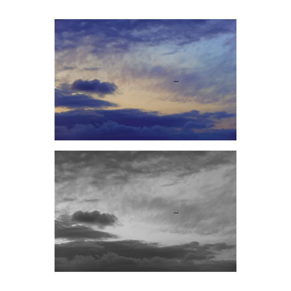
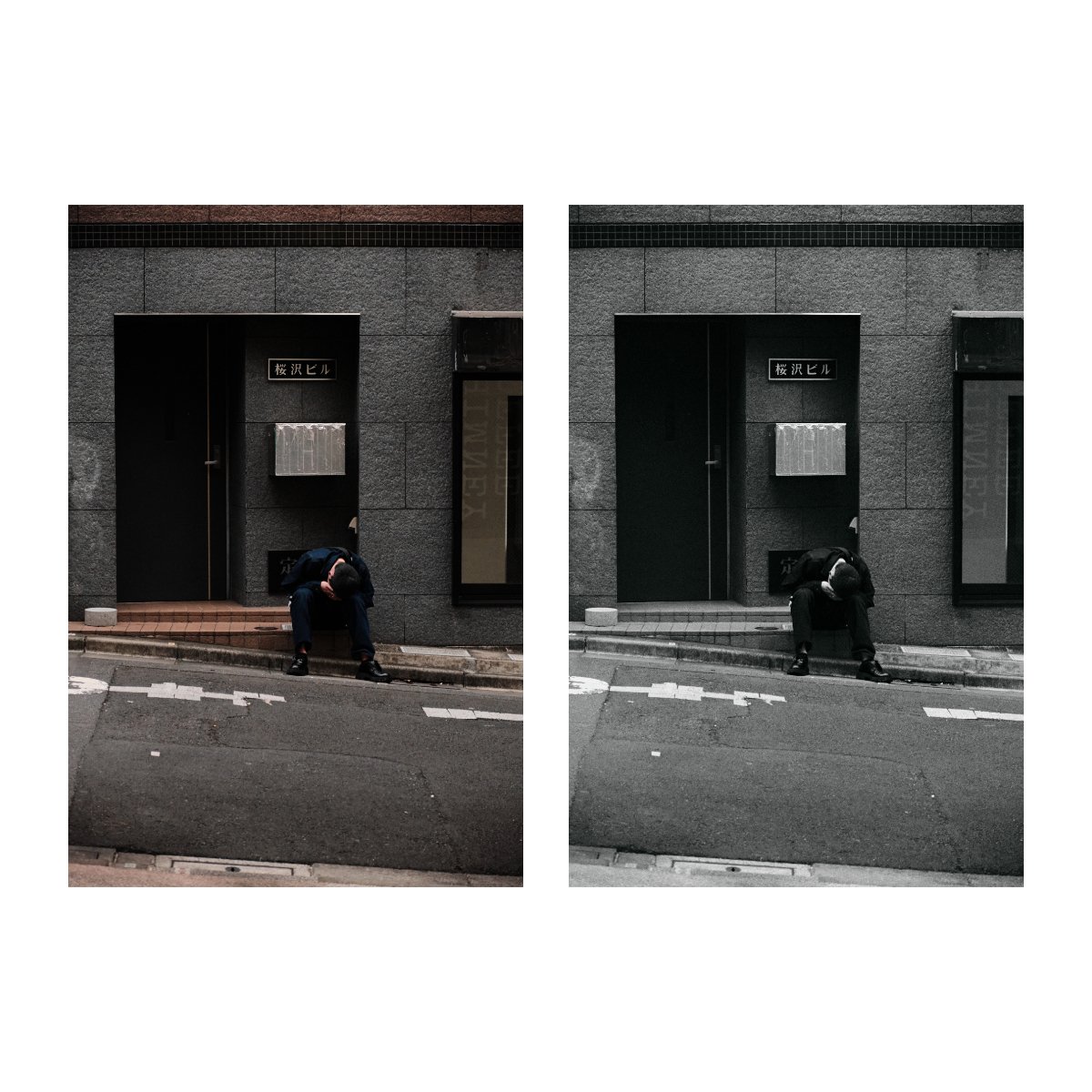
Therefore, many images are actually better off in black and white.
Black and white photos retain the moment, the essence of the photo, and still gets the point across without color.
And if there are certain colors getting in the way, black and white removes them completely.
Often times if I’m editing and find myself unable to work with the colors or make them look good, I’ll simply default to black and white.
It’s extremely useful, especially if the composition is good, but the colors are bad.
And it goes a long way to saving photos that would otherwise be discarded because of their “bad color”.
I know we want to get good color, but don’t underestimate the power of back and white photos.
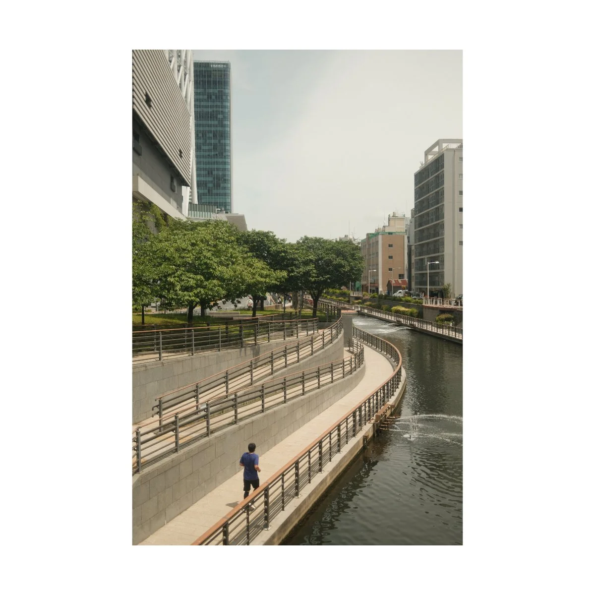
If you’re ever uncertain about if or how you should tweak a color, remember: less is more.
A lot of good color comes from not going too far.
In fact, good color can often be achieved by desaturation, not saturation.
So if there’s too much going on or something not working, try lowering one of your saturation sliders.
You can even use the blue or orange sliders to add or lower the warmth of the image selectively, rather than globally.
Something else I like to keep in mind when editing is to stay true to the original.
Sometimes there are too many things we want to do to an image that it clouds our vision of what should actually be done.
But if we pay attention and think back to the time we took the photo, we’ll realize a better edit comes from accentuating or bringing out what was captured at that time.
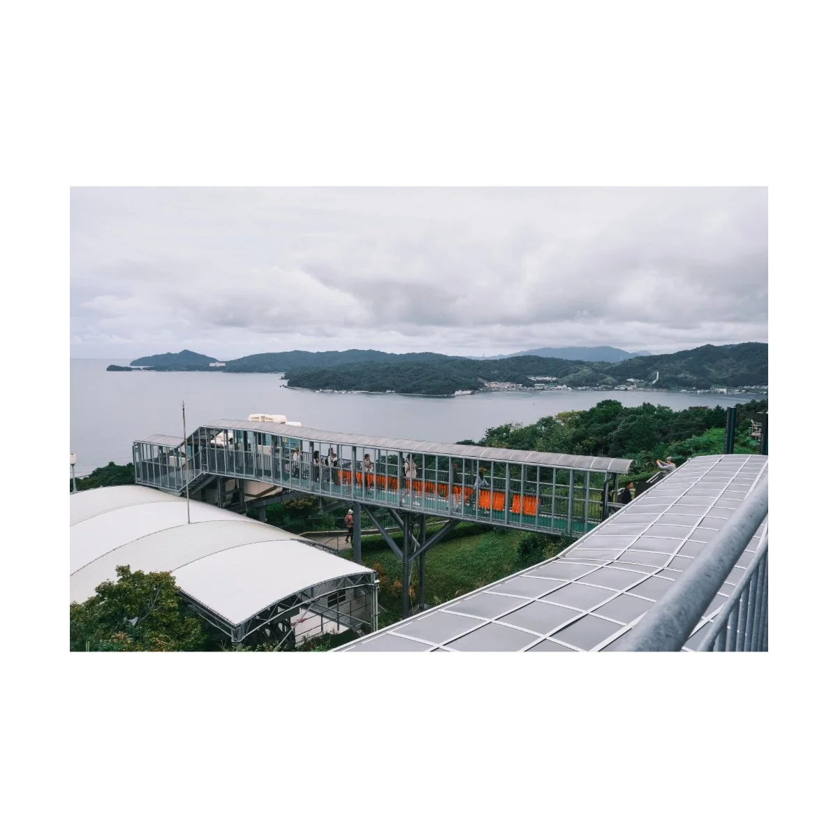
A cold frosty overcast day might not need the orange warmth you think it does.
But if you edit your colors to that feeling, the blues and greens can add to it, instead of take from it.
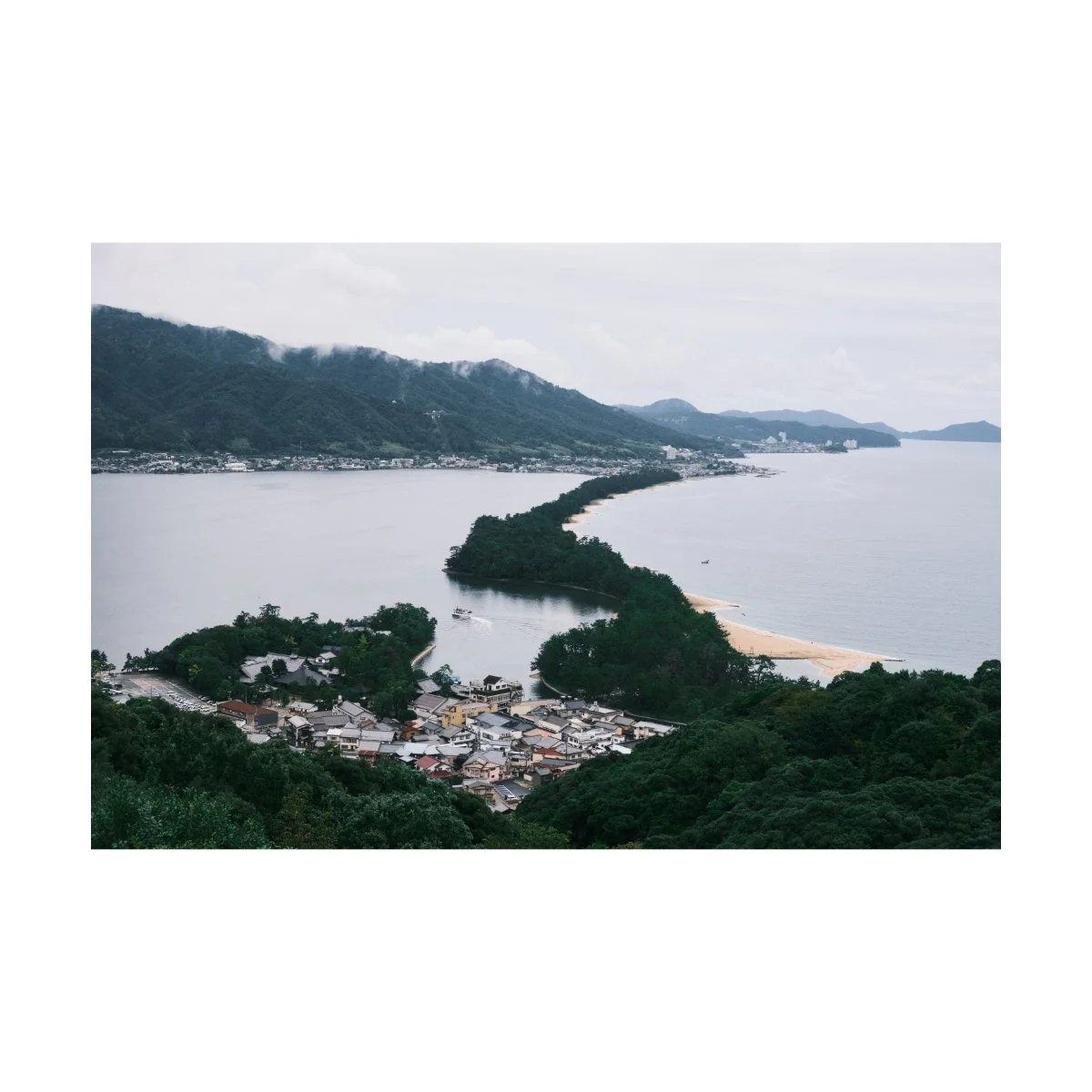
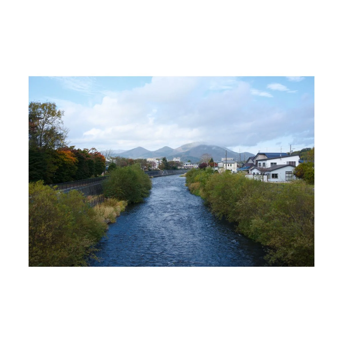
I did this with one of my favorite photos of Amanohashidate, in northern Kyoto.
The day we went was overcast and cloudy, so it didn’t make sense to edit the image with warmth.
But leaning into this, I could focus more on the rich green and blues of the shot, bring those out, and get a great result.
So try to edit with synergy in mind.
Think about what will look best for the photo, not what you want the photo to look like.
Because all the answers to the questions you have about color or tones are in the image itself.
You just need to look and pay attention.
The image will tell you what to do next, and if you get really good at picking up on that, you’ll have more edits that result in a natural good looking color.
That’s helped me get better color than trying to bend my image to any sort of color theory.
The Simple Language of Color
Based on everything we learned so far, what can we say about color?
Well, now we know that color theory isn’t always necessary, because we can see and utilize color even without fully understanding why.
We also know that color doesn’t replace moment, and what we’re actually taking a picture of is often times more important for a “good photo”.
And finally, color is a double edged sword, meaning it isn’t always a good thing and can sometimes make our images worse.
To speak the language of color then means working around these limitations.
Searching for and using color if we can, but not prioritizing it higher than other more important photography basics.
And also recognizing that every color combination has it’s place, and can work, we just might not know how yet.
Color theory is important, but don’t overthink it.
As long as you’re able to see, your brain will recognize and tell you when it finds something interesting.
And a lot of photography comes down to intuition.
Don’t believe the photographers that say they do everything on purpose.
Because a lot of photography is more accidental than we’d like to admit.
Learn to build and trust your meter for recognizing a good shot, with or without color, and follow that.
You don’t need to know why, you can analyze that later.
Your job is just to press the shutter.
The same goes for the editing room.
Experience will tell you whether something works or not, looks good or not, and you can always fix it later.
But don’t try to make every photo look a certain way because some photographer said or does so.
Learn to read the image and edit based on that, even if it breaks some “rules”.
The real world already has the language of color speaking for you.
You’re just the messenger, the translator, the guide.
The better you’re able to translate what you see, the more others will understand what’s being said.
It might sound anticlimactic to say, but that’s the simple but effective way I find works for most people.
That’s photography (and color) in a nutshell.
So that’s as best as I can express it currently, how I understand and use color.
If you have more tactical ways that have worked for you (that I’m sure there are), please share them in the YouTube comment section.
If you want to learn more, build the basics, and improve your photography, check out Photography Essentials (it’s free) or Photography Systems.
Thanks for reading, happy shooting.