I Tried the Internet’s Most Popular Fujifilm Recipe
Like many of you, one of the reasons I started shooting Fujifilm was because of the Film Simulation Recipes.
It was cool that we could tweak settings and emulate unique or classic looks, like old film stocks from back in the day.
I had my fun doing so, but several years ago stopped seriously using them.
Instead I shot mainly RAWs, using the JPEGs to experiment, try out looks, or compose better.
This was because, although recipes are fun, they have a bit of a double-edge to them.
Some highly rated recipes (I won’t name names) looked good in the right conditions, but not so good in others.
So it was easier to just stick to a base film simulation or edit on my own, so I could learn more without bleaching my images.
Similarly, there was no all purpose, set it and forget it, always looked good color recipe.
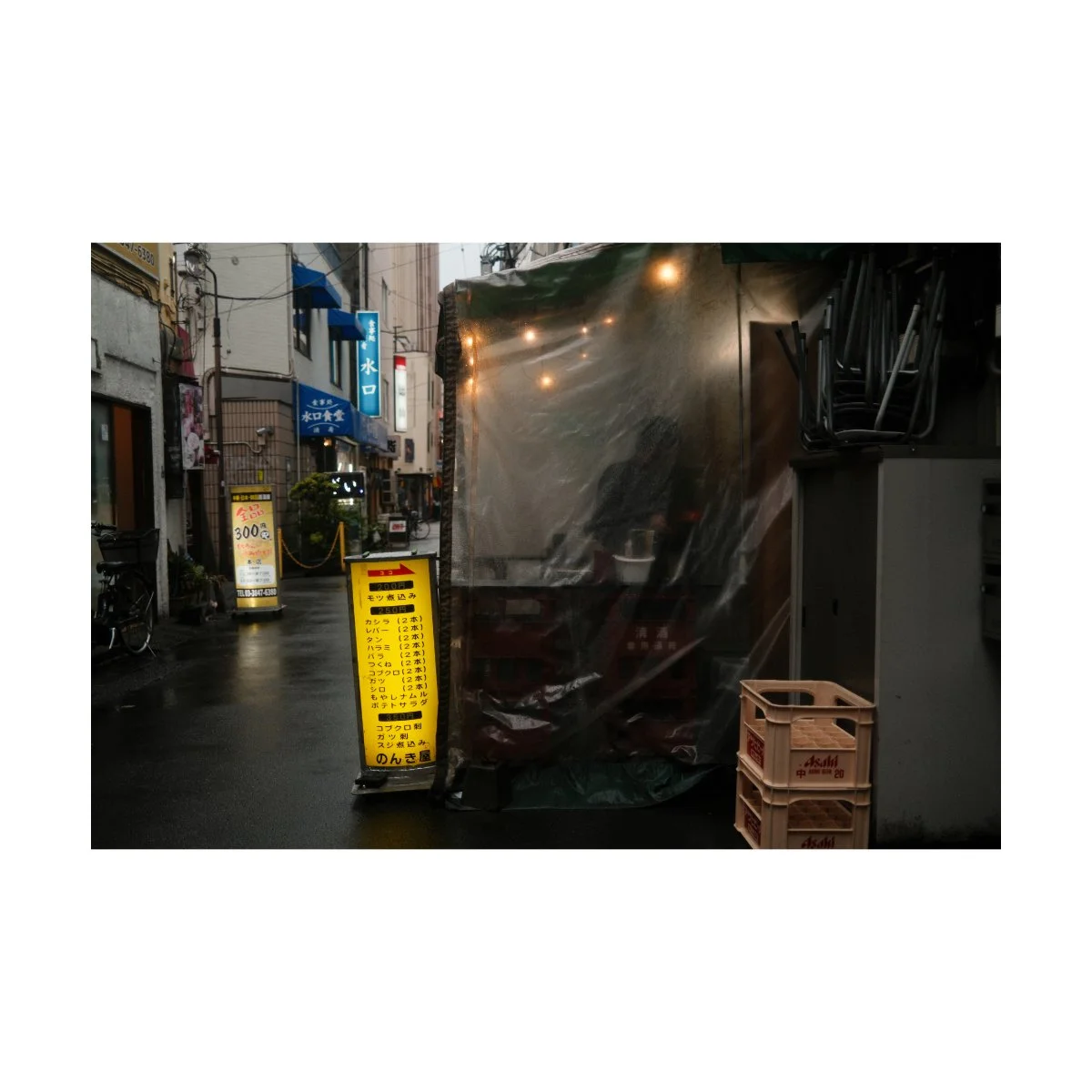
But lately, there’s a Film Simulation Recipe that’s been getting a lot of hype.
It’s touted as the most “versatile film simulation recipe” as well as the most popular one currently.
You’ve probably already heard about it: yes, it’s Reggie’s Portra.
Initially I looked at this recipe with skepticism, but for the past few months have been trying it out, and the things I’ve learned from using it surprised me, and have even changed my entire workflow.
Today, I’ll share my full thoughts on this recipe.
Disclaimer:
Some of the photos shown will be SOOC (straight out of camera), others with slight adjustments in Lightroom, which we’ll talk about in a bit.
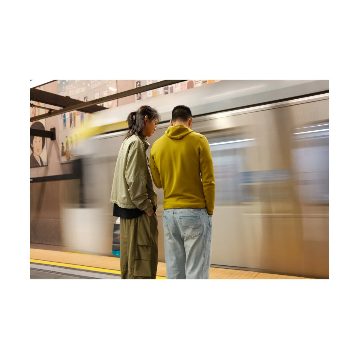
Reggie’s Portra Film Simulation Recipe:
Film Simulation: Classic Chrome
Dynamic Range: DR-Auto
Highlight: -1
Shadow: -1
Color: +2
Noise Reduction: -4
Sharpening: -2
Clarity: 0
Grain Effect: Weak, Small
Color Chrome Effect: Strong
Color Chrome Effect Blue: Weak
White Balance: Auto, +2 Red, -4 Blue
Exposure Mode: Manual
What Makes Reggie’s Portra Work
The issue with many color film simulation recipes are the strong characteristics they come with.
Because things like white balance tints are so integral to how a recipe looks, changing that is in essence, “bleaching the image”.
And when you bleach an image, sometimes it looks good, sometimes it doesn’t.
You could try more minimal adjustments, but then you’ll get less of a “look”, and shooting in a normal film simulation could be preferable.
So recipes are kind of like double-edged swords - great when they work, not so great when they don’t.
Shooting with one becomes more about picking the right one for the right situation rather than set it and forget it.
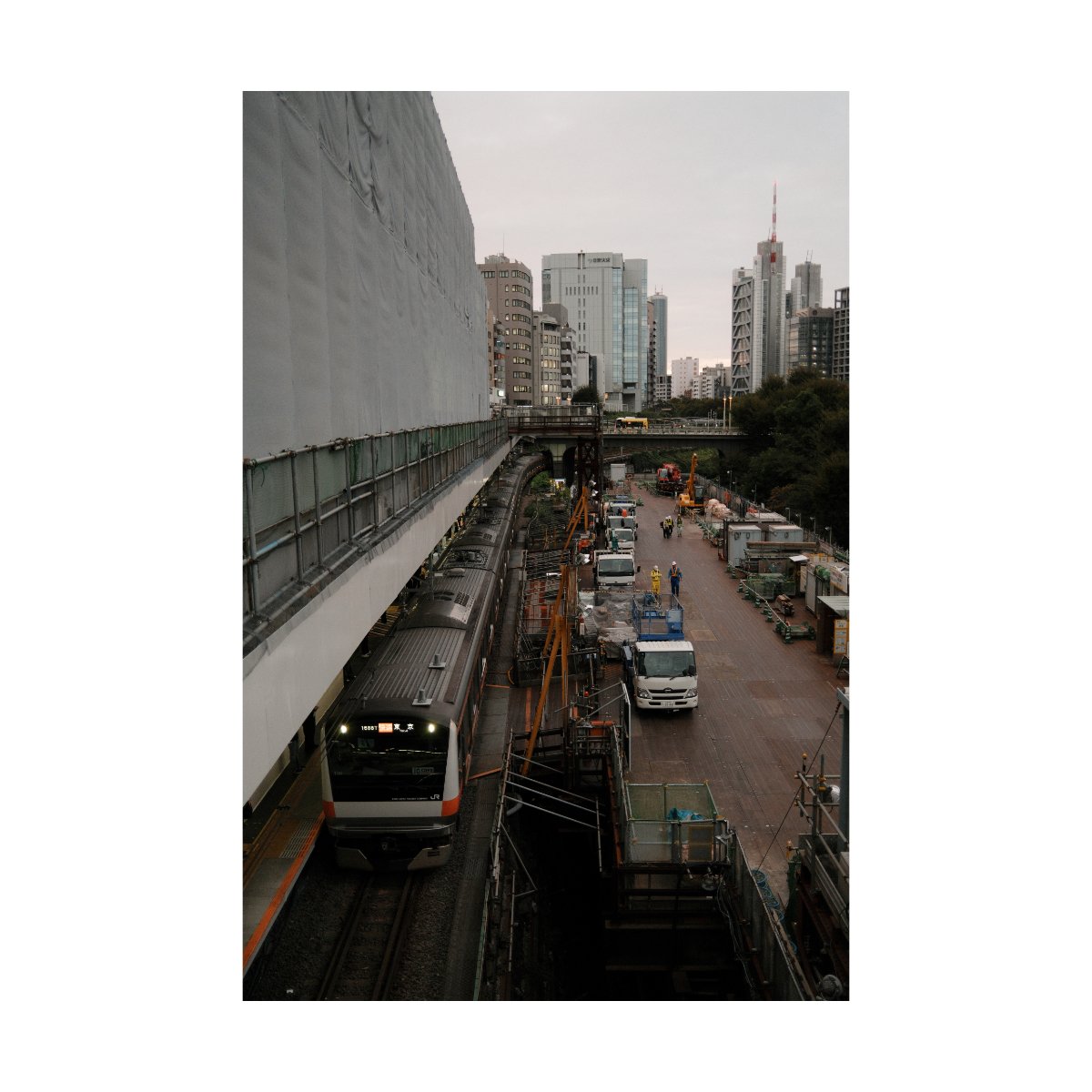
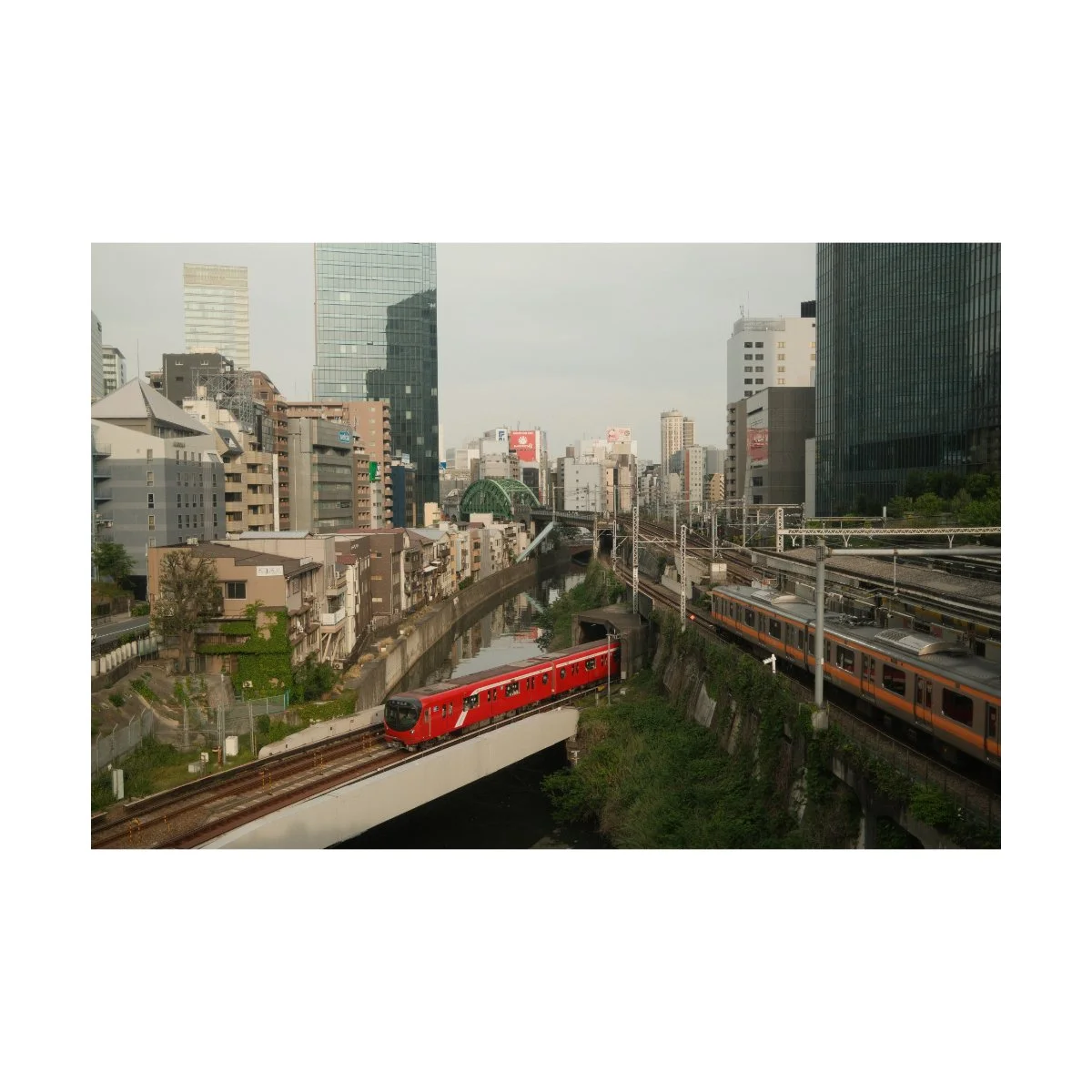
Reggie’s Portra however, does a great job at giving your images a subtle character or look, whilst being usable in most scenarios.
I’ve yet to find a time of day where the recipe doesn’t look good, and that’s quite surprising to me.
Of course there are certain scenes that will look better in other recipes or with other edits, but for the most part, shooting in Reggie’s Portra won’t make it look “bad”.
For example, take these shots I took down the street of the Senso-ji Temple.
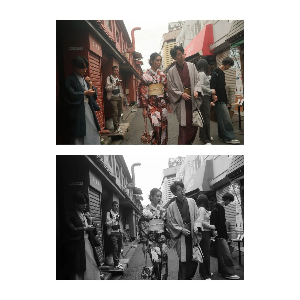
Many of these shots look pretty good in Reggie’s Portra, but I opted to edit them in black and white, because I felt like the look matched the type of image more.
It doesn’t mean Reggie’s Portra looked bad, some may prefer it, just that there was a better look for this specific situation.
So for the most, Reggie’s Portra does live up to it’s name as the most versatile film simulation.
But why?
What makes Reggie’s Portra different or better than the other recipes?
I’m not a color scientist, but I’ll tell you why I think it works.
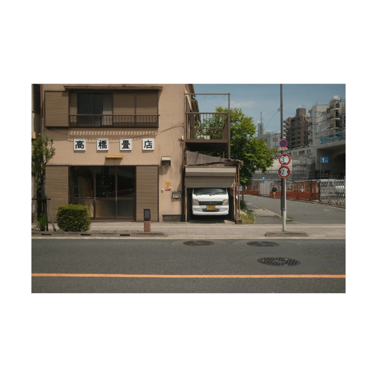
First off, Reggie’s Portra is built off of Classic Chrome.
Classic Chrome is perhaps my favorite film simulation, I think it looks great for both street and everyday photography.
However, there are some issues with Classic Chrome that has given me trouble in the past.
Sometimes skin tones don’t look the best because they sway to the pinks, white balance can lean to the cool side, and colors can be a little difficult to bring out.
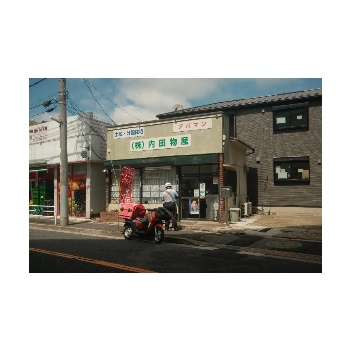
What Reggie’s Portra does, which I think compensates for this, is the white balance.
If you look at the recipe you’ll see there’s +2 Red and -4 Blue.
What this does is shift the white balance spectrum to the orange-green side, giving your images a warmer look.
I think this makes skin tones look a lot better, sunny days look nicer (because of the warmth), and even gives buildings a nicer shade of brown.
It’s the right compensation for a film simulation like Classic Chrome, and something I’d often do in my own photo edits already.
Plus it does so without overdoing it like some other recipes that blast the kelvin.
There’s also a +2 to color which I feel like helps with the mutedness of Classic Chrome.
Whether these adjustments look good or not depends on your taste, but I quite like it.
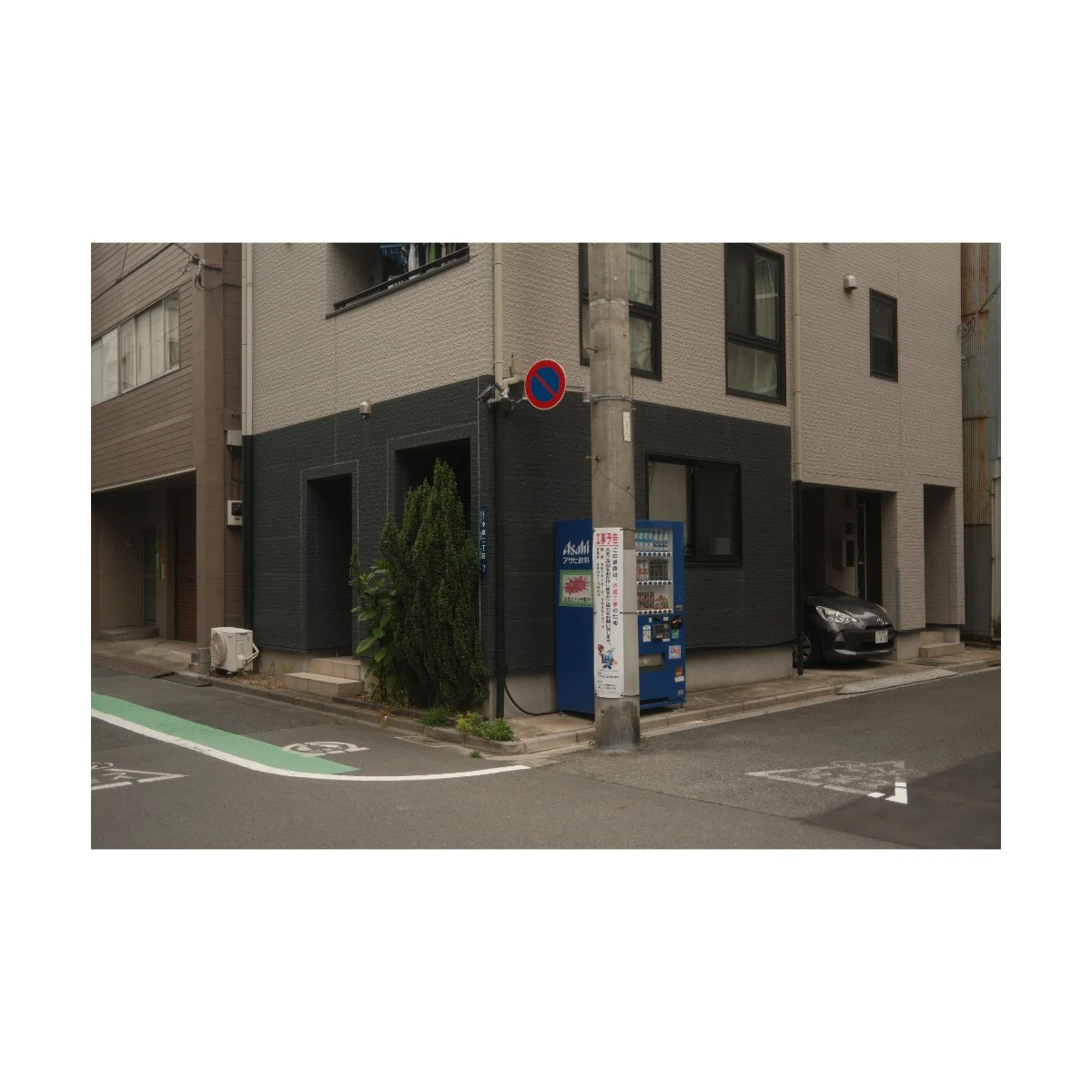
The reason why these adjustments work is because they’re subtle and effective.
Unlike other film simulation recipes that try too hard to get a “look”, Reggie’s Portra does less but in the right places.
I think that’s important to keep in mind when photo editing as well - it’s not how much you do, it’s about what you’re adjusting.
Tweak the right things and you won’t have to tweak as much to get it to look good.
Now although Reggie’s Portra has been great so far, no film simulation is perfect.
For me, there are a few things I like to do both in-post and while I’m shooting that I think makes the recipe look better.
Let’s talk about that.
Adjustments to Reggie’s Portra
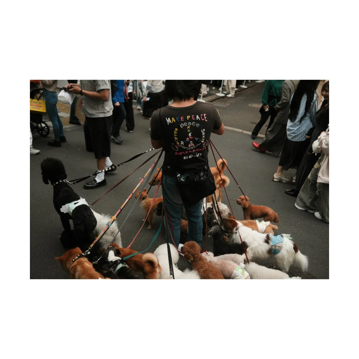
In general, the look of Reggie’s Portra is very solid - I’d say 80-90% of the shots I take with it look fine SOOC, no adjustments needed.
That being said there are some adjustments I like to make that I think make the look more complete, or at least to my tastes.
The first would be clarity.
Clarity is an adjustment often used to add or lower pop and intensity to your image.
Personally, I’ll add some clarity when I want an image to become a bit stronger or “hyper-real”, and I’ll remove some clarity if I want it to look softer.
“Softness” can add a nice touch of nostalgia and make your photos look more natural or less HDR.
There are many ways to adjust clarity, the first being a diffusion filter.
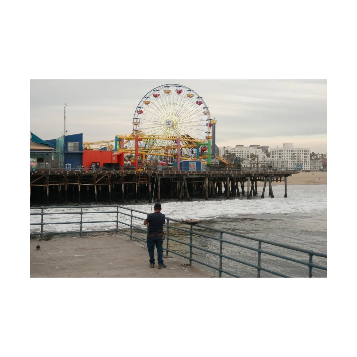
In his article, Reggie recommends using a Cinebloom filter (a Moment branded diffusion filter) instead of lowering the clarity in-camera, because that can slow the camera’s processing speed down.
I personally do the same with a 10% Cinebloom filter, and I think the shots look better that way.
And I know, diffusion filters aren’t exactly the same as an in-camera clarity adjustment, but they have a similar effect on your image and most people won’t be able to tell the difference.
If you don’t have a diffusion filter you can add a -1 or -2 to the clarity in-camera or simply adjust the slider in Lightroom to the left, both work.
Adjusting the clarity with a diffusion filter, in-camera adjustment, or in-post can help complete the look of Reggie’s Portra by balancing the warmer tones and soft color with a tiny bit of bloom.
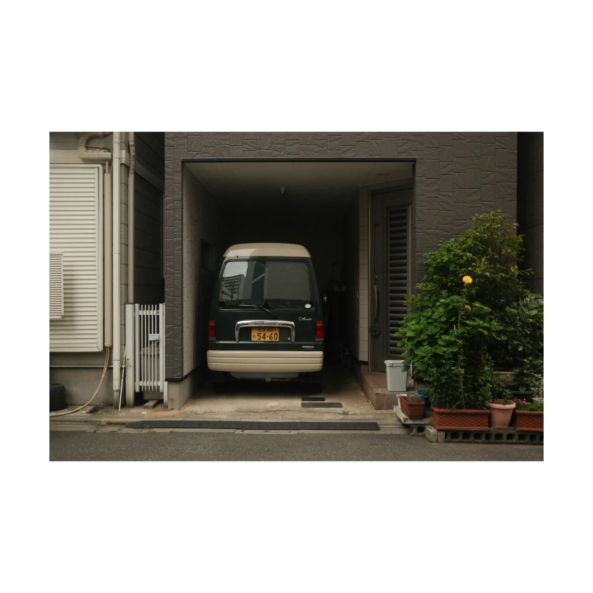
In addition to clarity there are some more Lightroom adjustments I like to do to complete this look.
This is based on my personal taste and preferences, so they’re optional, but I’ll share them with you.
Lately I’ve been editing many of the SOOC JPEGs instead of RAWs because they’re quicker and the difference isn’t very noticeable.
I know, this used to be sacrilegious to me too, but it works.
It’s much harder to get the same look when starting with a RAW base, so as long as the final output looks good, that’s my priority.
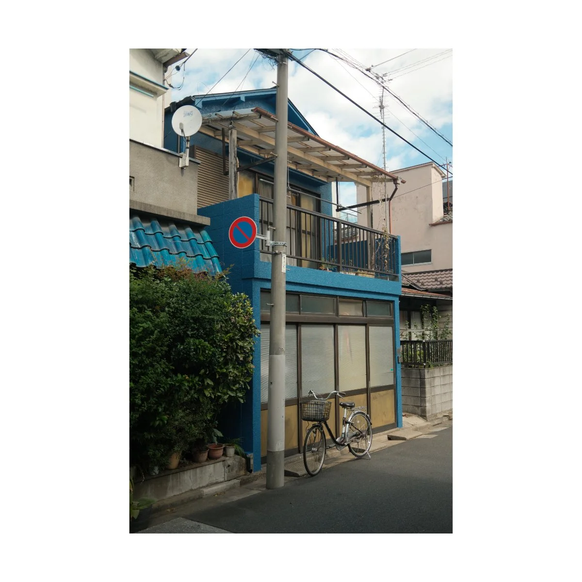
Given what we mentioned earlier, the main characteristics of Reggie’s Portra are a warmer image (primarily orange-green), slightly muted tones, added color, and clarity softness.
We won’t talk about the color chrome, noise reduction, sharpness, and grain today.
These do affect the image but are more on the detailed side of things.
Taking this into account, in my experience, sometimes Reggie’s Portra can look a bit flat or weak on the look.
These are good things, for reasons we mentioned earlier, but a slight adjustment in-post can give you a better result in situations where you want it.
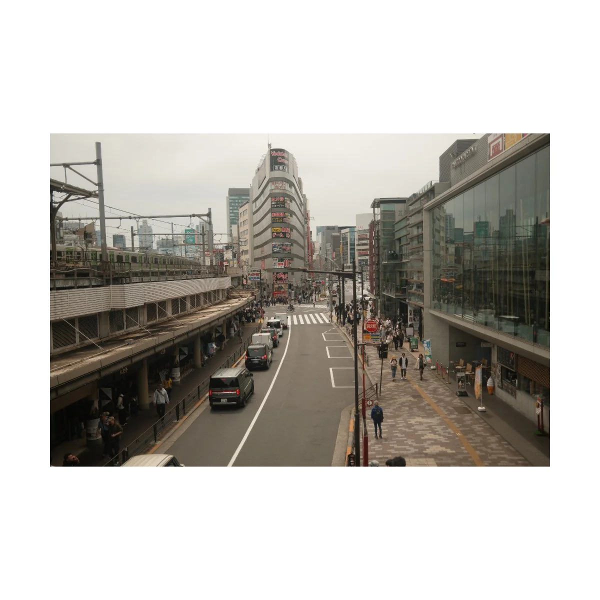
For example, some of these shots I took around the Shibuya Station in Tokyo, felt like they needed more oomph.
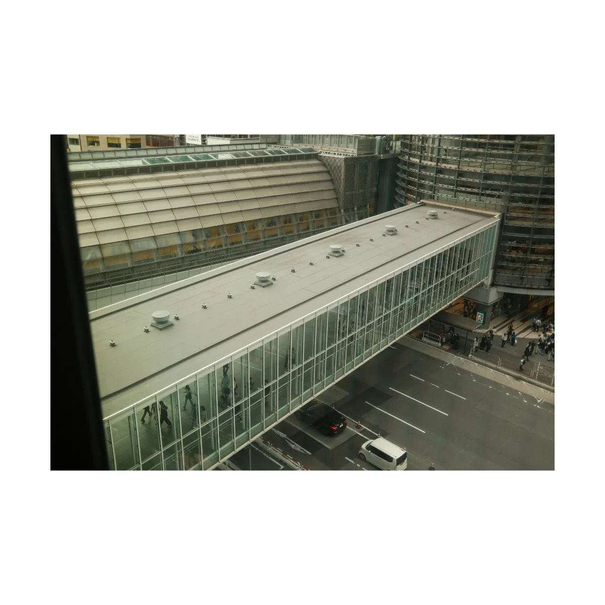
So, in situations like these, where I want to bring out Reggie’s Portra more, I’ll start by adding some orange to the white balance, usually +3 to +5.
If the image permits (meaning it looks good), I’ll also do a -3 on the green/magenta slider.
I think an orange-green look in general has a timelessness to it that I like in many of my edits.
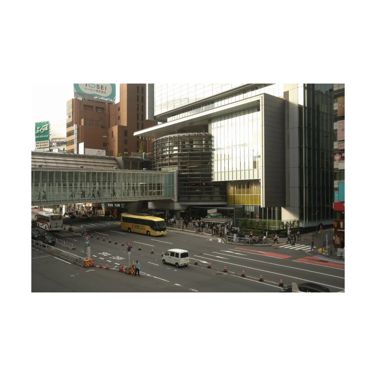
Now what you may notice is that when editing JPEGs, adjusting the white balance can adjust the exposure as well, visually.
To compensate for this, I’ll typically lower the exposure by a tick or two, -.1 to -.2 on an evenly exposed image.
Sometimes I’ll also add a bit of contrast (+5) to even things out.
This is just to deepen the shadows because Reggie’s Portra can occasionally feel a bit lifted.
Again, these are adjustments based on my personal preferences, if you don’t like the look, stick to the typical Reggie’s Portra.
I will however be trying these adjustments in-camera to see if I can polish the look up to my tastes, and I’ll update you guys in the future.
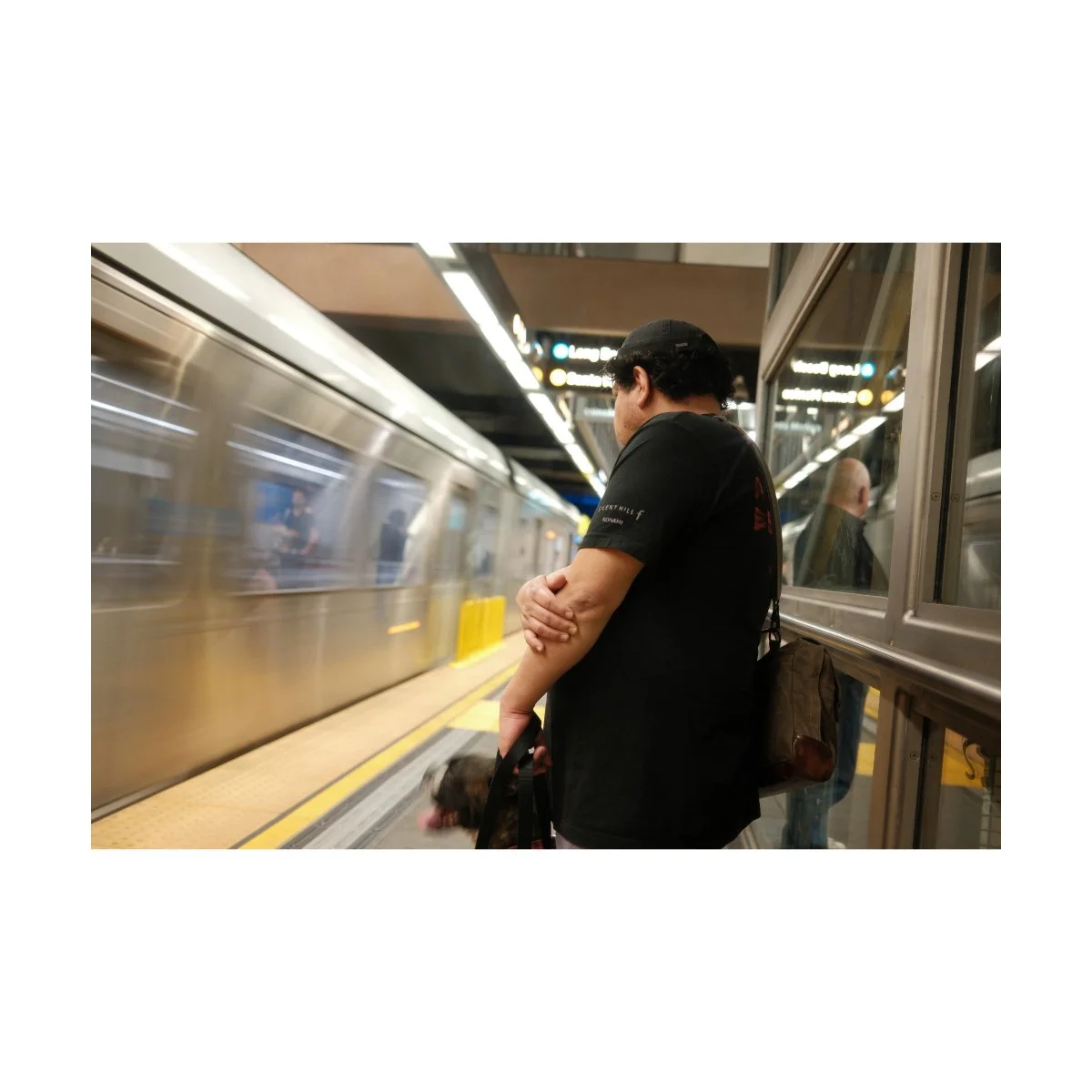
All in all, although a few parts of this article may seem critical, I actually like Reggie’s Portra a lot.
I just nitpick because I’m aiming for something specific, and you kind of have to if you want to understand something better.
But overall, using Reggie’s Portra has been a similar experience to using Newspaper, my favorite black and white recipe.
It gives me a result I’m more than happy with, where many times I prefer the SOOC look, without having to photo edit.
It encompasses a look I’ve been trying to get for my own Classic Chrome images for a long long time, but could never figure out and had to do in-post.
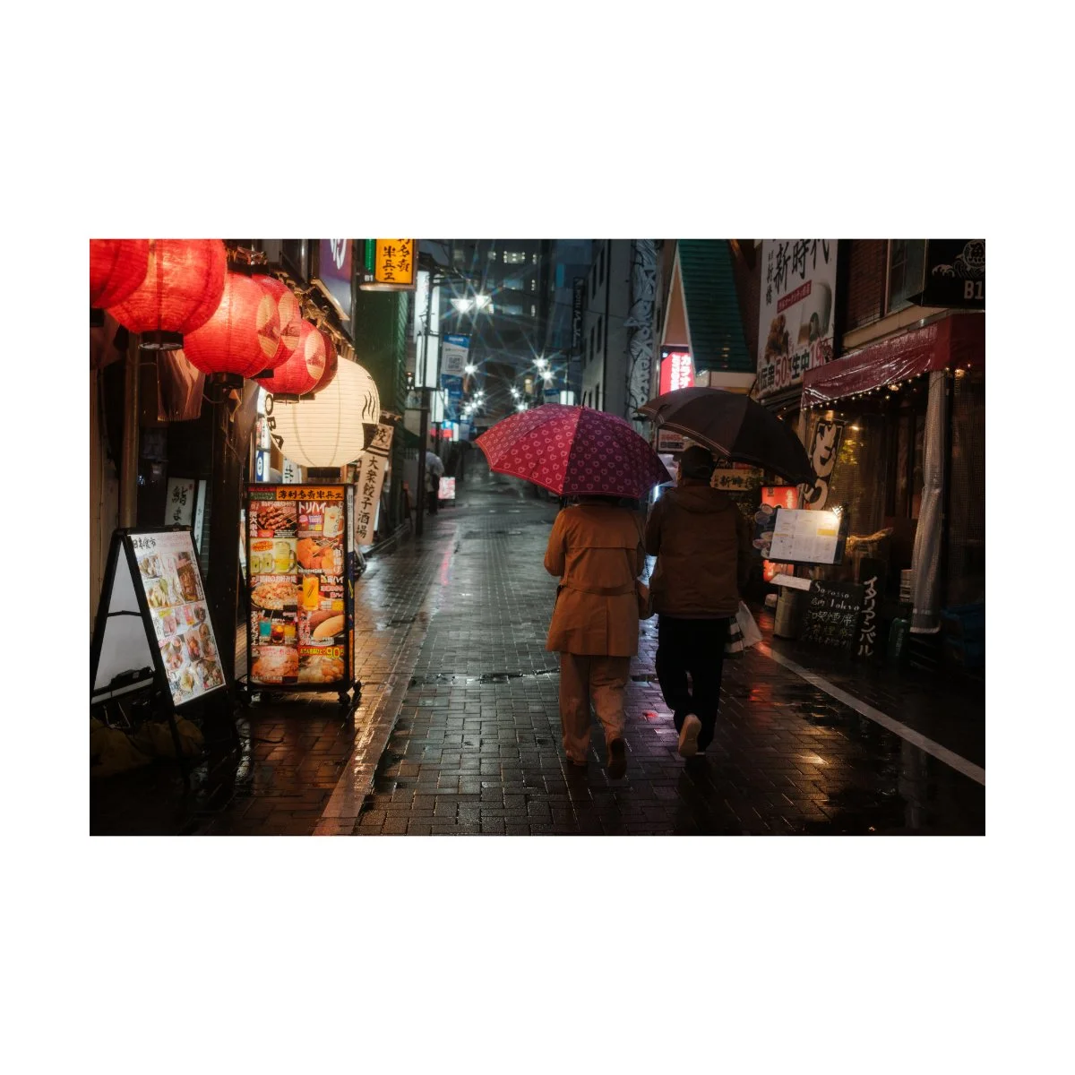
In fact, the usefulness of Reggie’s Portra has changed my workflow entirely.
Because I can get a near complete image, looking how I want it to without editing, or with minimal editing, it speeds up the entire process.
I simply approve and export photos, straightening things out or adjusting as I see fit.
And I keep the RAWs for backup, or if the image demands a different aesthetic.
Getting through a folder of a trip with more than 1500 images is so much faster now.
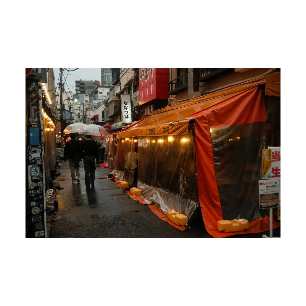
The look itself works great as an all purpose SOOC color recipe, and I can safely recommend it to those who only want to shoot JPEG.
Of course I’d still recommend everyone learn the basics of photo editing.
It’s not that hard, it’ll give you clarity on what you’re doing, what adjustments you’re actually making, and why certain looks aren’t working.
But if you want a set it and forget it recipe, SOOC, you can’t go wrong with this one.
It truly does live up to it’s reputation, and is probably one of the better, if not best color recipes I’ve used.
Thank you to Reggie for making this recipe, stay tuned for an updated video if my adjustments work out, and if you enjoyed this article share this with a friend.
You can also learn more about improving your photography in Photography Systems - check it out today.
Thanks for reading, happy shooting.