Ranking the Best and Worst Fujifilm Film Simulations (My 2026 Tier List)
Today, I’m going to rank every single Fujifilm film simulation based on what I think from my own experiences.
Disclaimer: this list will be highly subjective, and it’s just my personal opinions - yours will likely vary.
We’ll go in a random order, ranking each film simulation from A to C.
Build your list alongside me, and let’s see how they compare after.
Let’s begin.
P.S. If you want a full breakdown of every Fujifilm film simulation, check out Your Complete Guide to Every Fujifilm Film Simulation (2025).
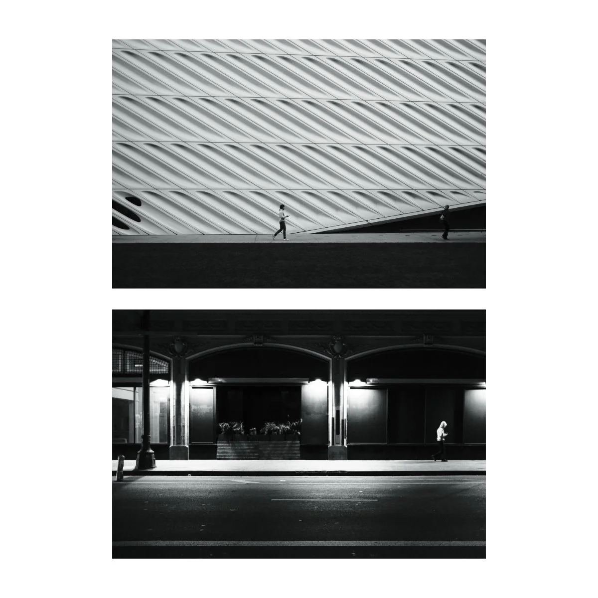
Classic Negative
This is probably one of my top most used film simulations.
I like it because the look is very unique and standout - and not in a bad way.
Personally, I like the tones, it’s got a very strong contrast, the greens have a nice hue to them, and browns and reds look nice as well.
From A to C, I’d probably give Classic Negative an A.
I definitely recommend trying it out.
Eterna Bleach Bypass
Eterna Bleach Bypass is one of those interesting film simulations I’ve never quite gotten a handle on.
To me, it looks like a washed out Classic Negative or a slightly colorful Monochrome.
It’s an interesting film simulation, although I can’t honestly say I like it that much.
Most of the times I’ll default to something else because the look doesn’t suit most situations.
There are people that like it though.
I’m giving it a C.
Pro Negative
Pro Negative is a film simulation I’ve been slowly warming up to.
Due to it’s similarities with Classic Chrome, I don’t often use it because I prefer Classic Chrome.
But I have mentioned in a recent article (Tired of Classic Chrome?), where I’ve been using Pro Negative as an alternative.
It’s got a similar rendition but handles colors differently.
Colors don’t default to the cool blue of Classic Chrome and I’ve found it useful if they’re too flat or the wrong hue.
It’s honestly been growing on me a lot in recent months.
I’ll put it at B tier.
Reala Ace
Reala Ace is a pretty cool film simulation.
I mentioned in my recent Reala Ace video how I wasn’t all that excited for this one when it was first released.
But I’ve been shooting and editing a lot of photos with it and it’s actually pretty good.
Colors are nice, blues and greens especially, shadows and midtones are a bit lifted, and it’s got a very “Provia” look, without being Provia.
Definitely one of the better standard color film simulations.
I’d give it an A- or B+, just because for me it’s not as good as Classic Negative, but it’s up there.
Velvia / Vivid
Velvia can be a hit or miss film simulation.
I used to never really understand it, until I began using it for sunset photography, where it’s vibrancy and color couldn’t be matched.
For me, Velvia tends to be situational, and I only really use it in abstract or sunset photography, although I know some people have figured out ways to make it work.
Because of that, I find it a bit more niche, doesn’t apply to every scenario, but really good in the right ones.
It’s a B for me.
Monochrome
Monochrome is challenging to rank because depending on the photographer you are, you could love it or care less about it.
For Fuji, it’s really just a standard Black and White film simulation, and I actually really like B&W.
But my preferred film simulation for B&W is Acros, so Monochrome doesn’t get much use unless I’m using an older Fuji.
But despite that, it’s still solid and standard, tones are more balanced, and you can’t go wrong with it.
B.
Astia / Soft
Astia is another situational film simulation I sometimes struggle with.
It’s decent, but I’m not the biggest fan, and typically use it only on older Fuji cameras.
Blue and yellows tend to really pop with Astia, making it great if you want to bring those colors out.
Tones are a little flatter, hence the “soft”, and colors are close to Provia in terms of saturation and vibrancy.
There are people who really like it, but I honestly only use it sometimes.
B tier.
Acros
Acros is the B&W film simulation I default to, particularly because of the tones.
As opposed to standard B&W profiles, Acros has a stronger and higher tonality, making for more drama and intensity.
It’s also got a solid film grain, especially if you add it in camera.
I personally love the Acros look, particularly for normal everyday photography because it just makes everything look more epic.
Again, I’m biased since this is one of my favorite film simulations.
A tier.
Eterna
When it comes to video, I shoot everything in Eterna.
Eterna is kind of a muted midway between a semi-Log color profile and a standard one.
It looks good on it’s own, but has the room and flexibility to edit and add color and tonality.
I think it looks great for video, but don’t often use it for photography.
This is simply because there’s a lot of extra work to do to bring it’s baseline to something normal.
And I just prefer the other film simulations more.
But it could be great if you’re just looking for something flatter and lighter.
It could also be a great base for custom film recipes, although I’ve yet to explore that area much.
B tier.
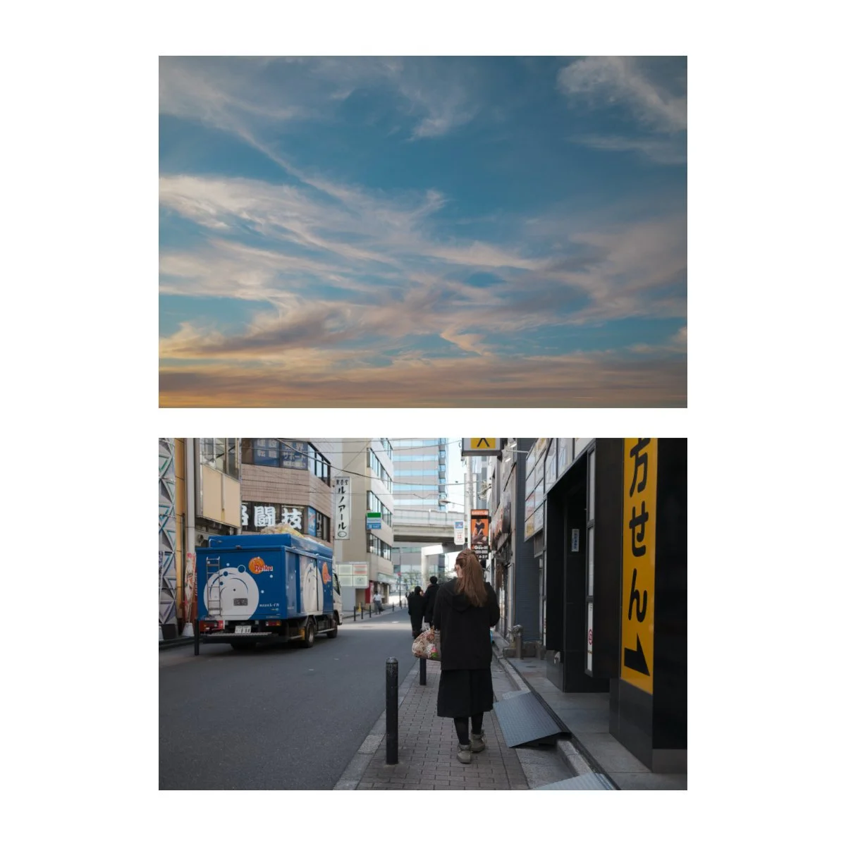
Provia / STD
Provia is Fuji’s standard color film simulation and I honestly don’t like it that much…
It just feels a bit basic and boring compared to the other looks - and I know, that’s the point.
But I will say I’ve come around to it more in recent months.
It gives a lot more color and normalcy to certain images that appear too empty and works as a safe general aesthetic to edit in.
And like Reala Ace and Astia, it’s a great alternative if I feel like I need a little more color or stabler base for my images.
It’s not my preference, but there are a lot of people who do like it.
B tier.
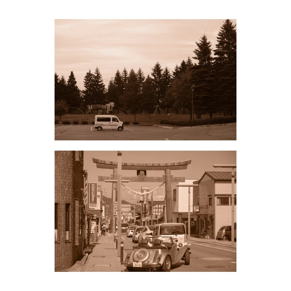
Sepia
Sepia is a look that doesn’t get enough love and…it’s easy to see why.
Originally, there was a functional use for Sepia, it preserved and made photographs more archival.
But not many people use it anymore because it’s not as needed.
Similarly, it’s not really in fashion.
Sepia is often associated with timelessness, as many of the older photos you’ve seen in Sepia are…well, old.
I’m not saying it can’t be done though.
Definitely there’s a lot of room for exploration with anything in photography, I just think “color” is the big thing right now and will be for a good long while.
C.
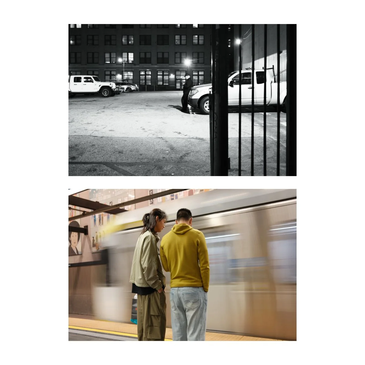
Classic Chrome
Classic Chrome, as many of you know, is my favorite film simulation.
It’s not perfect, and I must admit I’ve run in to many of it’s limitations that hold me back in some way.
Skin tones aren’t always the right hue, saturation can be difficult because of it’s mutedness, and the look isn’t for everyone.
But for the most part, I think it’s pretty damn good.
Solid shadows give a decent contrast while slightly bright highlights makes things shine a bit more.
Combined with sway to the blue/teal, and a “cooler” white balance, and you’ve got a great look for street or documentary photography.
It’s highly versatile and can be used for most things especially for making custom film recipes.
A, if not A+.
Nostalgic Negative
Finally, the Nostalgic Negative film simulation.
This one I was very excited for, although I ended up being fairly disappointed.
It’s nothing on the film simulation itself though, just my own expectations.
Nostalgic Negative is characterized by amber brown highlights, a slight lift in the shadows, and some blue in there as well.
It’s a decent look, although not suitable for everything, especially not colder rainy days.
Bright sunny days tends to be where Nostalgic Negative shines, although you might prefer other film simulations for those cases.
I think it’s a fun one, but sometimes the colors aren’t my favorite.
B tier.
So that was my Fujifilm film simulation tier list.
What do you think, did it match yours?
Leave your own personal film simulation tier list in the YouTube comment section.
And if you want to learn more about improving your photography, shoot more and stress less, check out Photography Systems.
If you’re looking for something foundational, check out Photography Essentials first, it’s free.
And be sure to grab any of the new merch, zines, and prints in the shop.
Thanks for reading, have a great day.