How to Photograph During Bright Sunny Daytime
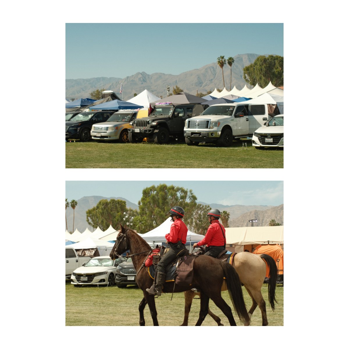
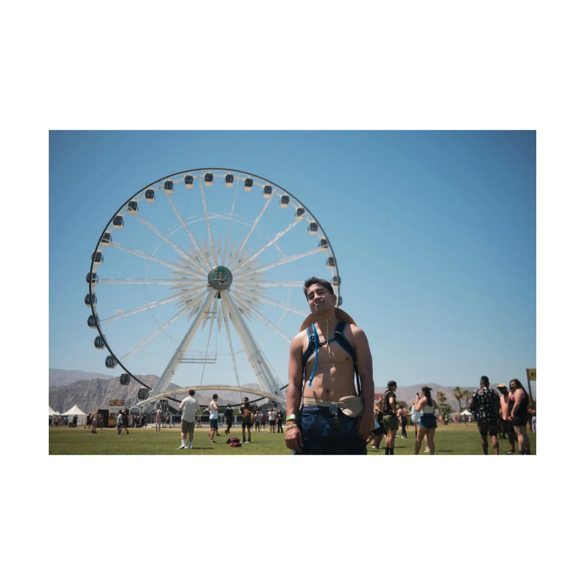
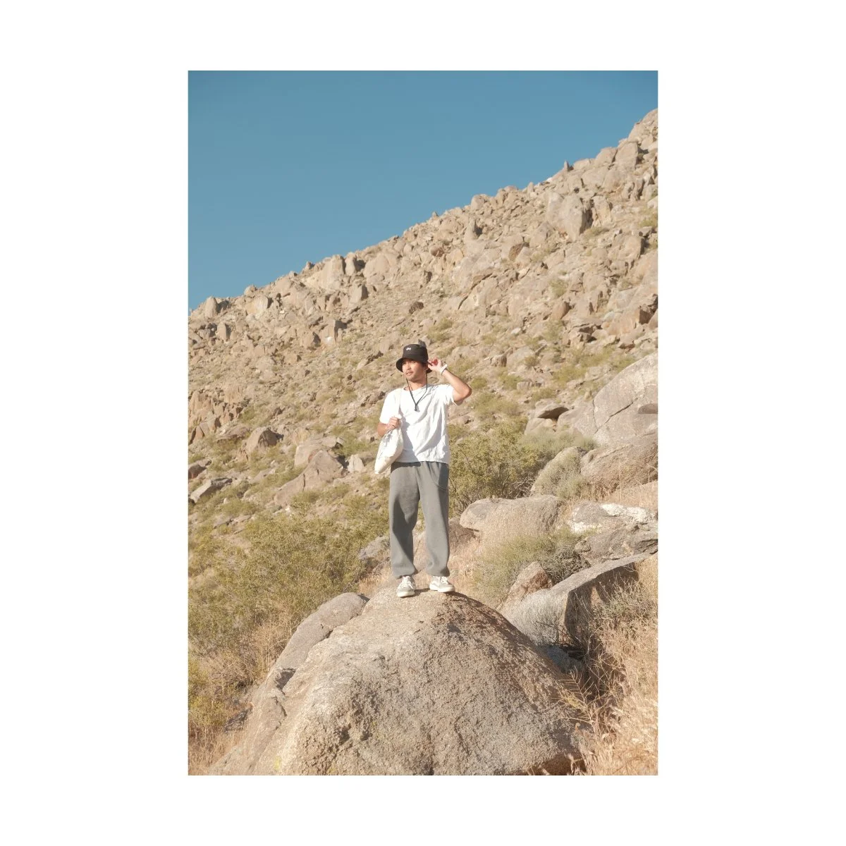
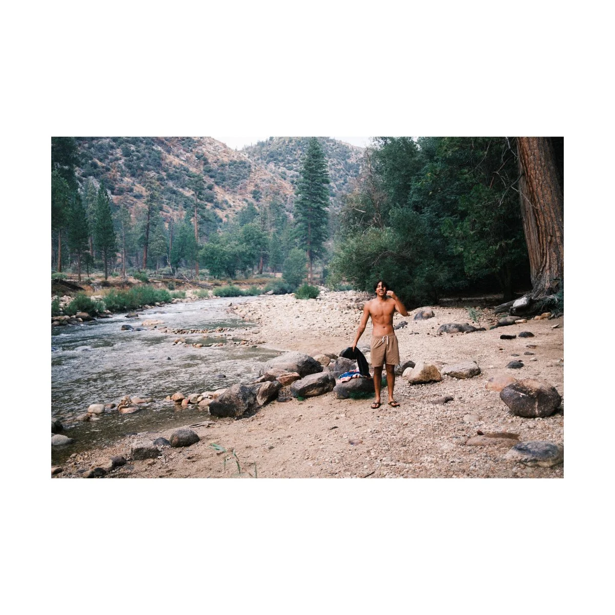
Every year we take a trip to the desert.
Out there the lighting is harsh, colors aren’t always the best, it’s hot, and difficult to see things clearly.
Over time I’ve learned to adjust and have found different ways of getting better shots in these conditions.
But many photographers struggle with harsh daytime photography, understandably so.
When shooting in any unideal scenario, one must remember:
Ugly photos are part of the game.
Not all of your photos will look good.
Certain adjustments will work sometimes, but not all the times.
And you’ll have to continuously try different things to figure it out.
But every time you do, you’ll learn something new, and you’ll become a more robust photographer.
Today I’ll share with you some of the many adjustments I’ve made to get better daytime photos in bright midday lighting.
Neither method will work 100%, but depending on your scenario, one of them will work.
Let’s get started.
Understanding Harsh Midday Lighting
If we want to take better daytime photos, we have to understand what we’re working with in the first place.
Currently, I’m going to assume that all we have is our camera.
No special equipment - just us and the sun.
In this scenario there are two main factors affected by this time of day:
Contrast and colors.
As opposed to other lighting conditions like Golden Hour, during midday we have a “harsh contrast”.
If you think about it, Golden Hour can be anywhere from 4-8PM, depending on the time of year and where you live.
During those hours the sun is usually down, closer to the horizon.
This angle is well reflected in our photos, drawing lines between buildings and adding more pleasing shadows to our subjects.
For daytime photography however, the opposite is true.
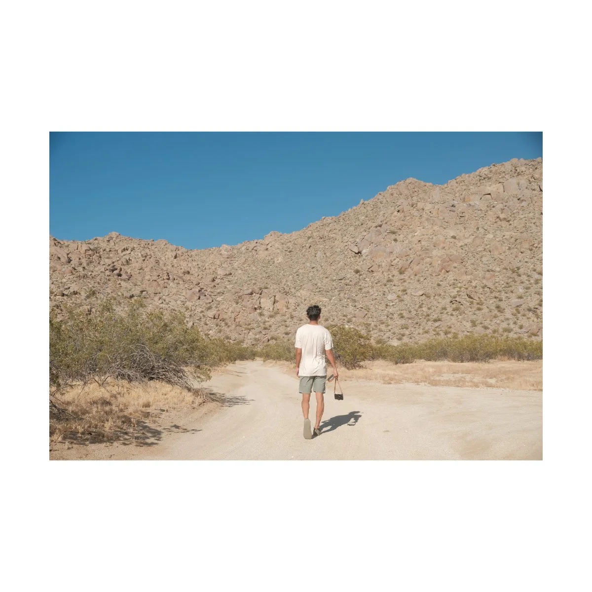
At around 11AM to 2PM, the sun is at it’s highest, hottest and brightest.
If you consider the angle, this typically puts the sun right above us.
The lines drawn from this angle would be straight down or in parallel with buildings and subjects.
So we don’t get the same nice glow we’d get during Golden Hour.
It’s also harder to use light as a compositional tool to draw lines in your frame.
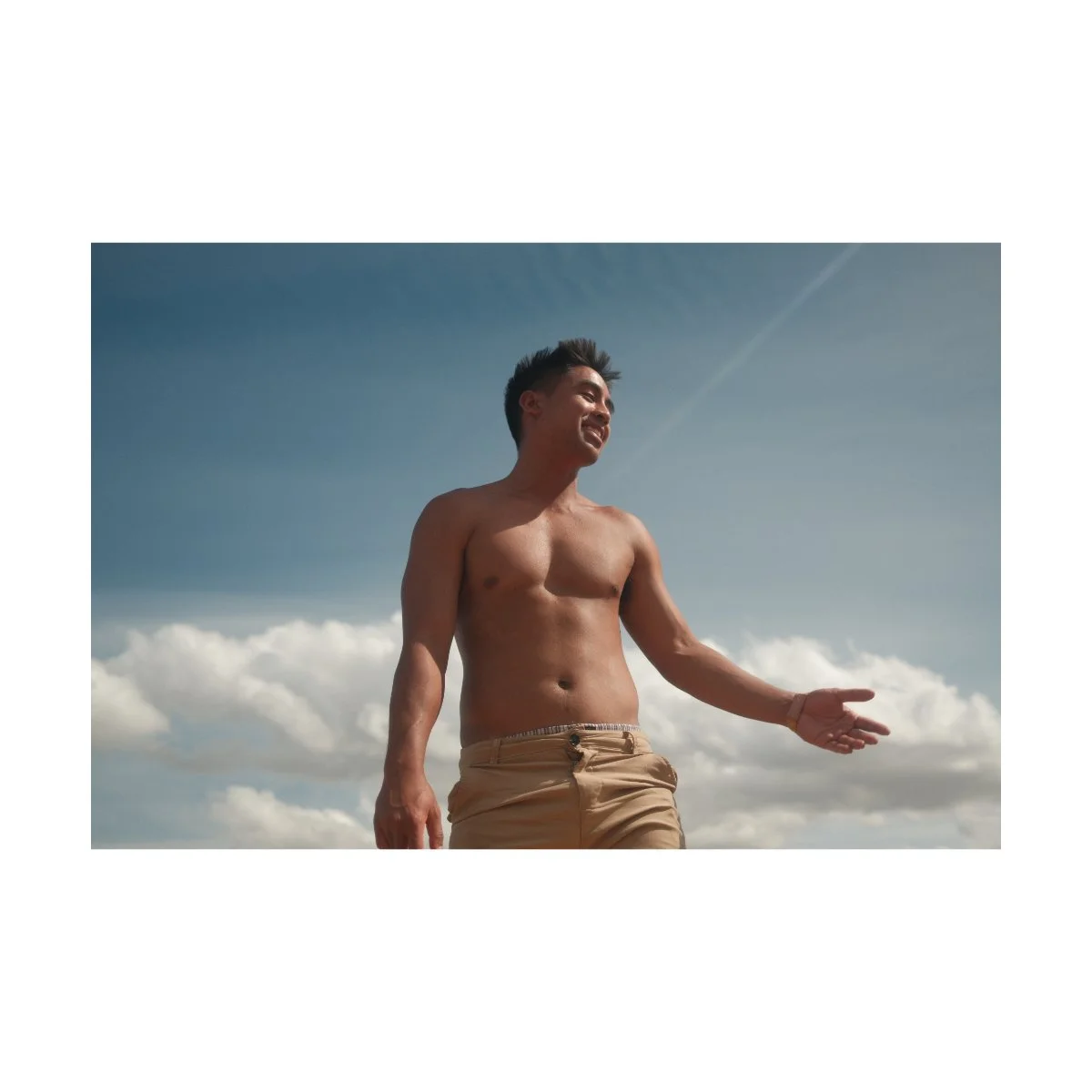
The characteristics of midday light are often considered unflattering.
Highlights can be blown out, shadows can be in weird places, and landscapes can be washed out.
And because it’s so bright, your subjects may squint more, because it’s harder to see.
Now that could be the emotion you want to capture, but it’s not the best look for portraits specifically.
In addition, colors are also affected by harsh midday lighting.
Daytime tends to mute colors, while Golden Hour gives us richer more vibrant hues.
They’re also flatter in appearance, making them look bland.
When adjusting for color we want to lean into this look, rather than fight against it, but more on that later.
In essence, contrast and color are what makes daytime and midday photos challenging.
It isn’t to say that daytime photos look bad.
Just that we need to know what we’re working with first, to then begin working with it.
“Daylight” White Balance
Now that we understand what’s tough about midday lighting, let’s do some quick fixes.
One of the easiest adjustments you can do to fix the bland or staleness of midday lighting is to adjust your white balance.
How you do this will depend on the camera you use, but for Fujifilm I like to use to the “daylight” white balance setting.
This changes your white balance to roughly 5500K - which can be done manually as well, if you prefer that.
Without getting too technical about it, adjusting your white balance in camera simply tells the camera how warm your conditions are.
So counterintuitively, raising the Kelvin tells the camera the lighting is cool, which makes your image warmer.
A warmer image can make bright lighting conditions look more appealing.
This is because colors are things we feel, so a warmer picture that matches a brighter daytime photo makes more sense for our brain.
You don’t have to blast the Kelvin, but a little tinge of yellow or orange can go a long way.
This daylight white balance setting has helped me a lot in the past.
I’ve personally used it the most in an older Portra 400 recipe, which was made for the X-T30.
It helped make my daytime photos look more natural and less stale, and I’d try it out if you haven’t yet.
Daytime Film Simulations
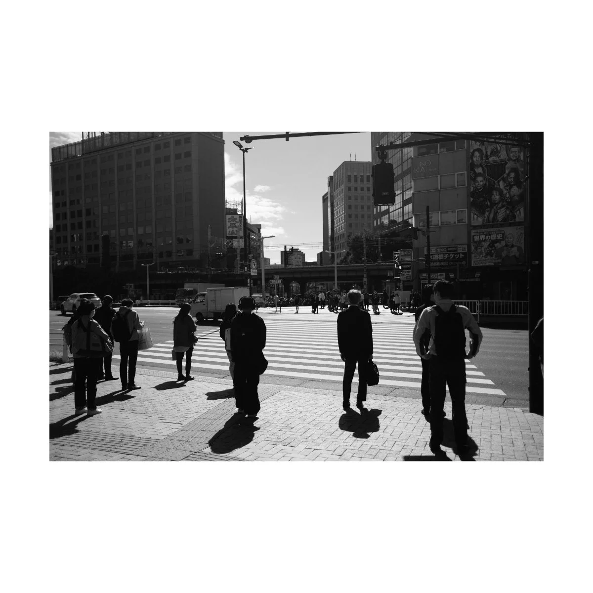
A while back, when I was exploring the streets of Tokyo, I took many photos in Nostalgic Negative.
I was new to the film simulation, but was comfortable using it on the trip because I still had the RAWs as a backup.
When I looked back and went through the photos, I was surprised to see how it performed.
Although colder blue rainy days weren’t so great, Nostalgic Negative actually handled bright sunny daytime conditions pretty well.
The rendition of browns and the warmth of the images made certain shots look better and easier to work with in post.
I could use it both SOOC or tweak and edit it to get a desired look.
And other film simulations like Classic Chrome were sometimes a bit too muted for my liking.
So Nostalgic Negative works great during the day, but it does come with some limitations.
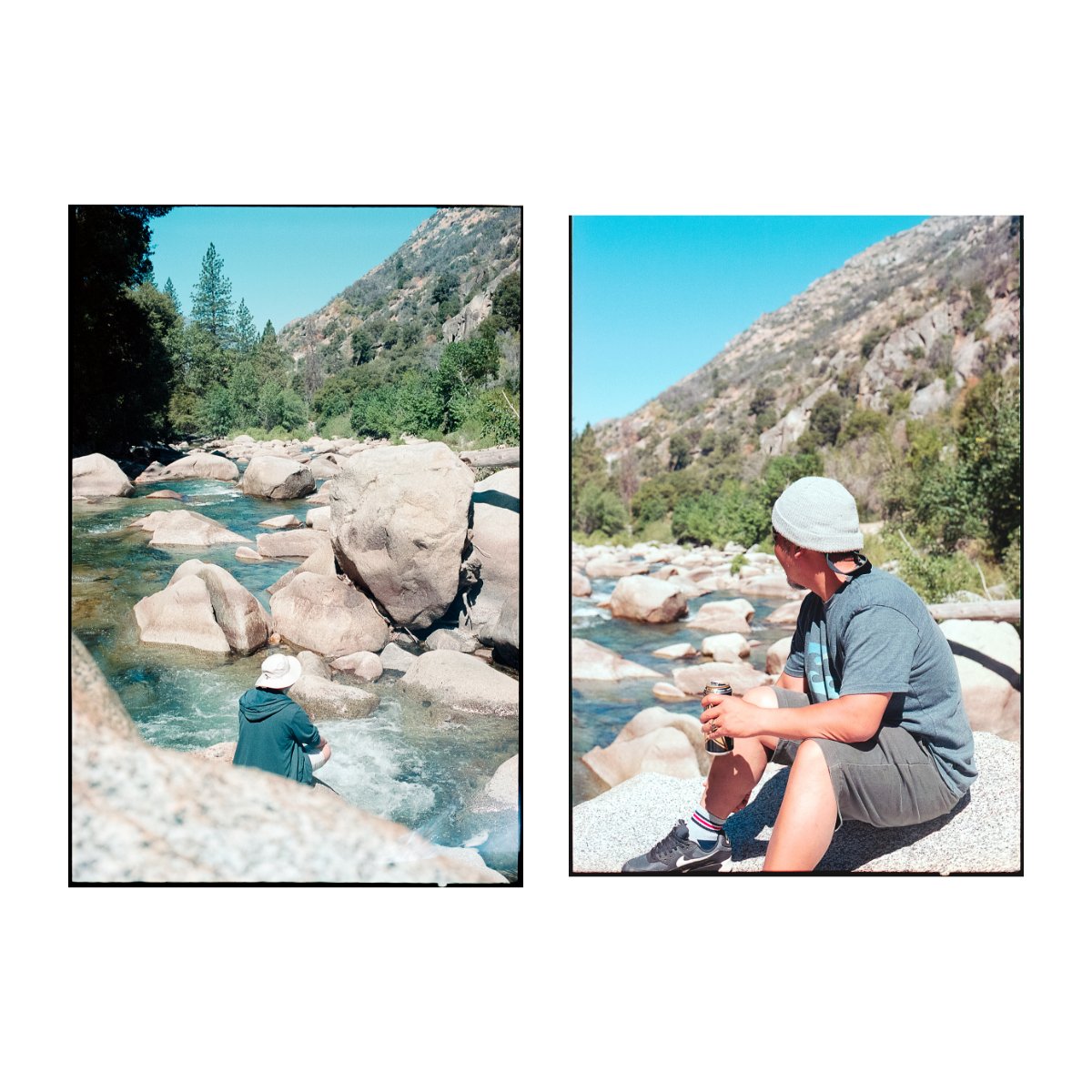
Take these two images for example:
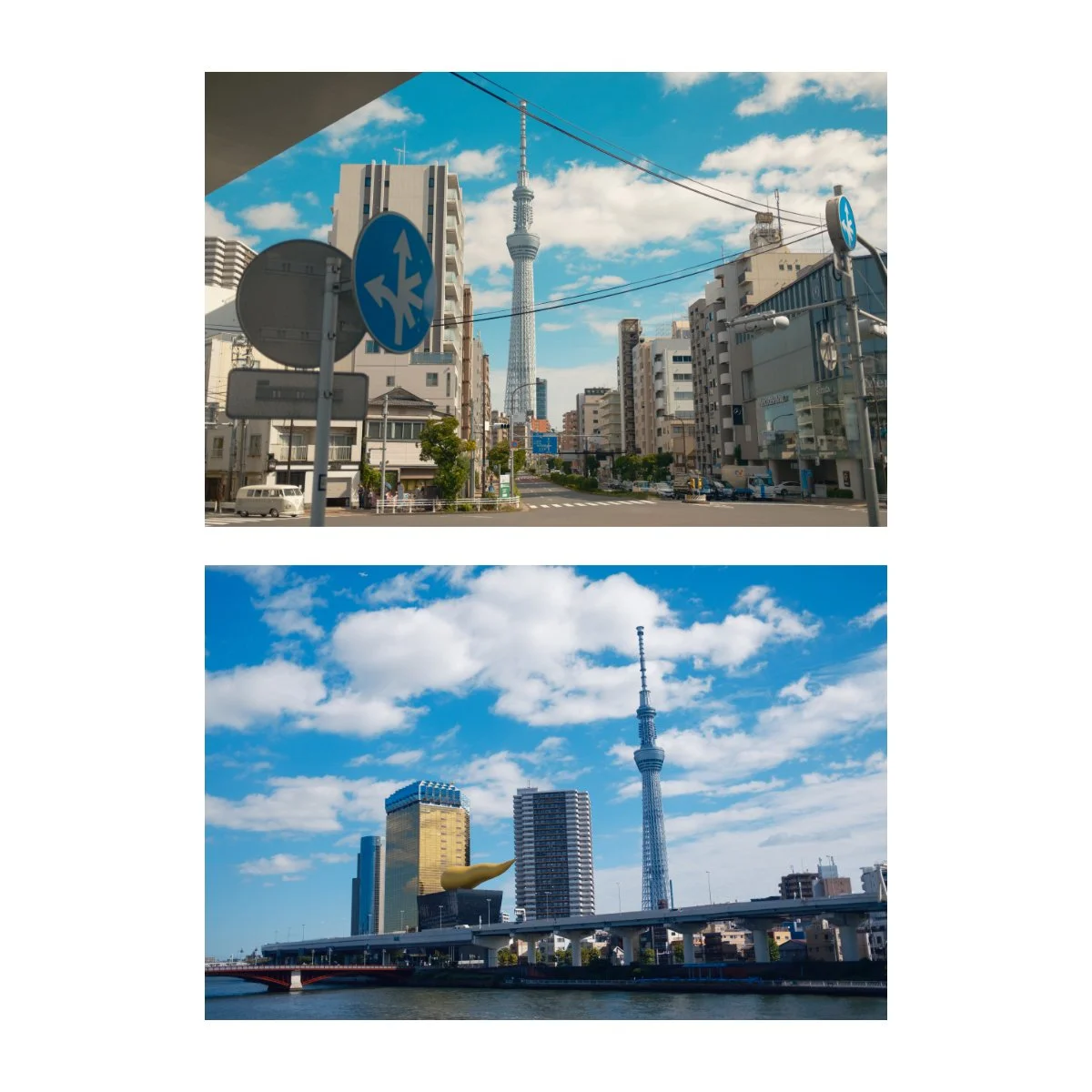
One are some edits I made of the Tokyo Skytree along a busy intersection.
Another are some shots of the same Tokyo Skytree but next to a river.
Both were in harsh sunny daytime conditions, but for some reason I like the intersection ones much better.
The colors looks nicer, the browns balance the shot better, and the blues are a tad unflattering in the river photos.
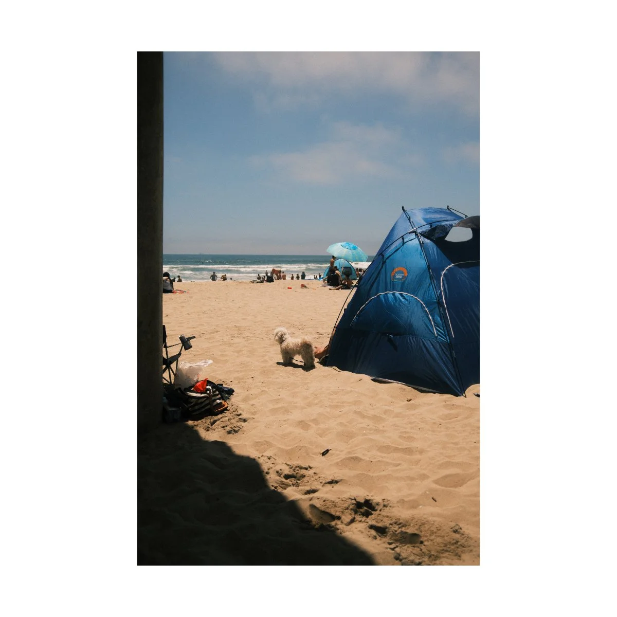
Similarly, if we compare them to these shots I took at the beach in Nostalgic Negative, we can see just where the film simulation shines.
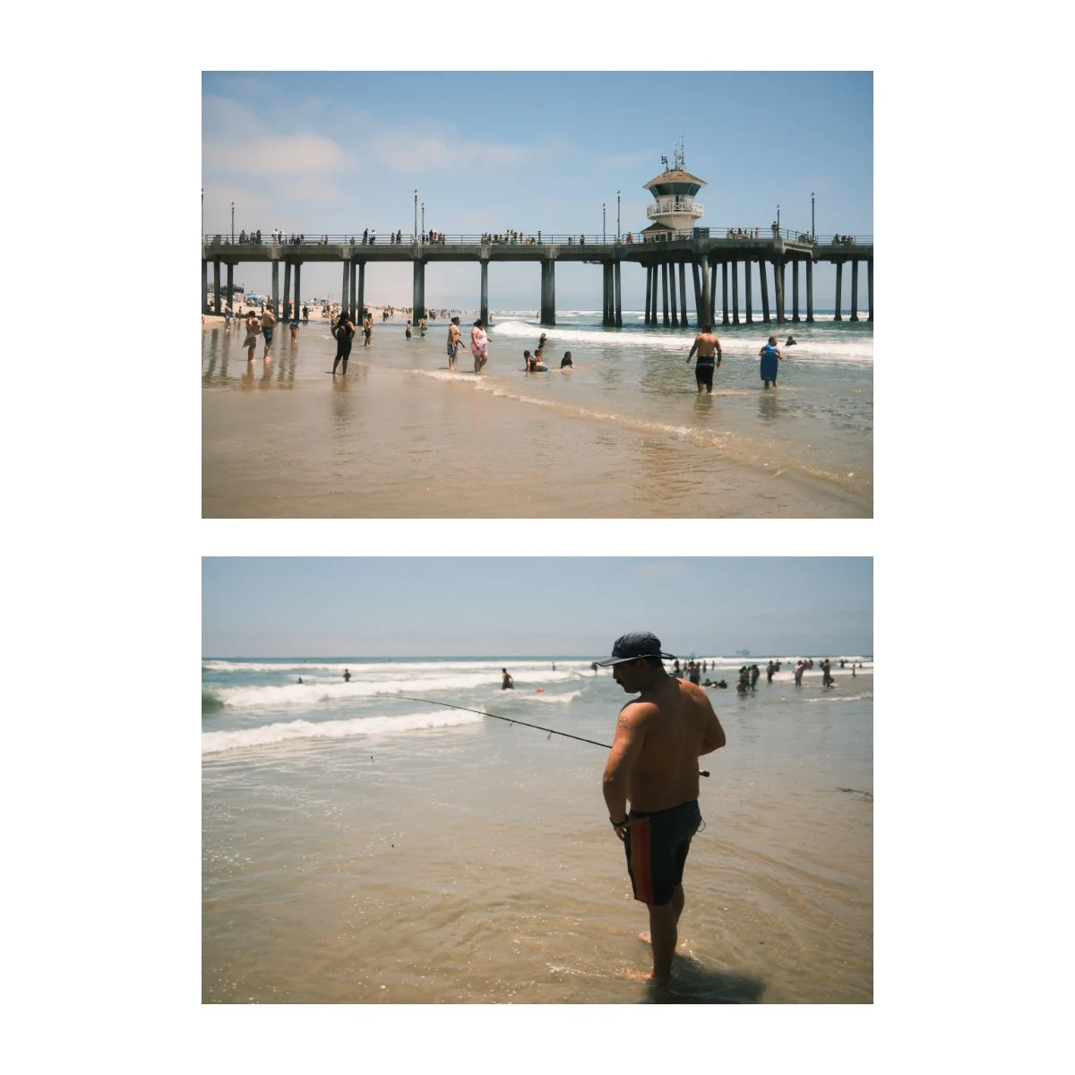
Nostalgic Negative looks better when there’s some kind of brown involved.
It could be the buildings, the sand, the sun, but as long as there’s some brown/orange, it renders better.
The shots by the river had too much blue and I didn’t find that hue appealing.
I show you this to say: if you’re struggling with getting the right look during the day, a quick fix could be to change the film simulation you’re using.
Nostalgic Negative is great, but because it doesn’t always look nice I like to flip flop between that, Classic Chrome, and Classic Negative.
Each one has it’s limitations, but if you can understand where they shine, you can get much better results.
Editing for Harsh Daytime
So now that you’ve played around with your White Balance and switched up your film simulations, what about photo editing?
Photo editing is a bit tricky because like much of creativity it exists in a realm of specific knowledge, where many things you learn by trial and error.
Different aesthetics work during different times of day, and not all of these looks you’ll find appealing.
That being said, there are a few adjustments I do that I find work consistently enough for daytime photography.
The first would be shifting the white balance, like we mentioned earlier.
Just a tick or two to the warmer side should be enough.
This adds some presence from the sun, and you can better feel it’s influence on the scene.
Some people like to add a radial gradient from where the light is shining, and add warmth to that, but I think that can get too intense too fast.
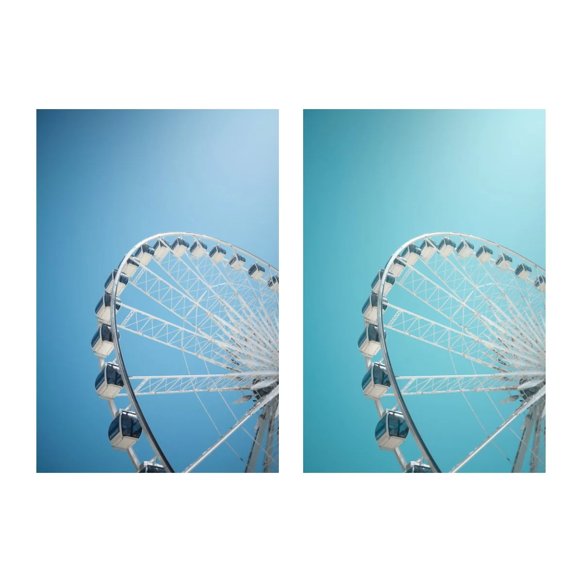
Second would be a slight hue shift from the blues to the teal.
When shooting during the day we often have clear blue skies.
But during different seasons the blue changes hue.
A hue shift to the teal matches the color I find reminiscient of bright spring or summer days.
That look I personally think is more pleasant for bright daytime photos.
This is also the type of hue you’d get when exposing on film, so it works well if you’re trying to recreate that.
Third would be to lower the contrast.
Since the lighting conditions are challenging, adding contrast can sometime create a muddy image.
So what we want to do here is the exact opposite.
Instead of adding contrast, removing contrast “mutes” the image.
Light becomes more evenly distributed and that goes a long way towards making your photos softer.
This “softness” has a dreamy look to it, which can fight against the brightness of the day.
You can also try reducing the clarity by a tick or two to further accentuate this look.
Or just put a diffusion filter on your lens when taking photos.
This will spread the light out more and give it a little glow.
That’s something I’ve been trying out recently and I think it looks pretty nice.
Also try using a built-in or external flash to expose your photos - it can make a BIG difference.
So those were some editing tips we can do in post to compensate for the bright sun.
Now, let’s talk about what to do when nothing’s working.
If All Else Fails
In my photography journey there have been many times when nothing is working.
When I’ve tried all the tricks and adjustments to make my photo look right, but it just looks ugly.
And the photo itself might not even be bad, framing wise, but the colors and contrast are just off.
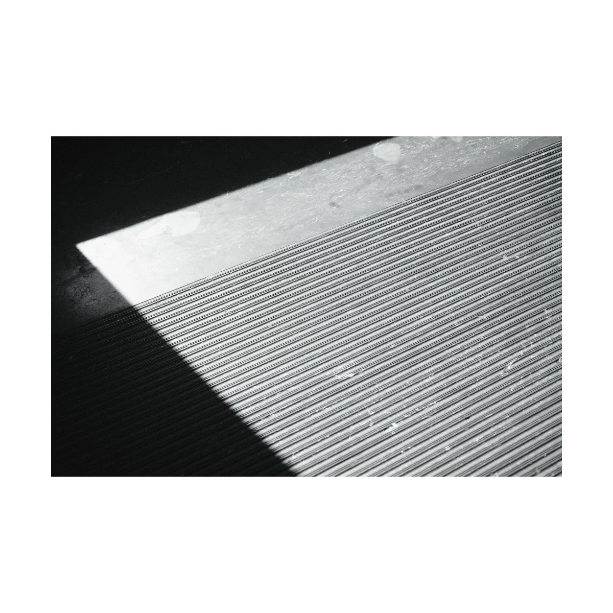
In these cases, I usually just say f*ck it, and change my photo to black and white.
Shooting or editing in black and white is a great failsafe, especially when the colors aren’t working.
Similarly, there is a wider breath of exposure options in black and white that still look good.
Where high contrast on a bright day can look bad in color, the same can actually look pretty good in B&W.
Underexposed photos can just look “moody” and even slightly overexposed photos can look good too.
Personally, I like to blow out some of my highlights and deepen my shadows - I think it makes things look more dramatic and timeless.
Slightly blown out highlights can actually look pretty appealing because it’s just white, as opposed to botched color.
Similarly, you can still feel the hot summer sun, even without color.
Just make sure you’re exposing for the midtones, and you’ll be fine.
So when all else fails, shoot black and white.
It can save a ton of photos.
Capture the Theme
Whether it’s bright sunny midday in Venice, beautiful golden hour in California, or pitch dark nighttime in the streets of Tokyo, all lighting conditions have one thing in common.
That being: theme.
An underlying quintessential concept or feeling that connects the time of day to the image you take.
For many photographers, theme is the very last thing they think of.
They focus more on settings, aesthetic, and composition.
But having a strong theme can actually allow you to forsake some of those elements.
Think about it for a second.
What do you think of when you think of midday?
For me its the heat or brightness of the sun.
What do you think of when you think of Golden Hour?
For me it’s staring out at a viewpoint, thinking about life, and a tinge of sublime.
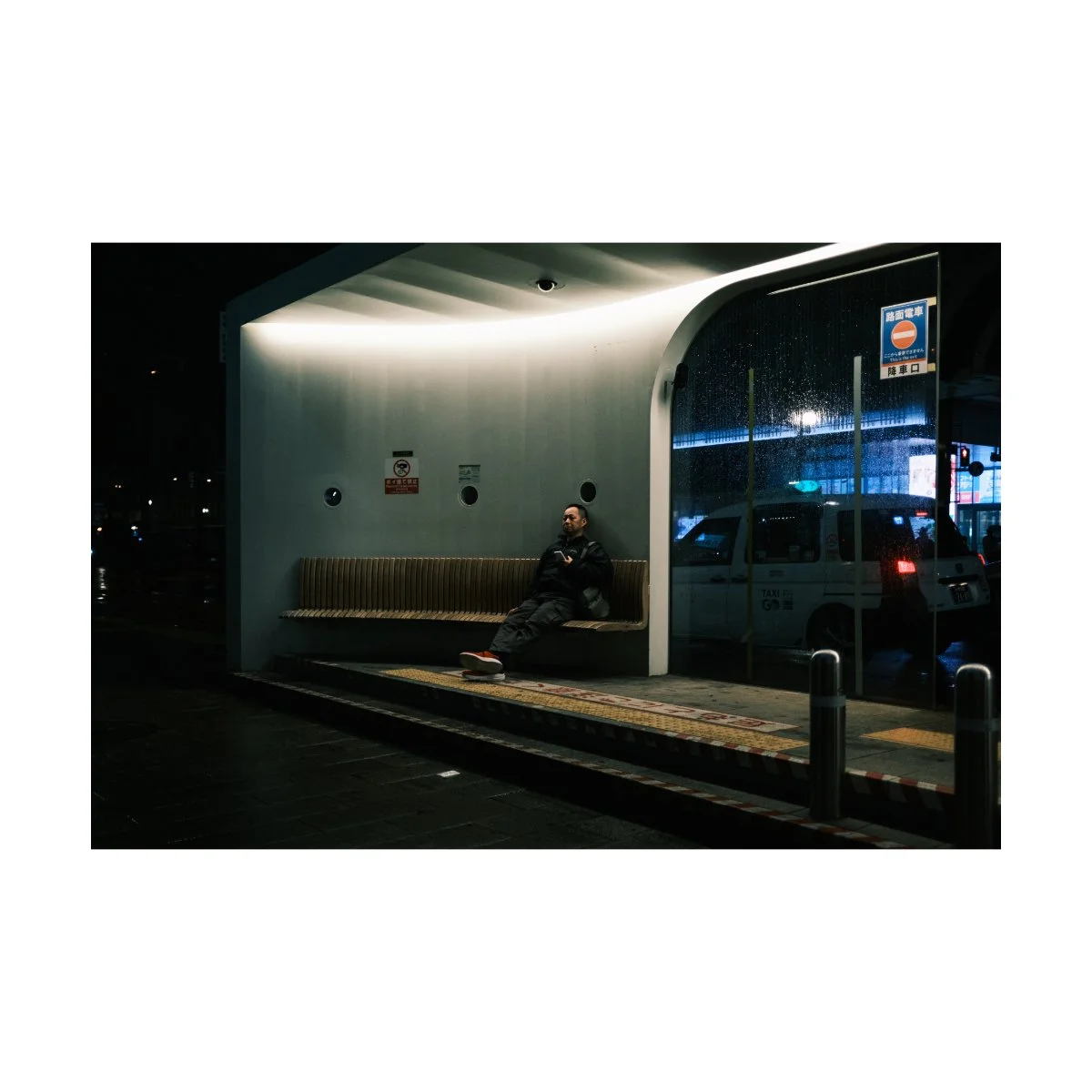
And what do you think of when you think of nighttime photography?
For me it would be cold, loneliness, wandering, etc.
Capturing those specific elements is what you want to focus on.
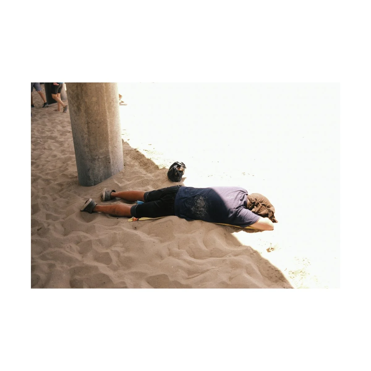
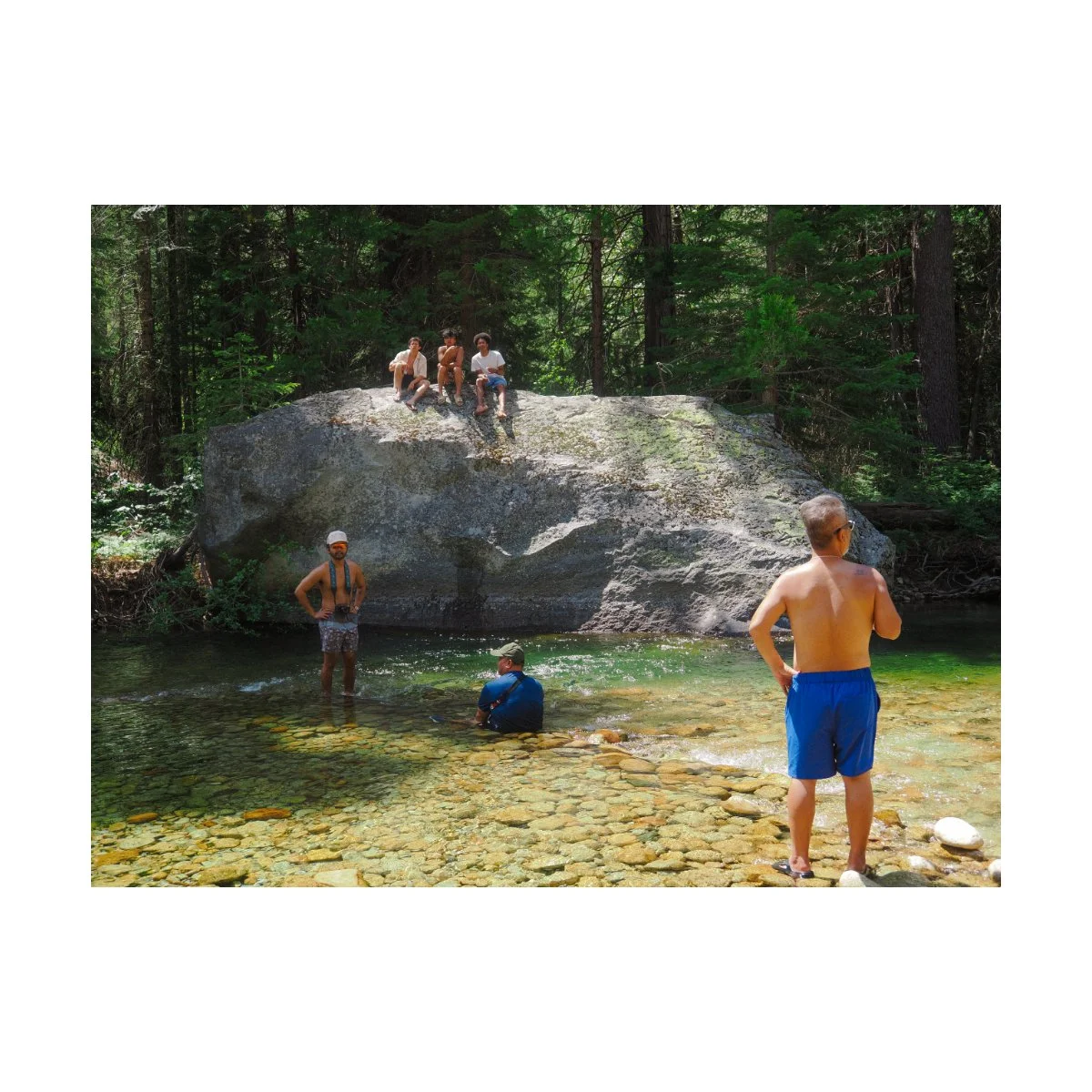
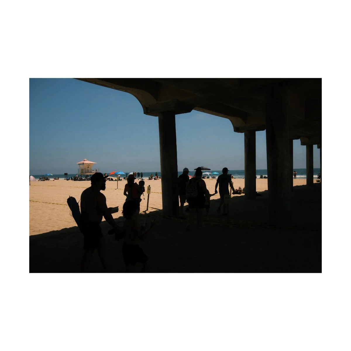
The man lying half in the sun, half in the shade on a hot day.
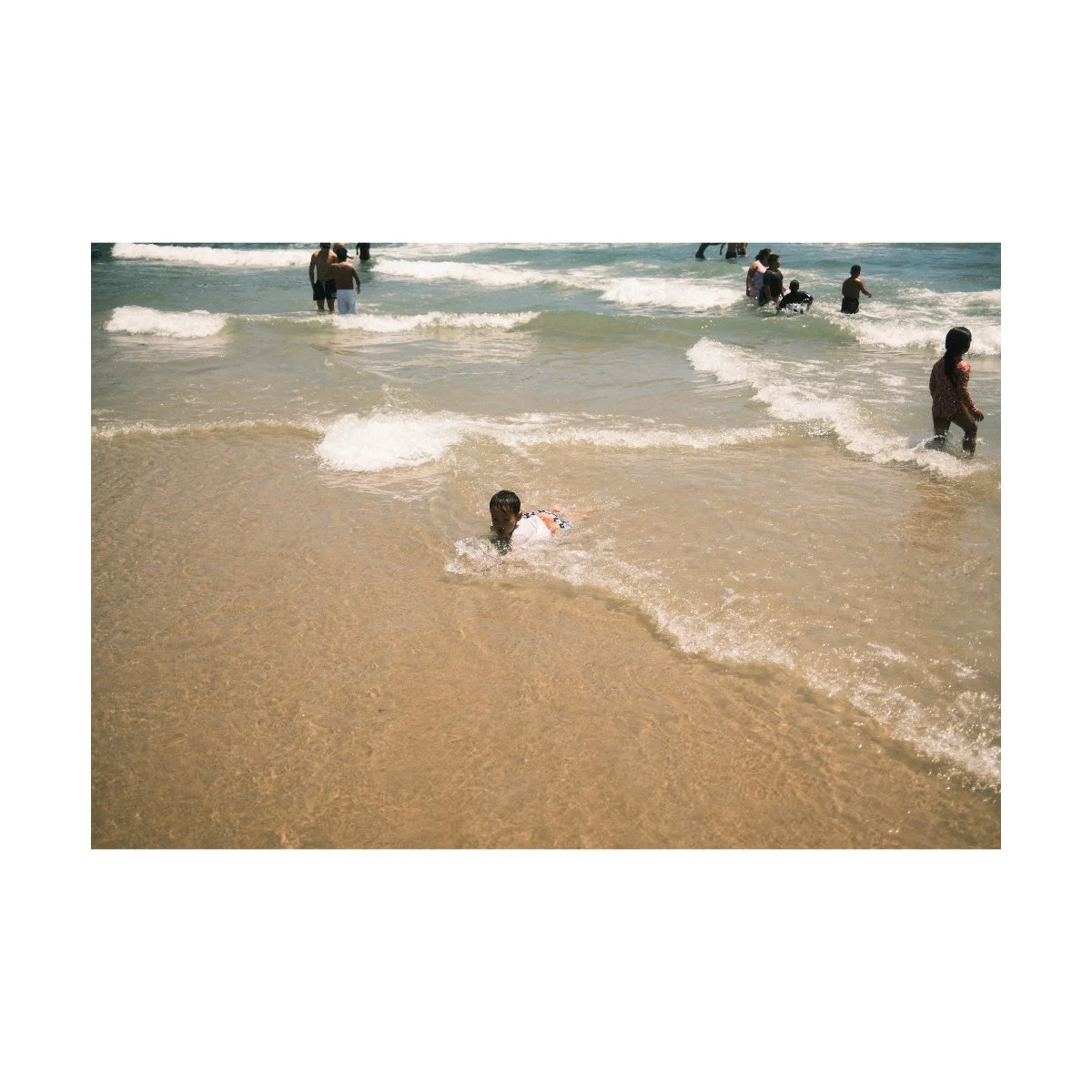
The kids playing in the cool refreshing water.
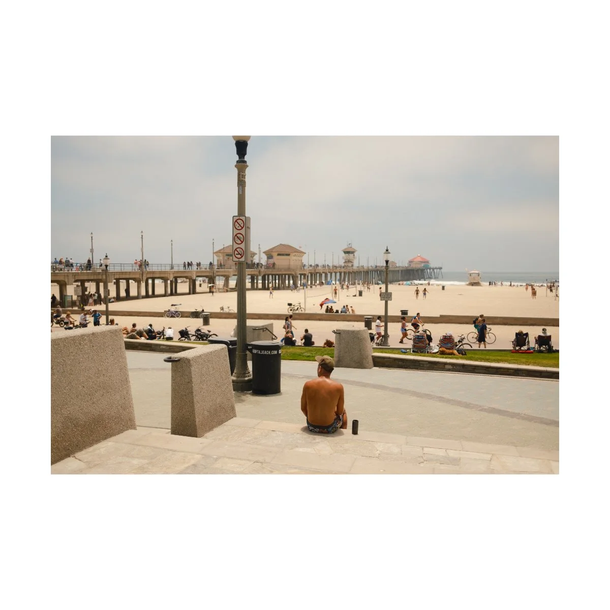
The sweat on that guy’s back from the blistering heat.
There are plenty of things we can do to “show” the daytime theme that will make our photos better, regardless of the lighting condition.
So although we talked a lot about adjustments, better daytime photos isn’t actually about that.
It’s not about trying to “fix” the light and color or even attempt to make your photos look like golden hour.
It’s about capturing the essence of that moment.
This applies to any photo you take at any time of day in any location around the world.
Recognize what characteristics exist or are exhibited in this very moment, and simply bring that to life.
The aesthetic or look you choose will ultimately be dictated by that, but capturing that comes first, not the other way around.
Many things I found that worked for my daytime photography came from asking those questions.
Doing this will give our photos much more synergy, a concept we talk about in Photography Essentials, which will make our photos feel and look “right”.
This concept might be a bit tough to grasp at first, but it’s the key to all of photography.
When you understand it, you won’t need to ask how to edit or shoot during this particular time of day.
Because you’ll be able to see and recognize what the image needs at an instant, and adjust accordingly.
That’s the next level.
I know this was a lot so, let’s sum it all up real quick.
Ultimately, understanding how to get better looking daytime photos is the same as all other forms of photography.
It’s going out enough times, trying a bunch of stuff, seeing what works and what doesn’t work, and then replicating what does.
Daytime photography has some unique characteristics that make it more challenging than other times of day, like the harsh lighting and muted colors, but that shouldn’t scare you.
Because there are plenty of things we can do like:
adjusting our white balance in camera or in post to match
trying a different film simulation that renders the look better
if nothing looks right, shoot black and white
And finally, learn to capture theme within your photos.
That’s the underlying factor that connects all your work.
If you do a good job at that, you won’t need any fancy tips or hacks to make your photos look better - the theme will drive the car.
So if you found this helpful, share this with a friend who could also use this.
If you want to learn more about improving your photography, shoot more and stress less, check out Photography Systems.
It’s a bit less hands-on as this article, but I still think you’ll find it useful.
Thanks for reading, happy shooting.