Tired of Classic Chrome? Try These Film Simulations Out
Classic Chrome has been one of the most popular film simulations since it’s release.
Personally, I’d put it up there as my favorite, since I use it the most when shooting and editing.
It’s a bit difficult to describe what I like about it though.
Some say it brings out the positive aspects of black and white photography without simply desaturating the colors.
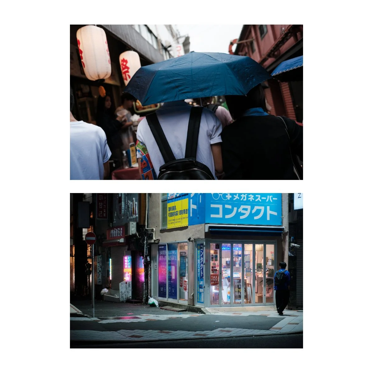
The shadows are good, blues are a bit teal, and it’s well suited for documentary and street photography.
It’s not my favorite for reds however, and sometimes skin tones can be off.
But I like it - because I can use it for most situations and it serves as a great base for photo editing.
In recent years though, I have been getting a bit tired of it.
It’s not to the point where I’d stop using it - but rather crave or want to try something different.
So I’ve been experimenting with other film simulations trying to find a good Classic Chrome alternative.
These are observations based on my experience, and aren’t necessary “right”, so your mileage may vary.
If you’re looking to learn more about film simulations check out some of the other articles I made:
Tips to Learn & Use Fujifilm Film Simulations (for better photography)
Your Complete Guide to Every Fujifilm Film Simulation (2025)
But anyways let’s get into it - here’s what I learned in my search.
A Sleeper Profile
Reala Ace has been a bit of a sleeper film simulation for me.
Initially, I wasn’t very interested in it since it seemed like just another standard color profile, without many standout characteristics.
But as I craved something different from Classic Chrome, Reala Ace made it’s way into my photography.

In my article Reala Ace is Actually Reala Good, I observed it to be quite similar to Provia.
But unlike Provia, there’s something about Reala Ace I find more appealing.
Some people prefer the Provia look, which is perfectly fine, I just find it a bit boring.
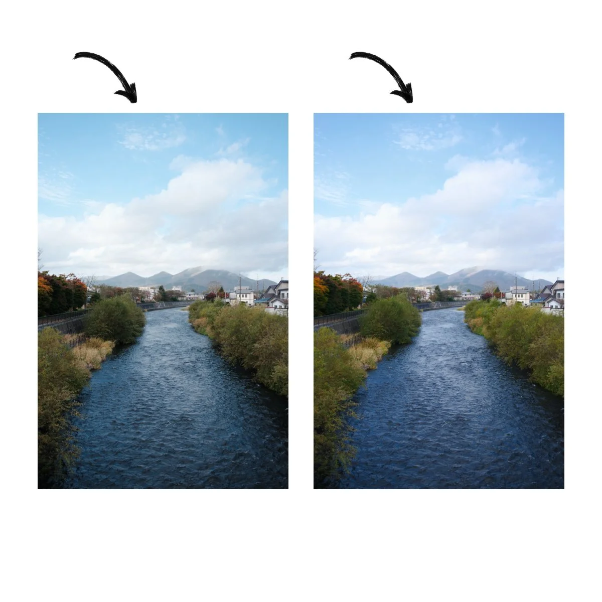
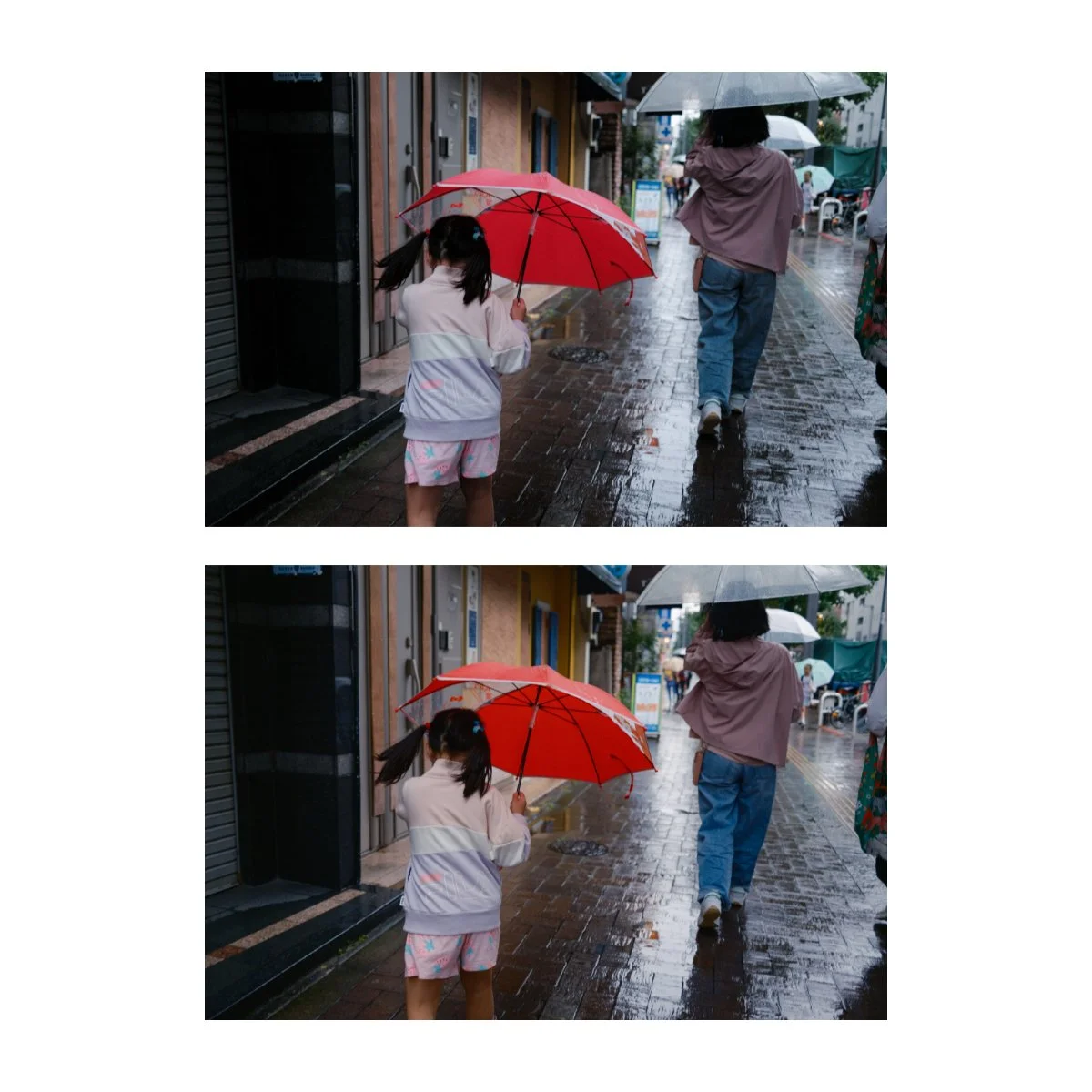
Looking closer, the main difference between Reala Ace and Provia are the tones.
Shadows and midtones are slightly lifted and colors are a bit muted in Reala Ace.
Top: Reala Ace
Bottom: Provia
In comparison to Classic Chrome I’ve found it to be more similar than you’d think, and with a few adjustments you can get similar color tints in the blues and oranges.
The contrast is a bit stronger in the shadows for Classic Chrome, but that’s something that can be adjusted for in the sliders or tone curve.
Meaning it’s similar, but different enough if you’re craving another look.
Top: Classic Chrome
Bottom: Reala Ace
I’ve been experimenting with Reala Ace to see how I like the look and, it varies…
Sometimes I like the brighter midtones, other times I want the shadows to be deeper.
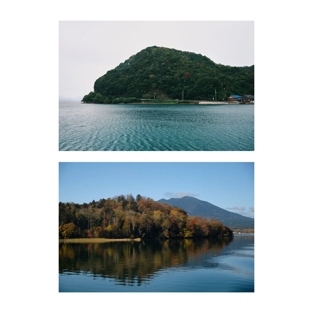
It is fun though and I find the blues and greens in particular to look quite nice in Reala Ace.
Unlike the tealish blues of Classic Chrome, Reala Ace is on the bluer side, giving it a nice ocean feel.
Left: Classic Chrome
Right: Reala Ace
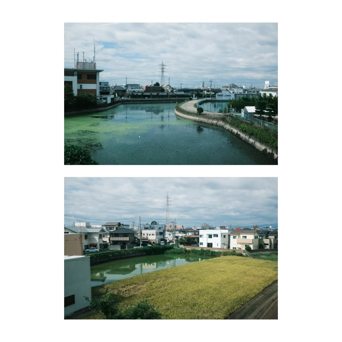
Browns can be on the greener side and I’m still debating whether this is a good thing.
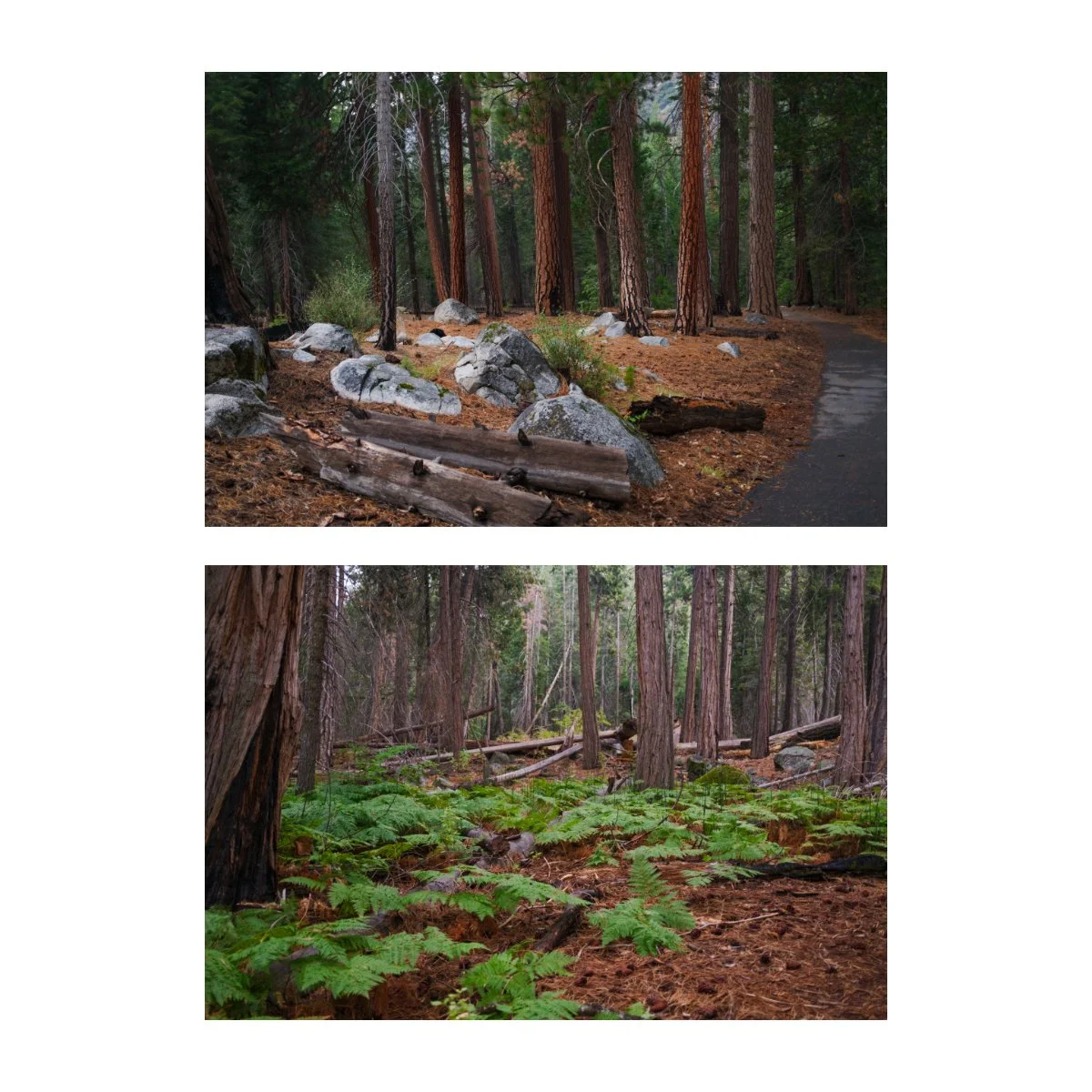
In my recent camping trip I shot a lot with Reala Ace and I think nature, forests, and wilderness type shots look great, especially when you even out the contrast.
I actually prefer the skin tones of Reala Ace as compared to Classic Chrome, especially for tanner subjects.
This is because Classic Chrome tends to be on the pinker side, and like I mentioned before, it looks a bit off to me, at least for darker skin tones.
All in all, I’d recommend trying Reala Ace out, especially if you’re looking for something standard, but different.
It’s unfortunately only available on the newer Fuji cameras, but worth a shot if you get the chance.
The Hipster’s Classic Chrome
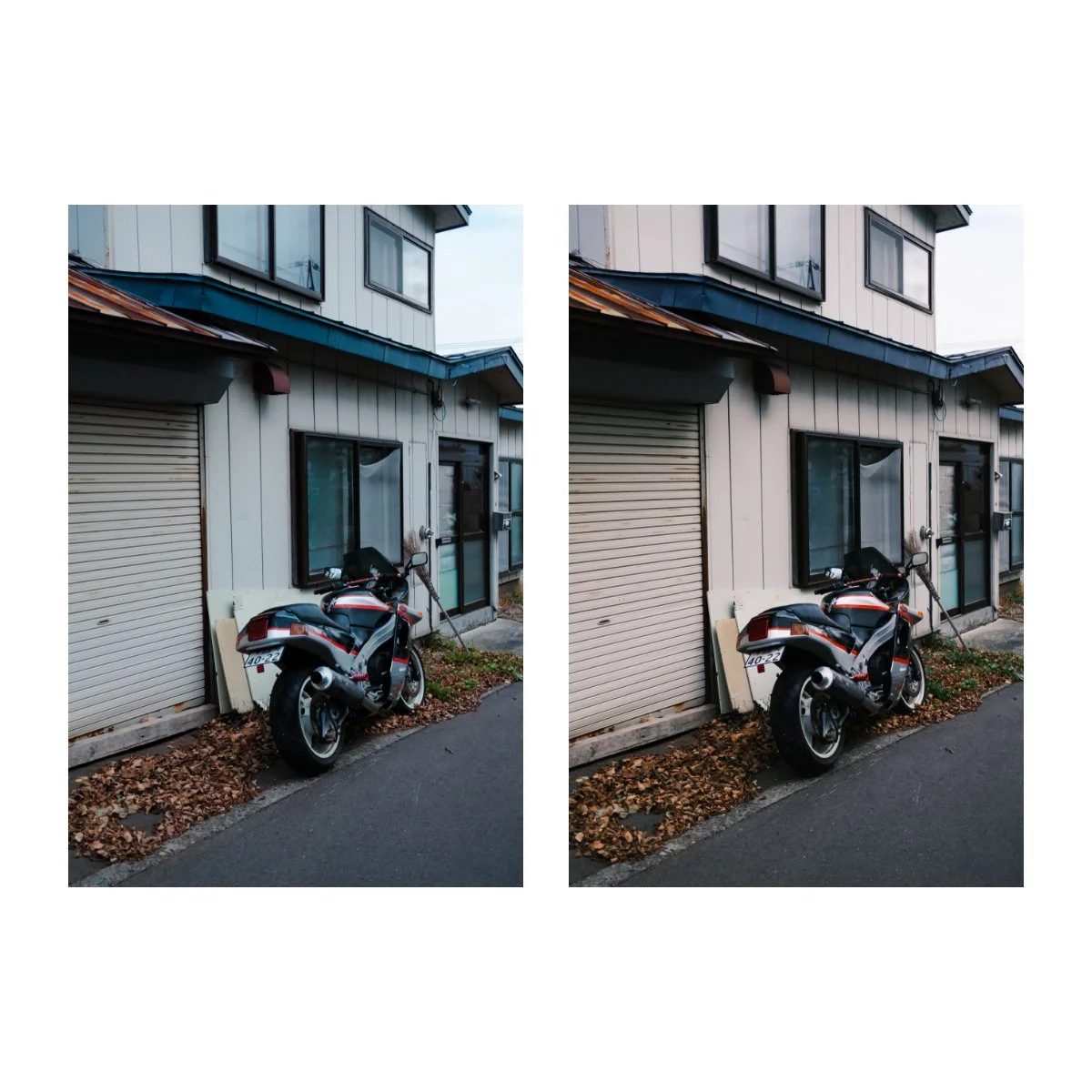
Pro Negative is the film simulation I like to think of as the hipster’s Classic Chrome.
This is because it was sort of the Classic Chrome before Classic Chrome.
After it’s release Classic Chrome boomed in popularity, but many long time Fuji users still stick to and prefer Pro Negative.
I’ve personally always preferred Classic Chrome, but have been experimenting with Pro Negative lately.
I also prefer Pro Neg Hi over Std, so we’ll be talking about that one more.
At a glance, the two are very close to one another.
They have a similar mutedness to their colors and aren’t as saturated as the other film simulations.
But when comparing any film simulation, the main things we have to pay attention to are the tones and colors.
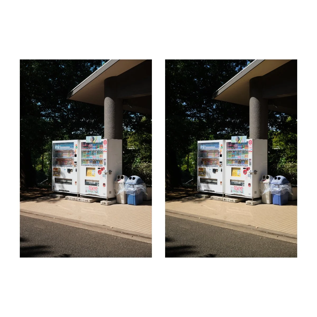
Left: Classic Chrome
Right: Pro Negative Hi
Between Pro Neg Hi and Pro Neg Std, I’d place Classic Chrome closer to the Hi side for tones.
Classic Chrome seems to be a bit brighter in the whites and highlights, making it look more contrasty, but otherwise their histograms are about the same.
Pro Neg Std, as we know, is lighter in the shadows and flatter all around.
Left: Classic Chrome
Right: Pro Negative Std
When it comes to colors, Pro Neg seem to be a bit warmer and a tad stronger.
It’s not to the same level as a film simulation like Provia, but a tad more than Classic Chrome.
The warmth also might just be a result of Classic Chrome preferring the cooler side of things.
The color of blues are also more standard in Pro Neg, as opposed to the tealish ones of Classic Chrome.
Those are the main differences between the two, but otherwise many would find it hard to tell them apart.
In my experience, Pro Neg has been useful in photos where Classic Chrome has the right tones but not the right colors.
Something I’ve struggled with in Classic Chrome is bringing out the colors.
Classic Chrome is naturally a bit muted and while this can provide for a good base to add adjustments, it can also make it hard to add adjustments.
For example, the starting point for color in Classic Chrome versus Provia or Velvia is much lower.
Meaning I’d have to add a lot more in or do a lot more work to get the same levels or look.
It’s been achievable in the past in some of my sunset photos, but sometimes I don’t want to do all of that work.
And if getting a similar result sooner is easier on a different film simulation, why not do that, right?
Pro Negative has been handy for that.
Plus, if you don’t have Reala Ace on your camera, Pro Neg can be a good alternative to try out.
It won’t be miles apart from Classic Chrome, but it’s still fun to use and you might find some things you like about it.
Not What I Expected
Nostalgic Negative was a film simulation I had high expectations for.
I thought it’d be the replacement for Classic Chrome, an alternative to what I used so often.
And although not a bad look, it wasn’t what I expected.
Nostalgic Negative’s biggest defining characteristic is the amber warmth.
This changes the shades of browns, gives it a bit of a color cast, and you’ll notice it especially in the highlights.
You’ll sometimes also see deeper blues in the shadows, which I’m still debating whether or not I like.
In terms of tones, Nostalgic Negative has a bit of a lift in the shadows.
This probably gives it a “softer feel”, which might be what they were thinking when they named it.
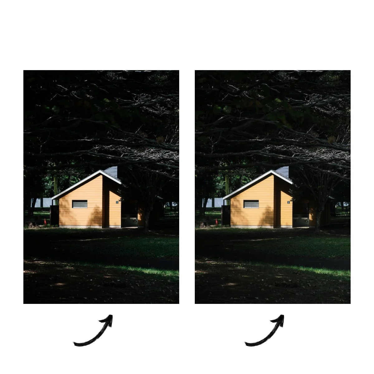
Top: Classic Chrome
Bottom: Nostalgic Negative
Characteristics like these aren’t bad, but I think the more you have, especially the stronger they are, the less versatile it makes the film simulation.
If you think about Reala Ace and Pro Negative, which we talked about earlier, they share a close resemblance to Classic Chrome.
And I’ve been able to edit back and forth between the three, and make them look fairly close to one another if needed.
For something like Nostalgic Negative, that’s impossible.
The characteristics of this film simulation are too noticeable, and I’d put it on par with Astia.
Top: Classic Chrome
Bottom: Nostalgic Negative
Furthermore, it’s not always the best option especially on colder days.
I find the amber browns to be a mismatch with overcast, clouds, or colder temperatures.
In contrast, it’s much better suited for hot, summery, and even midday scenarios.
Because of this, Nostalgic Negative is in my opinion, less versatile and more situational.
Now, when you stick to and use it where it shines, Nostalgic Negative can actually look really nice.
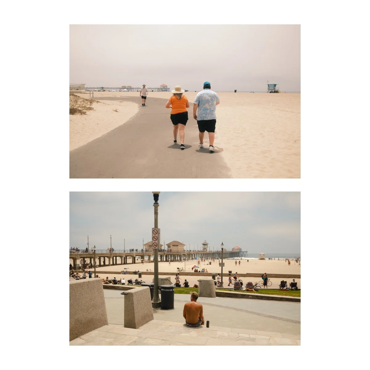
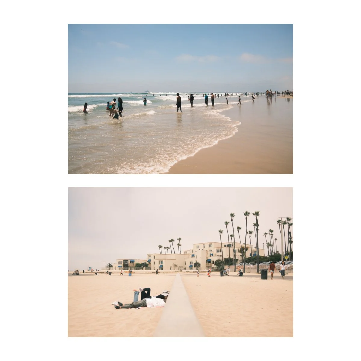
For example, in these photos I took at the beach last year, Nostalgic Negative felt like the right choice, since the amber brought out the warmth of the day and matched the colors of the sand.
Blues and shades of orange were the dominant colors of the day, so that played a big role as well.
And although the timing was midday, Nostalgic Negative, being lighter in the shadows than others, made it so the images weren’t too harsh.
So although it’s not as versatile and all purpose as the other film simulations we talked about but I’d still recommend trying it out.
It’s a good alternative to Classic Chrome, especially if you’re looking for something more different, not just slightly different like the previous two.
For Something Very Different
Now, let’s say you’re far off the treadmill and you don’t need something just slightly different, you need a complete 180.
In these cases I’d recommend my second most used film simulation, Classic Negative.
Classic Negative is a film simulation I use on occasion, and it helps balance my overuse of Classic Chrome.
Although it’s completely opposite to something like Classic Chrome, I think it’s general look and aesthetic is pretty damn awesome.
The defining characteristics of Classic Neg are the strong tones and color shifts in brown, red, and green.
You’ll notice instantly when switching your camera to Classic Neg how drastic the image looks from Classic Chrome.
And unlike Reala Ace and Pro Neg, which are somewhat adjacent to Classic Chrome, Classic Neg stands out.
Tones with Classic Neg are strong, meaning the highlights and shadows are closer to the extremes, giving your images more drama and intensity.
Browns are less yellow, red are a tad darker and deeper, and greens become green green.
I’ve mentioned this before, but I really enjoy how greens look in Classic Negative.
They become less yellow, and although this is something you can technically do in a hue slider adjustment, I think the green makes plants and trees look more full of life.
Like we mentioned with Nostalgic Negative, strong characteristics make a film simulation less versatile.
Because of this, I don’t use Classic Negative for everything, although I’m sometimes tempted too.
I find the look great, but can be overbearing at times, and some images don’t need that kind of contrast.
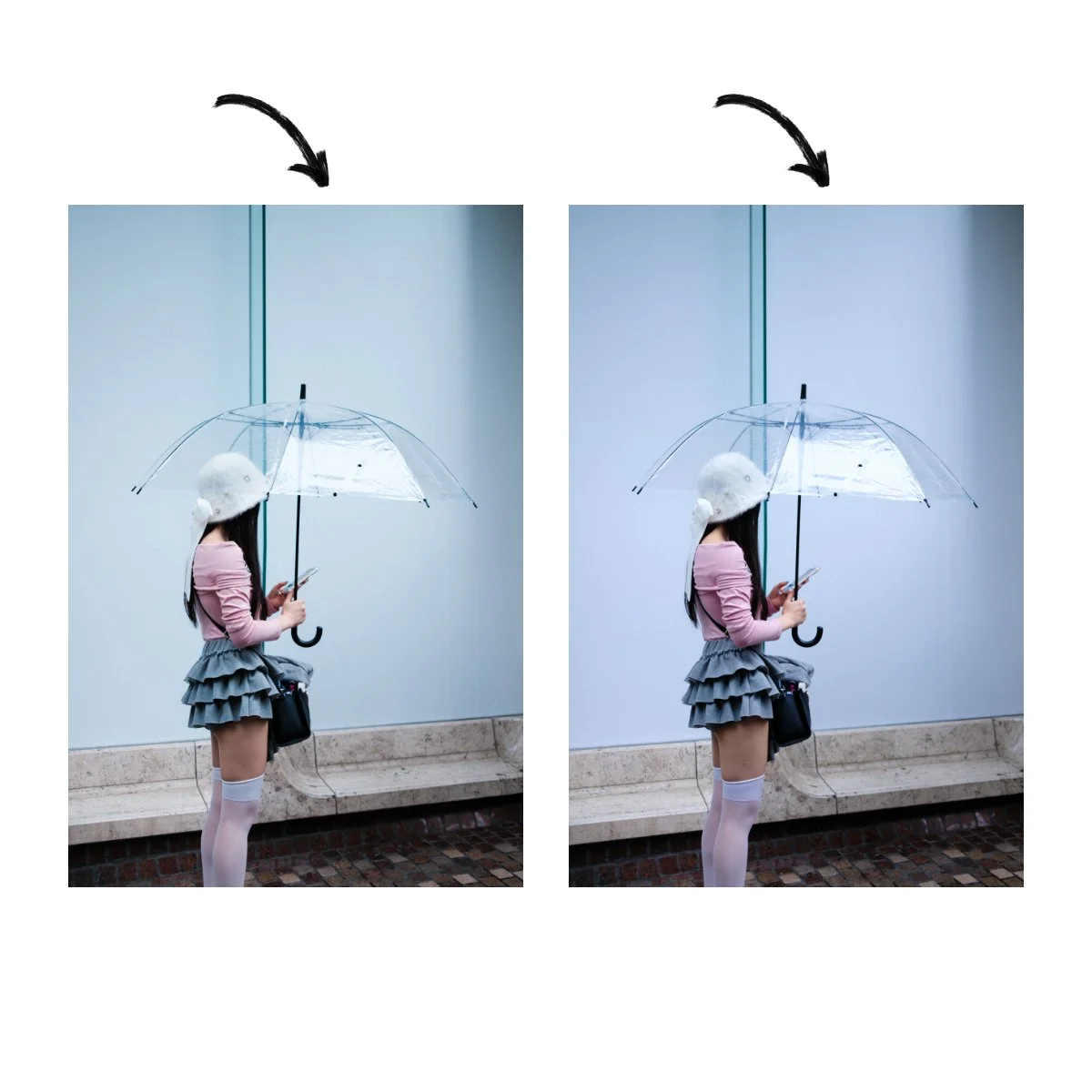
Left: Classic Chrome
Right: Classic Negative
Lately I’ve been trying to edit my Classic Negative images opposite to it’s characteristics.
Because it’s a higher contrast film simulation profile, I used to edit in a way that emphasized that look.
This meant deepening the shadows, brightening the highlights, and adding clarity and contrast.
But recently I’ve been doing the exact opposite, just to see how it plays out.
And strangely, I’ve been finding the balance to be quite appealing.
Sometimes you just want the colors of Classic Neg (the browns, greens, and red), but not the tones.
So lifting the shadows, dropping the highlights, and flattening the curve and clarity can even out Classic Negative’s characteristics.
And this can actually look really good.
So, to sum it up, if you’re tired of Classic Chrome, it might be time to try something new.
First, if you’re looking for something similar but a little different, either Reala Ace or Pro Neg could work well.
Reala Ace I’d recommend if you want something brighter and with a tad more color.
Pro Neg Hi is good if you like the general shadows of Classic Chrome but again, need a little more color.
Both work well if you want something with less of that cold blue that Classic Chrome has.
If you’ve got a newer camera, try Reala Ace, if yours is older, Pro Neg.
Now if you want something different than Classic Chrome entirely, try either Nostalgic Negative or Classic Negative.
I find the warmth and browns of the Nostalgic Negative is a lot of fun, especially on sunny midday scenarios.
And Classic Negative is just a great look.
At the end of the day understanding these looks will take some playing around with.
If none of these other film sims are doing it for you, I’d recommend searching up some recipes or adjusting some of the settings in your preferences.
You’ll learn a lot and probably discover something new that way.
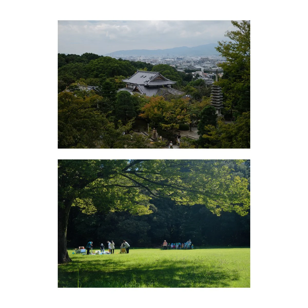
Top: Classic Negative
Bottom: Pro Negative Hi
If you found this useful, do share this with a friend who’d also like this.
Also leave some of your film simulation or recipe recommendations in the YouTube comment section - to help out those who are also tired of Classic Chrome.
Check out Photography Essentials if you’re interested in building a solid foundation with photography, it’s free.
And we’ve got something big coming up on the website - look forward to it.
Thanks for reading, have a great day.