Amongst the many Fujifilm recipes, there is one key component:
White balance.
You may have noticed, but white balance tends to be the core element that makes a recipe different, besides the Film Simulation itself.
And although there are many variations and changes in tints you can use, most of them revolve around the warmer yellow and orange tints.
Its such that many Fujifilm recipes have gained this reputation of having a “piss/pee” filter.
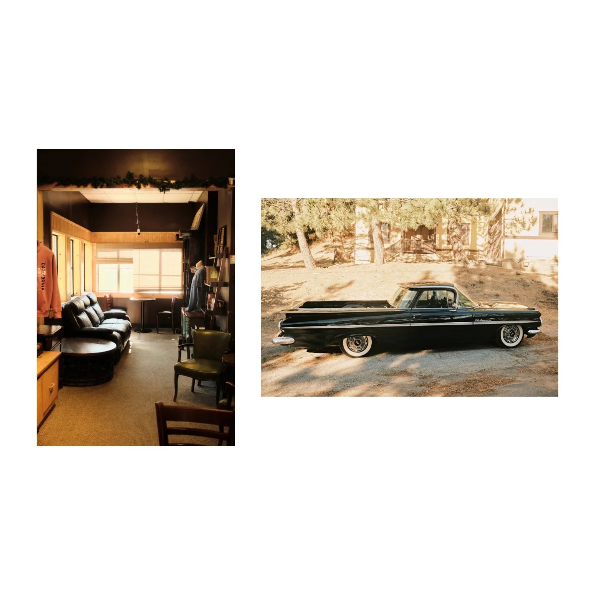
Personally, I sort of laughed the first time I heard it - because in part it’s kinda true.
I’ve used many recipes in the past that go way too strong on this coloring.
But at the same time, I do find elements of it effective at getting the look I want - most recently, as you know, in Reggie’s Portra.
When it comes to things like these, there will always be someone who doesn’t like them.
But looks go in and out of trends, so you should stick to what looks good to you.
That being said, I did end up creating my own Fujifilm Recipe.
Not out of response to the “piss filter” wave, but sort of on accident.
Today I’ll share that with you, for anyone who wants something a little different.
I call it “Aqua Negative”.
P.s.
Many of you have been asking about my Reggie’s Adjusted Recipe.
It’s not done yet, but I’ll make an article when it is - don’t worry, I haven’t forgotten.
The Birth of Aqua Negative
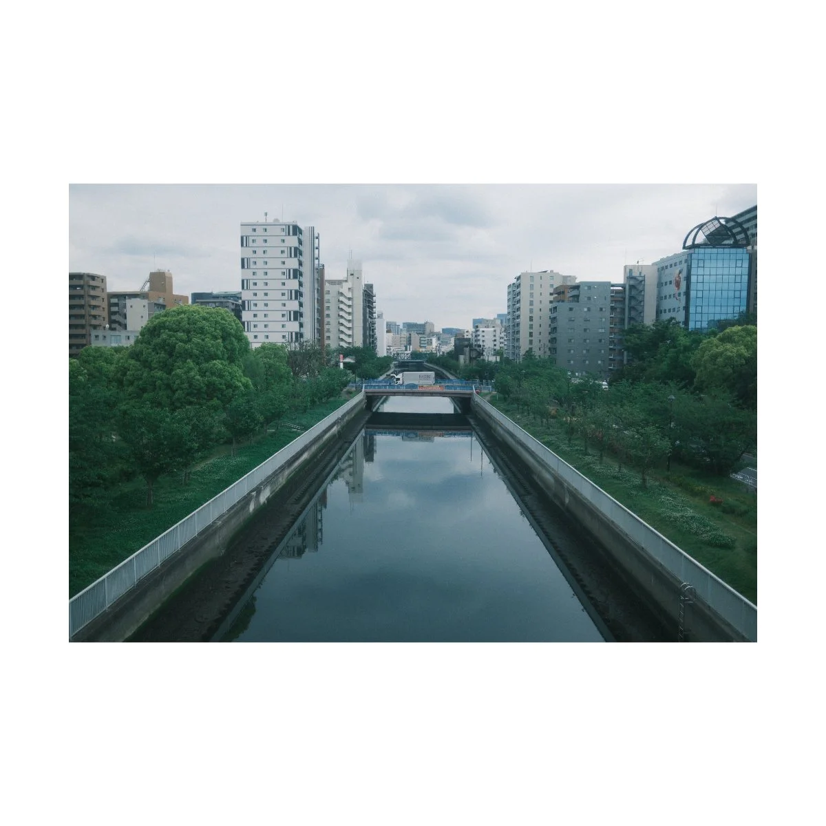
Aqua Negative was first inspired by an edit I made way back in 2024, of the Amanohashidate sandbar.
Being a well known naturally occurring landmark of the Miyazu Bay, the name translates roughly to “bridge of heaven”.
Back then, it was something I was looking forward to seeing, but there was one big problem:
The weather wasn’t ideal.
Lighting conditions were bright, overcast, cool tones, with occasional rain and not too much sun.
I remember being somewhat disappointed, because I wasn’t going to get a second chance to see it.
But later, once I got home and began editing, I actually really loved how the pictures turned out, moreso than if the day was warm and sunny.
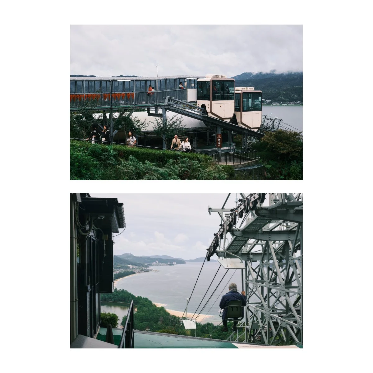
The edits I used here were in Classic Negative, with a heavy lean into the blues of the sea and the greens of the trees.
This look inspired the new recipe: Aqua Negative.
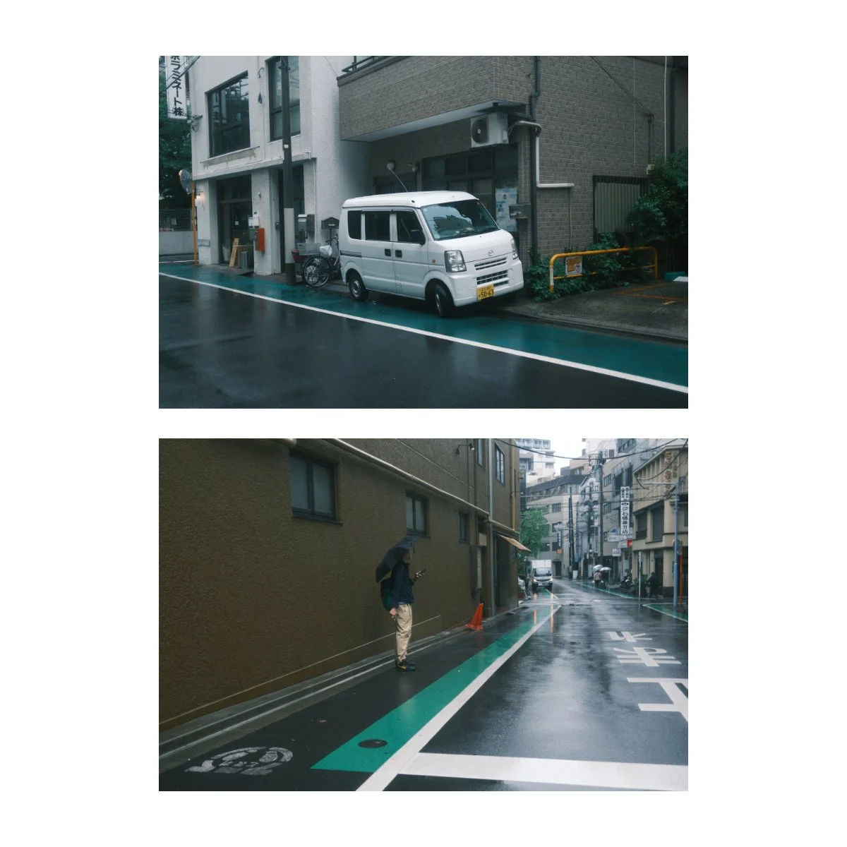
More recently, when I was exploring Tokyo this year, looking for a coffee shop, I found myself in similar lighting conditions.
The day was bright overcast late morning, and the warmer Fujifilm Recipes in my camera just weren’t cutting it.
There was just too much conflict.
So, I decided to recreate the look from my Amanohashidate edits, only in camera for a SOOC version.
In that process, I created Aqua Negative, a colder moody film simulation recipe.
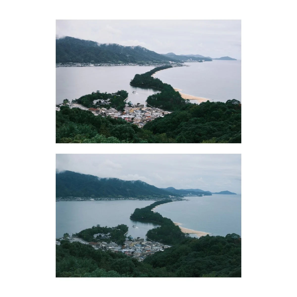
Side by side, you can tell it doesn’t look exactly the same as the original edit.
Aqua Negative is much more blue as well as has a lower contrast profile.
That’s normal because one’s being done in camera with different and less options.
I also think that Aqua Negative became it’s own thing along the way, as I leaned more and more into the blues.
You can find the settings here:
Aqua Negative Film Simulation Recipe:
Film Simulation: Classic Negative
Dynamic Range: DR-Auto
Highlight: -2
Shadow: -1
Color: +1
Sharpening: -2
Noise Reduction: -2
Clarity: -2 (or use a mist filter)
Grain Effect: Strong, Small
Color Chrome Effect: Strong
Color Chrome Effect Blue: Weak
White Balance: Auto, -3 Red, +1 Blue (or Auto White Priority, under yellow light)
Exposure Mode: Manual
What Makes Aqua Negative Work?
Aqua Negative’s foundation is built around the film simulation Classic Negative.
This is personally my second favorite color film simulation, coming right after Classic Chrome.
Although…I have been using it a lot more lately.
Classic Negative tends to have a very distinct look that you’ll be able to recognize if you shoot with it often.
My personal impressions of it are: higher contrast look with shifts in the browns and greens.
Classic Negative does shift blues and reds as well, but I see them as less distinct, more secondary changes.
Since the browns of Classic Negative tend to stand out a bit, I never used to think it had the option for a “cooler” recipe.
Especially with the many popular recipes out there like Cuban Negative, that lean to the warmer side.
But since many of these edits still looked great, I decided to focus on the cooler tones, heavier blues, and moody exposures, by adding -3 to Red and +1 to Blue.
And to be clear, this look isn’t going to be a color accurate “Aqua” color, okay.
That’s the just most fitting name I found for it.
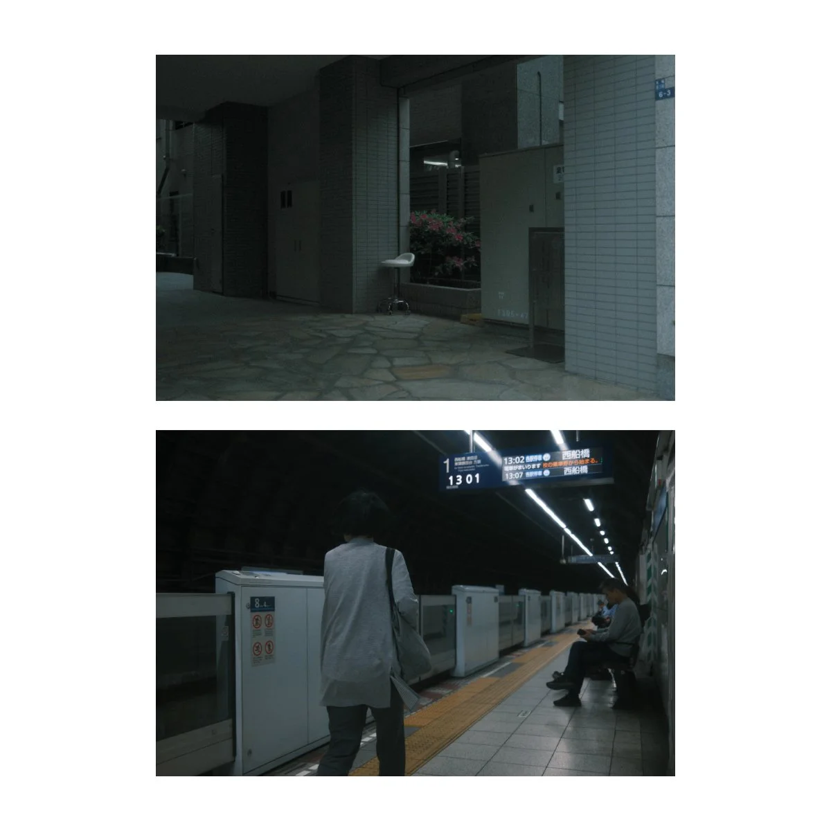
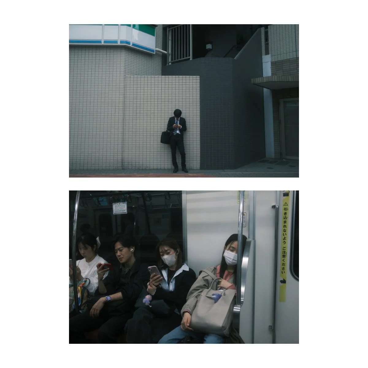
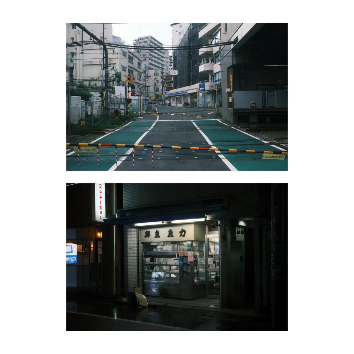
When used at the right time of day Aqua Negative can create for a great look, especially when it comes to street photography.
The higher contrast, dark shadows, and cool tones make many shots look more melancholy, empty, and even serene.
This is in part due to the combination of color chrome and white balance shifts.
Which is an interesting way to add a bit of somber tones to your photography, in contrast to the standard warm and happy recipes.
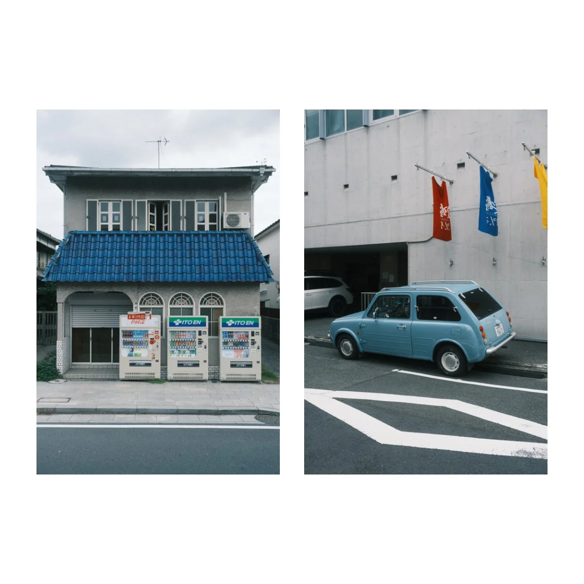
However, don’t be fooled.
This look can actually work for normal everyday photos as well.
Since returning from Japan, I’ve been using it a lot in a mixture of cloudy and sunny days just to see how well it performs.
And I’ve noticed that the “aqua look” can still be nice, even if you’re not going for something “moody”.
The blues kind of give the skies a feeling of chilly early morning Fall or Winter, with the sun still out.
And I personally like that feeling a lot.
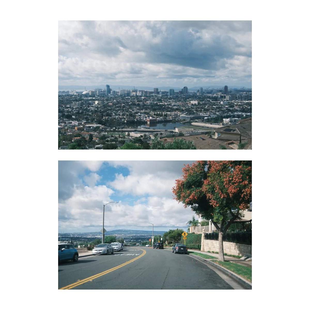
You may have noticed, but Aqua Negative also has a -2 on clarity.
I did this to soften the image a bit, in combination with the -2 to the highlights.
If this slows your camera’s processing speed down, feel free to set it to 0, or even use a mist filter instead, either works.
If you want to lean into the moody contrast and drama, you can even add a +1 or +2 to clarity.
So those are some of the main characteristics of Aqua Negative.
Now let’s talk about when to use it.
When to Use Aqua Negative
As you might be able to tell, Aqua Negative has distinct features.
That being said, it doesn’t work, and isn’t meant to work, in every scenario.
Like many other Fujifilm Recipes, the look is somewhat situational.
So let’s cover some of the scenarios I think this recipe looks the best in, as well as the ones where you should probably use something else.
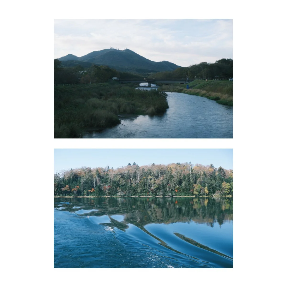
After using it for some time, as well as converting many older images into this recipe, I’ve noticed that Aqua Negative affects a few colors in particular.
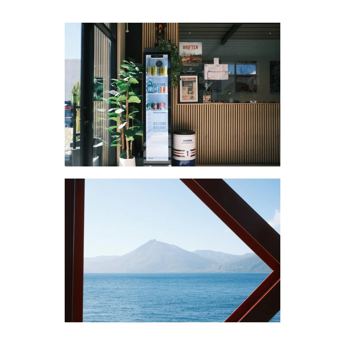
As the name suggests, it heavily prefers the blues and greens.
Blues becomes a dominant color cast, but the shade can blend in well with greys, creating an almost “slate blue” look.
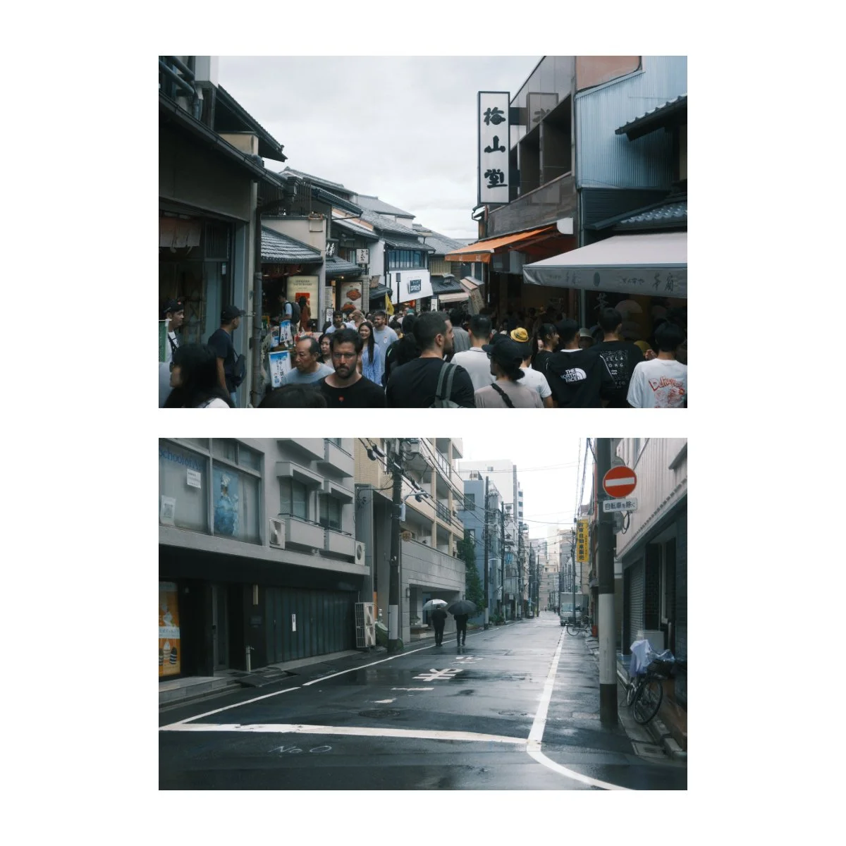
Greens are great as well, they sway to the green-green and can sometimes even look more blueish.
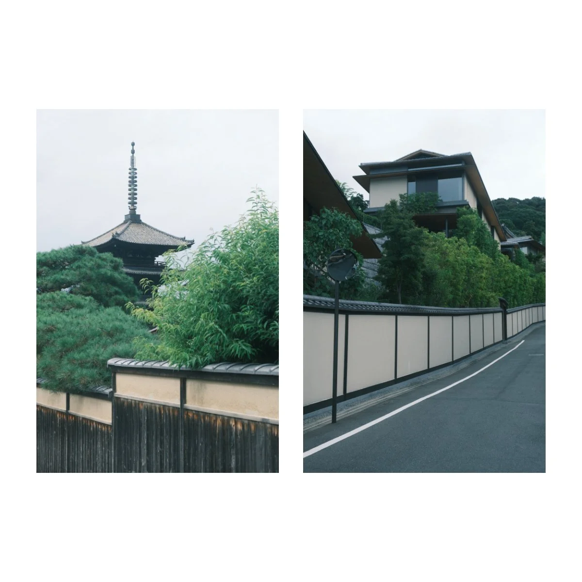
The secondary colors that are affected are the reds and browns.
These still look nice, however seem to be a bit more neutral, rather than standout.
I personally like the hues of many of these shots.
Now, there are a few conflicting colors to take caution of:
Oranges, and to a lesser extent, yellow.
Not all shades of course, some can work, but we’re not gonna get that specific here.
Naturally, the main oranges are on the opposite side of the color wheel, so in my opinion, don’t look as nice in Aqua Negative.
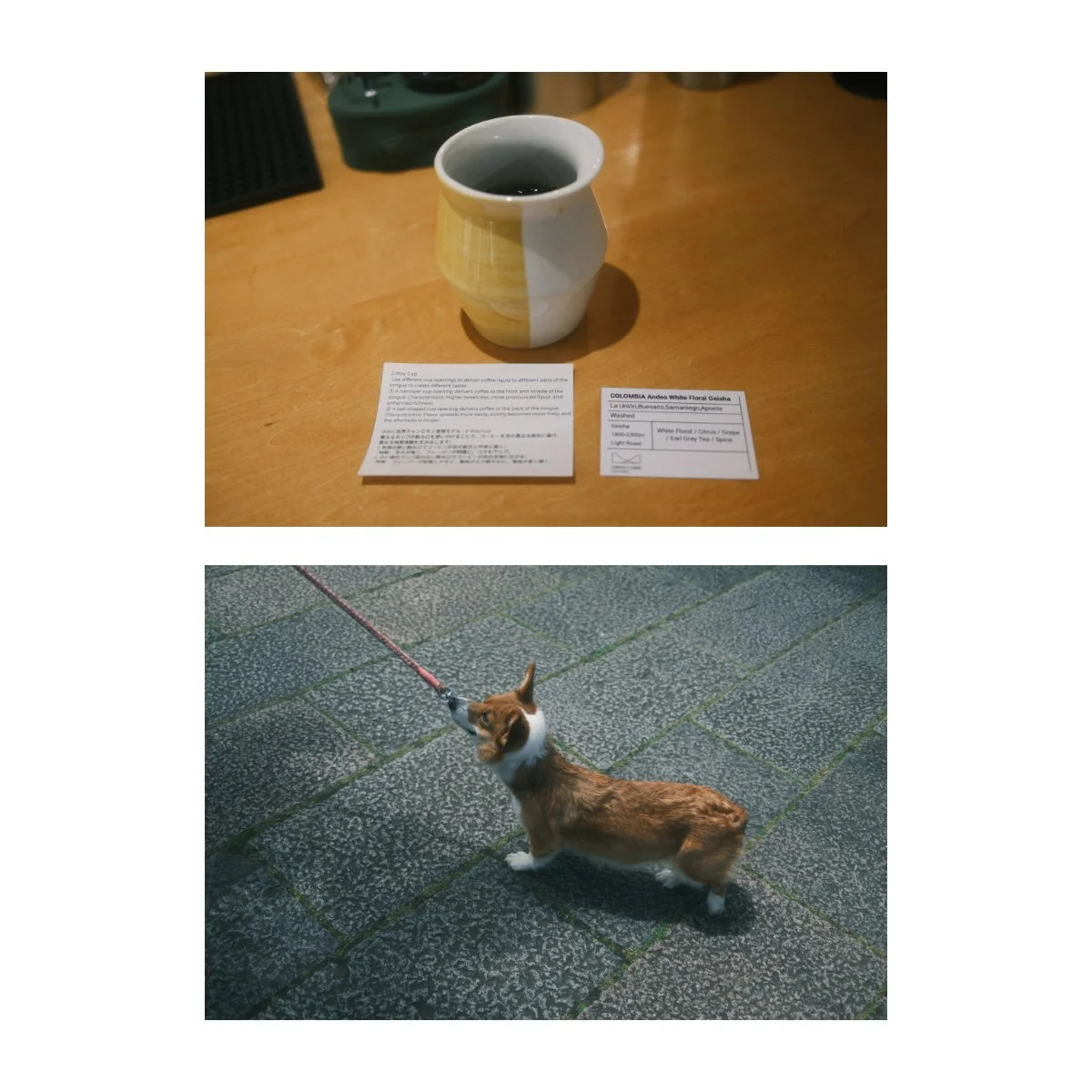
It’s such that, Aqua Negative looks good in some, but not all scenarios.
The first is bright, cloudy, overcast mornings, generally, in the Fall or Winter times.
That was around when this recipe was first designed, so I made it with these days in mind.
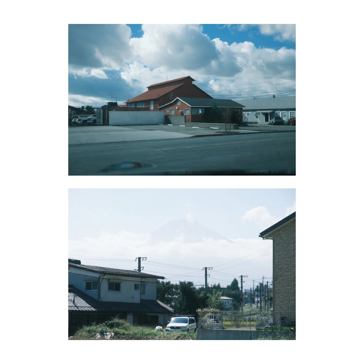
In general, Aqua Negative looks good when our daylight is bright and cold, hence overcast.
I find that the blue blends in well with this look and adds to the feeling.
If it’s fully overcast or even rainy, your shots become more moody, which can be a nice dramatic street photography look to lean into.
I haven’t used this recipe in the snow however, but I imagine you’ll be fine.
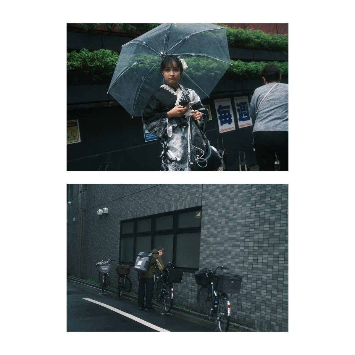
On the contrast, warmer sunny days can be a hit or miss.
Orange and yellow tend to conflict with the colors of Aqua Negative, so I wouldn’t recommend it for a sunny Golden Hour vibe.
If the day is only slightly warm however, it can work, you just need to find the right colors.
Like we mentioned earlier, getting greens and blues involved can keep the look natural.
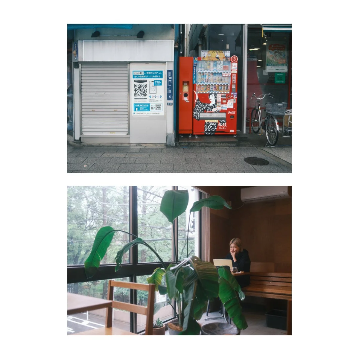
Browns and reds can work, and help balance your shot, just make sure the sun (because that’s your main light source), isn’t too strong.
Think: Fall, Winter, and a little bit of Spring vibes, but not so much Summer.
Food as well, can look unappetizing on Aqua Negative, so I wouldn’t recommend it…
So that’s Aqua Negative in a nutshell.
I’ve been working on this recipe to share with you guys and I hope you like it.
I’d love to hear your thoughts on it, any things you’ve noticed, and if it can be improved, so leave a comment in the YouTube section.
Again, it’s not perfect nor is it supposed to be the most versatile recipe.
But when gotten right, it can have a very cool look (pun intended).
It’s also winter right now, so depending on where you live, the timing might be perfect.
Again, Reggie’s Adjusted is coming, I haven’t forgotten, look forward to it.
If you want to learn more about the basics and build a solid foundation with photography, check out Photography Essentials - it’s free.
If you struggle with motivation, the “doing” of the craft, and getting past the intermediate swamp, check out Photography Systems.
Otherwise, thanks for reading, happy shooting.