Your Complete Guide to Every Fujifilm Film Simulation (2025)
Photography can be a bit overwhelming to get into.
You’ve got to learn about all these different cameras.
You’ve got to learn settings, composition, and exposure.
And if you shoot Fujifilm, you’ve got to learn and understand film simulations.
Film Simulations are the bread and butter of Fujifilm cameras - they’re what make them unique and fun to use.
The most obvious way to familiarize yourself is to shoot with each one to see which you like and how they work.
But I’ll save you some time and share the many different things I’ve learned.
We’ll cover everything that exists up to the x100vi - the latest being Reala Ace (at the time of writing).
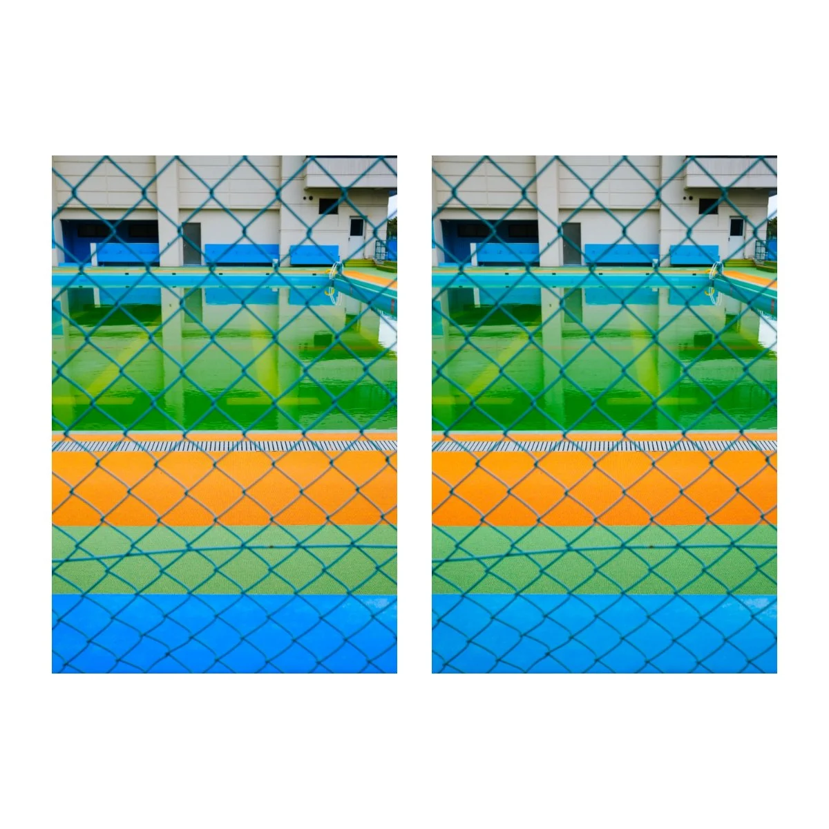
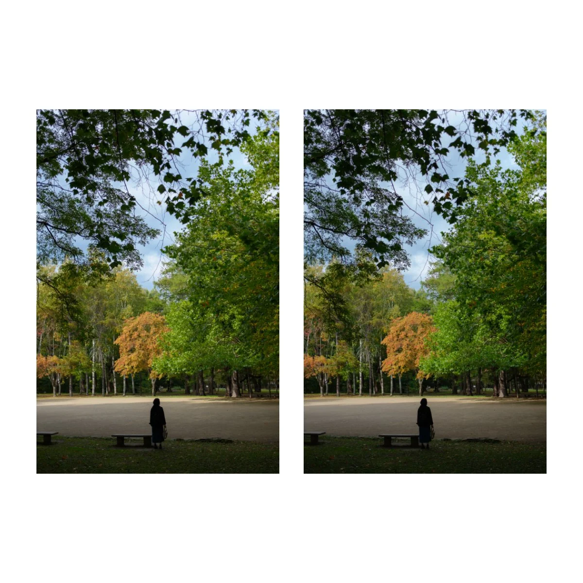
And of course, there will be a bunch of photos.
Most of these will be edited, some will be SOOC.
This will also be a descriptive comparison, not scientific, based on my experience, so it won’t be 100% accurate.
Let’s begin.
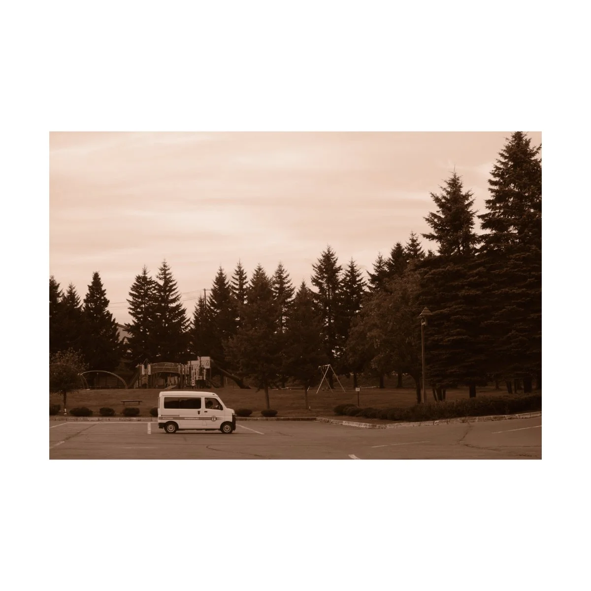
Classic Chrome
Since it’s release, Classic Chrome has become one of the most popular film simulations.
Being loosely based off of Kodachrome, Classic Chrome is very versatile.
You can use it in basically any setting, from street, travel, and everyday photography.
It’s characterized by a slightly muted look.
This is because colors aren’t as strong in Classic Chrome and they tend to sway to the colder side.
Blues are more teal blue, while browns tend to sway pink rather than yellow, making skin tones sometimes nice, sometimes hard to work with.
Contrast tends to be fairly even since the shadows are good, which helps give it that “chrome” look.
Because of it’s more muted look, it acts as a great base to edit photos off of.
There’s a lot of room to push and pull, especially if you have a higher dynamic range setting.
And because color saturation and color pop isn’t nearly as pronounced as some other film simulations, it prevents a lot of people from “cooking” their photos, especially when the temptation nowadays is to add more color.
Classic Chrome also acts as a great base for many custom film simulations.
When emulating film, many people will use Classic Chrome as the primary film simulation and tweak a bunch of settings here and there to create different looks.
It does a great job at replicating different film stocks and there’s a lot of room to push and pull contrast, shadows, and color.
Some of my most used Custom Film Simulations that have Classic Chrome are Portra 400 and “Usual” - a personalized one I made, not to look amazing SOOC, but rather to see clearer.
So, Classic Chrome is the film simulation I use the most - maybe 80-90% of my photos are edited off it.
But it’s been pretty popular these past years so some people might be tired of the aesthetic.
Because of this, I’ve been using other film simulations lately or trying different looks, just to mix it up a bit.
I’d still recommend it though as it’s one of the best film simulations.
Let’s move on.
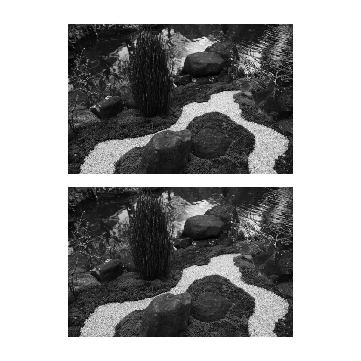
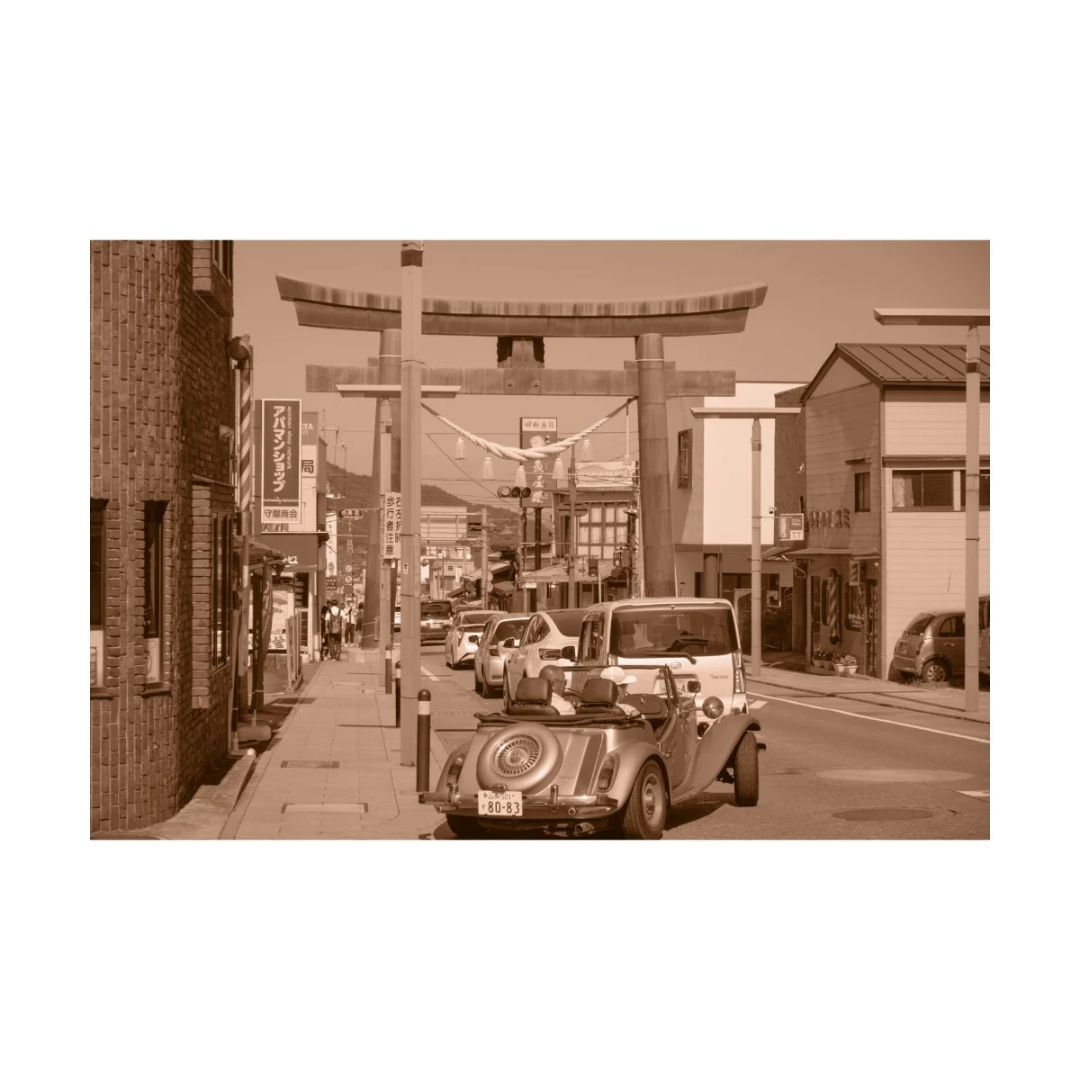
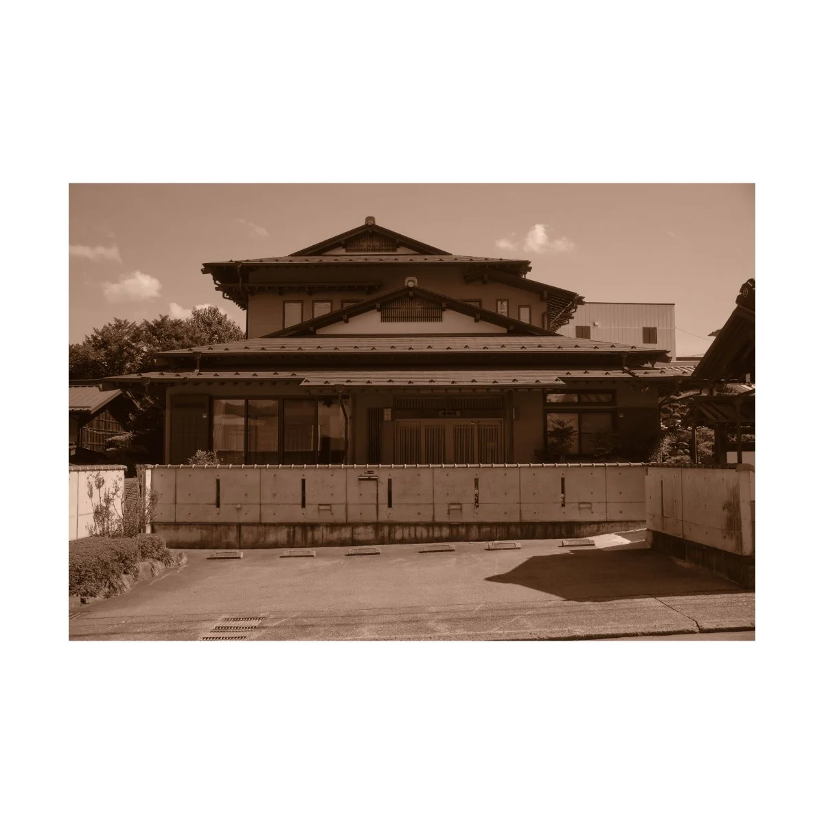
Classic Negative
Classic Negative is probably my second most used color film simulation.
I like it because it provides a stark contrast or difference from Classic Chrome.
Top: Classic Negative
Bottom: Classic Chrome
While Classic Chrome acts as a flat base for a lot of edits, Classic Neg has much more character in comparison.
Typically when I think of Classic Neg, I think of a shift in browns, a sway in greens, and a strong contrast.
You can see some of these characteristics of Classic Neg in these shots I took of the Hachimangu Shrine.
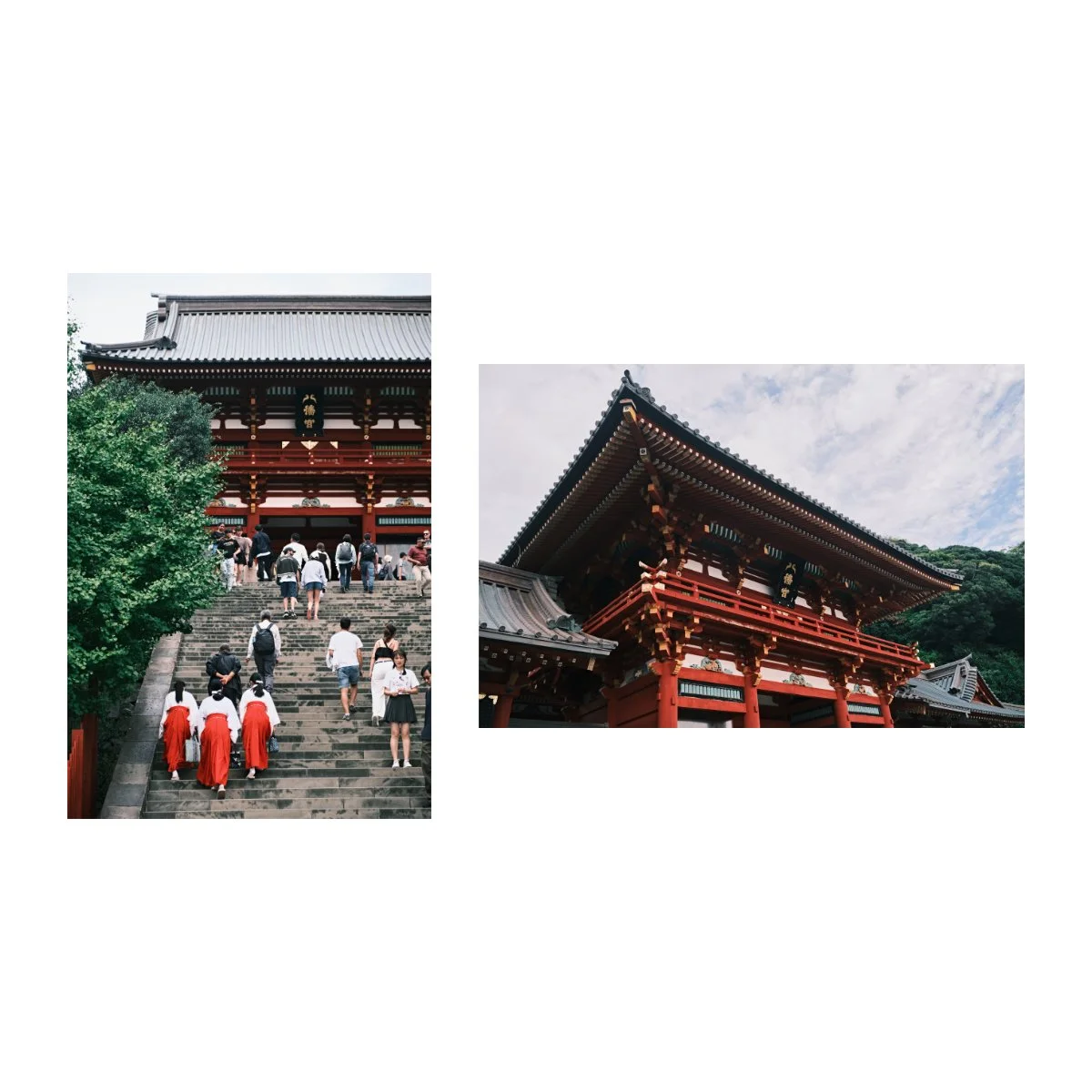
The shift in green makes the green look more green green as opposed to yellow green.
I prefer this look and have even taken and applied this hue shift to many of my other edits that aren’t in Classic Neg.
You may also notice the reds as well have a less bright and deeper hue to them.
Sometimes I feel as if Classic Neg sways the reds to the brown side, and the browns become less yellow.
Furthermore the overall tonality of the images is high, with brighter highlights and darker shadows.
This contrast can help give your shots a bit more pop when your photos are looking dull.
Now, I’d exercise a bit of caution when using Classic Negative.
It’s a great and fun because of it’s aesthetic but it doesn’t work for every situation.
And often times I’ll find it a tad too strong for some shots.
So I’ll use it when I think a standard film simulation is a bit boring, or when I can take advantage of the looks it gives.
Acros
Out of the two black and white film simulations Fujifilm provides, Acros is my most used one.
It’s based on Fuji’s own Acros film stock from back in the day which seemed to be quite popular.
Now it depends how you use it, but my general impression of Acros is a more dramatic, higher contrast, moody, and grainy aesthetic.
This is in part because the custom settings and tone curves I use in camera emphasize these aspects, but I still find this to be true when comparing a base Acros to Monochrome.
For a time period I was obsessed with Kevin Mullins’ “Newspaper” recipe which would blow out the highlights, darken the shadows to oblivion, and make everything look timeless.
The slight shift to greens in the shadows were also a great touch.
I wrote a small article with this recipe way back, you can find it here.
Nowadays, I tend to edit my black and white shots to be a bit more balanced in exposure, but I do still use the recipe if I feel like it.
When shooting black and white on Fujifilm cameras you also get the option to use a red, yellow, or green filter.
These filters simply change the way light and color get interpreted in your camera.
It’s up to you if you want to use them or not - standard Acros works just as well.
In sort of a non scientific interpretation, here are my impressions of each filter.
Yellow is the most standard, and will make your blues darker.
This can add some contrast between your clouds, skies, and the rest of your photos.
Red filters I generally use for skin tones when it’s dark, as it’ll lift the reds and brighten them, making them pop more.
So I kind of use it as an exposure hack rather than a filter.
Green filters I probably use the least, but it generally darkens the red and oranges.
If you’re unsure of what filter to use, stick to the standard Acros or Acros + Ye, as it’s the most versatile.
You can also check your raws in post on Lightroom or Capture One to compare side by side and understand the difference.
Moving on.

Monochrome
Monochrome is another black and white film simulation available on Fujifilm cameras.
This is what you’d consider your “standard” black and white that you’d be used to on other cameras.
When compared to Acros, Monochrome is generally flatter, more balanced, less moody, less heavy, and just solid all around.
Top: Acros
Bottom: Monochrome
This can be a preferable look to Acros as you might not always want the deeper tones or drama.
Personally, I don’t often use Monochrome unless I need it to balance the exposure in my highlights or drop in shadows.
But I have seen many instances where the lighter softer look, looks better.
If you’re just looking for a standard black and white to use, Monochrome is great for that.
It’s got the same filters available to it that Acros does, and it can be a much friendlier base for editing.
I’ve been meaning to dive into it more and go on a “Monochrome phase”, but we’ll see if I ever get to it.
Sepia
Sepia is one of those “dead” looks that probably doesn’t get enough love.
It’s one of those standard color profiles many digital cameras have, so it’s not an exclusive Fujifilm film simulation.
Sepia is a reddish brown sort of monochrome look that was popular in the early days of photography.
And it was used as a way to improve the longevity of black and white photos.
It’s usefulness has sort of died out in the modern era because everything’s digital and we don’t really need it anymore.
And in most cases I’d rather just edit in black and white than in Sepia.
So it’s one of those things that has gone out of style, popularity, and usefulness over time.
The “Sepia look” is often reminiscent of older times.
When I look at photos in Sepia, I think vintage, retro, 1800s.
Because of this association, it’s difficult to imagine the daily photos I take in a Sepia profile.
That’s probably a big reason as to why I don’t use it alongside defaulting to black and white.
It’s not the most appealing aesthetic to me personally, but it can be a cool look.
Maybe I’ll take the dive one day.
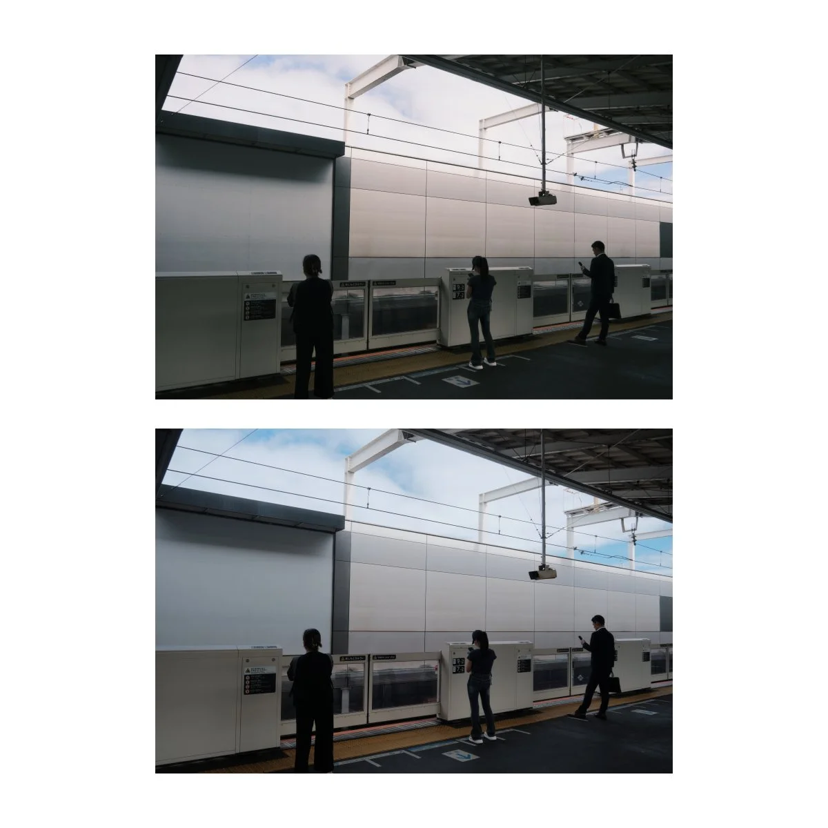
Pro Negative
Pro Negative Hi and Pro Negative STD are kind of like your hipster’s Classic Chrome.
Back in the day when there were much less film simulations and Classic Chrome didn’t exist, people used this.
And every now and then I’ll see someone saying how Pro Neg is so much better.
I’m personally not too experienced with the Pro Neg look, since I’ve always just defaulted to Classic Chrome.
But based on my limited understanding, Pro Neg seems to be very close in tone and contrast, only slightly more colorful and slightly more warm.
Left: Pro Negative Hi
Right: Classic Chrome
The yellows, greens, and oranges aren’t nearly as flat.
Classic Chrome tends to be more of a muted, colder, blue grey feel.
So Pro Neg doesn’t get the same color shifts that Classic Chrome would.
And just comparing them side by side, some of these shots I actually prefer the Pro Negative look.
Sometimes Classic Chrome can be too flat, while things like Provia and Astia can be a bit much.
So Pro Neg or Reala Ace might be a good in-between.
I’ll probably have to try it out more in the future to understand it better.
My recommendation is to flip flop between the two and see which one you like.
Left: Pro Negative Hi
Right: Pro Negative Std
Now the difference between the “Std” and the “Hi” versions are mainly contrast.
Std is supposed to be more even and balanced, while Hi is higher.
But when comparing them side by side to other film simulations, I actually prefer the “Hi” look.
I think the contrast is closer to Classic Chrome, while the Std, although it says “standard”, tends to look more faded and be of lower contrast.
However, Std can be useful in situations where you don’t want things to be too moody, dramatic, or just want room to add contrast yourself.
So again, use whichever you prefer.

Nostalgic Negative
Nostalgic Negative was the film simulation I was most excited about getting on the x100vi.
I’d heard about it when it was first added to the GFX series cameras, but had never gotten the chance to try it out.
Nostalgic Negative is a film simulation characterized by warmer highlights, softer tones, and an amber color cast.
There’s also a bit of a lift in the shadows when compared to other film simulations, so the contrast isn’t too heavy.
When shooting with this film simulation I found myself enjoying it, although not nearly as much as I thought I would.
It just wasn’t what I expected when I heard the name.
I like the amber tint and warmth of the shots, but it’s not always the best look for the situation.
The browns especially seem to get tinted to a more yellow brown hue.
This can work in some cases but isn’t always my personal preference.
I’ve found that Nostalgic Negative works best with a bit of natural sunlight, while colder days or indoor lighting aren’t always as pleasing.
But I do like the general look and aesthetic and would recommend trying it out.
Eterna
Eterna is my most used film simulation…for video.
It’s not a film simulation I use often for photography, rather it’s strengths lie elsewhere.
This is because of it’s flat and muted appearance.
I’ve described Classic Chrome as flat and muted earlier - you can think of Eterna as that times two and without the color shift.
Top: Classic Chrome
Bottom: Eterna
Where Classic Chrome has deeper solid shadows, Eterna pulls them up.
The highlights get dropped as well and white balance is more “white” - neither blue nor orange.
It almost looks as if someone pulled the contrast dial all the way down without removing the detail.
You can argue that this makes it a great base for editing photos, but I’ve personally found it to be too much.
Where Eterna shines, in my opinion however, is for video.
(for sample footage view the YouTube video in the link above)
It’s high flatness, low contrast, muted look mimics halfway between Log and a standard color profile.
This is great for beginners who want to color grade but aren’t quite at that level of grading straight from Log.
Furthermore, video in Eterna is already decent without editing, so you can just export it as is, if you truly want.
Skin tones also show up quite nicely, and all of the talking head videos you’ll see me post are recorded in Eterna.
Personally I like to go a step further and toss a -2 reverse s-curve in camera.
This gives me maybe 65% of a normal Log look, which leaves a little more room to add contrast and shadow in post.
And with the dynamic range available on Fujifilm cameras, you’re honestly not missing out on much.

Eterna Bleach Bypass
While Eterna is kind of like Classic Chrome x2 in mutedness, Eterna Bleach Bypass is that on steroids.
It’s hard to describe but it reminds me of a stripped down desaturated Classic Chrome or a high contrast muted Eterna.
You can even think of it as shooting in black and white, with a little bit of color left.
Left: Bleach Bypass
Right: Eterna
It’s tones does remind me a bit of Classic Negative, as the shadows tend to be deeper and the brightness tends to be high.
It’s honestly a pretty cool film simulation but I don’t use it much since if I’m going that far, I’d rather just shoot in black and white.
And because it has such a noticeable look, the actual situations you can use it in are few.
Top: Bleach Bypass
Bottom: Acros
I think it’s useful if colors seem to be getting in the way and you want the tones without going full black and white.
Or if you just like the way it looks.
Velvia
If you could imagine someone took all the saturation, contrast, and clarity, turned the dials up, and bottled them into a film simulation, that’d be Velvia.
Velvia is probably the strangest film simulation out there.
And for the longest time I didn’t understand it, because it seemed like a cluster of things that shouldn’t exist.
Fujifilm describes it as their “vivid” film simulation.
I think that’s putting it lightly.
When you use Velvia, everything goes crazy - and in most cases, it doesn’t work.
It’s the epitome of cooking your photos, just as a film simulation.
In my honest opinion, many photos I’ve taken with it just look straight up ugly.
That is, until I found the right circumstances for it.
A couple of years ago I went on a binge of photographing sunsets.
I took thousands of photos of the sun, light rays, cloud formations, you name it.
And when editing, Classic Chrome and the other film simulations just didn’t cut it.
They didn’t give the pop or saturation I felt like the images needed to look the way I wanted or the way I felt like they did at the time.
Even when editing and turning up the saturation dials to the max, I couldn’t quite get the right colors.
That’s when I switched to Velvia.
For some reason the colors, contrast, and clarity that made my other photos so ugly, made these sunsets extremely vibrant and appealing.
And the range and flexibility I had to push colors a certain way without overdoing it was awesome.
Velvia also works quite well for abstract photos if you really want to smack the color there.
So the important thing I learned here was: Velvia looks best in “unreal” scenarios.
Things that don’t look real and aren’t supposed to be real or accurate to actual life.
I wouldn’t recommend Velvia for basic stuff like portraits or people, because the skin tones and colors just won’t look right.
Instead, save it for photos that really need that punch and don’t need to look “real” or color accurate, like sunsets.

Provia
Provia is Fujifilm’s “standard” color profile.
It’s the closest to what you’d get when shooting with a default color profile on another camera.
Because of this, I’ve stayed away from it because it honestly felt generic to me.
A big part of why I enjoy shooting with Fujifilm is because I could shoot in these different film simulations and tweak things to get different looks.
So shooting in a standard color profile was of no interest to me.

While many of other film simulations have a look or character to them, Provia is almost neutral to all of these.
If you could imagine taking a photo with an iPhone or smartphone, Provia is the closest thing to that “standard” look, in my opinion.
The greens are mostly yellow green as opposed to Classic Negative’s green greens.
The white balance is generally even as opposed to Classic Chrome and Nostalgic Negative.
And colors tend to be more saturated than the other film simulations.
Which is why I don’t generally like using it because it feels a bit “fake” to me.
Now it’s not all bad.
Provia can come in handy and many photographers seem to enjoy it.
And although I tend to think of Provia as “boring”, you could also argue that a better word for it is “balanced”.
I think it’s strengths are when you’re having trouble getting the right look from your other film simulations.
Classic Chrome isn’t colorful enough, Classic Negative’s colors don’t look that good, and maybe you don’t want that pop that Astia gives.
Top: Provia
Bottom: Astia
Provia is reliable in these cases when the other film simulations just aren’t working.
Or if you just need something standard and non characteristic.
I’ll have to see how it compares to Reala Ace editing wise, since that could be a better alternative.
But currently, they’re more similar than I initially thought, I just prefer Reala Ace for both tones and color.
Astia
Astia is supposedly Fujifilm’s “soft” film simulation.
This probably comes from the tones and contrast, as it’s slightly flatter and more even than the others.
“Soft” isn’t the first thing I think of when I think of Astia, however.
For me, the first thing that comes to mind is the “pop”.
You can see in some of these shots how Astia changes the rendition of certain colors.
Top: Astia
Bottom: Classic Chrome
Colors like blue and yellow in particular gain a lot of character with Astia.
Blues become more “blue blue” as opposed to Classic Chrome’s slightly teal blue.
This “character” is less noticeable, but similar to the “character” you’d find in other film simulations.
They affect the image in a way you can’t edit out of and is difficult to replicate separately.
So if I’m going to edit an image in Astia, Classic Neg, or anything with noticeable characteristics, I’ll keep that in mind.
Because of this I don’t often use Astia, save for when I need that part of it.
Left: Astia
Right: Provia
Now, that aside, Astia isn’t too far off from Provia.
Colors are similar and although they do have a look to them, it’s not as extreme as some of the others.
The main difference is the tones, since Astia’s got that “soft” look.
Before Reala Ace came out, Astia was my alternative to Provia when I needed a somewhat standard color profile to edit off of.
I don’t usually prefer Astia as skin tones can be a bit too yellow and colors in general can be a bit much.
But it does have it’s uses in certain scenarios when the other film simulations just aren’t working.
I’d recommend playing around with it - it can be hard to tell the differences at first, but you might end up really liking it.
Reala Ace
Within the past 6 months or so, Reala Ace has been the film simulation that’s grown on me the most.
It was first introduced in one of the GFX series cameras back in 2023 but was also added to the x100vi upon release.
I initially thought it would be just another boring standard profile, much like Provia or Astia.
There’s nothing wrong with those film simulations, and I still use them from time to time, but they’re often not my taste.

Ironically, I started experimenting with Reala Ace, initially just for fun, and have found myself really enjoying the look.
The film simulation is based on the Fujicolor Superia Reala Ace 100 color negative film, which was only sold in Japan.
Fujiflm describes it as “faithful color reproduction with hard tonality”.
Which at first, makes no sense.
You’re basically just telling me: good colors, good contrast.
But as I continued shooting with Reala Ace, it actually began to make sense.

The film simulation is literally that.
The colors you’ll get with Reala Ace is often true to the eye and true to tone.
In my experience, I’ve found that many of the other film simulations shift the colors in some way.
But Reala Ace has almost a non preferential color base with good contrast.
Which is pretty much what Fujifilm described it as.
Left: Reala Ace
Right: Provia
Side by side, it’s actually quite close to Provia.
But unlike Provia, which can feel a bit too “smartphoney” for my taste, Reala Ace is brighter in the midtones.
I think this makes a big difference because I often raise the brightness in my tone curves anyways.
I like the way it looks and the way it feels.
And for some reason, the color, although not too far off from Provia, doesn’t turn me off in the same way.
So Reala Ace seems to be a great alternative from the other standard color profiles, especially if you don’t want too much character in your shots.
I’ll have to use it more, but overall it’s become a pleasant surprise that’s moving it’s way up my list of top film simulations.
So I hope you found this useful - if you have a friend who’s getting into Fujifilm and needs a breakdown of each film simulation, show them this. It might help.
If you’re looking to build a solid foundation with photography, go to Photography Essentials - it’s free.
And be sure to check out “The Sinking Sun”, my latest photography zine.
We also have new prints and limited merch available.
Thanks for reading, happy shooting.